Incorrect colors appear in ggplot

Dear All,

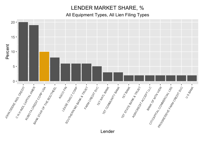
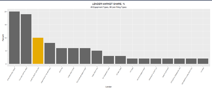
I am having trouble correctly specifying colors for bars and lines in ggplot output in markdown documents.

The colors that I specify by using Hex codes (“#E6AB02”,“#666666”) are not the colors that appear in the output ( “#D95F02”, “#1B9E77”). The undesired colors that do appear are from the correct palette (RColorBrewer Dark2), which is the palette that I specify and also contains the correct colors.

No matter which hex codes I specify in the aes() statement, the hex codes that are applied are the hex codes for the first two colors in the RColorBrewer Dark2 palette. The codes that I mean to specify are the 6th and 8th colors in that palette. I've included the palette and the hex codes in the output that is attached to this post.

I suspect this has something to do with the pallet but exactly what is wrong has me flummoxed.

I'd appreciate any insight to solve this problem.

Thanks.

Linda

Output: ggplot_specifying colors.pdf (92.3 KB)

---
title: "THE COLORS THAT ARE SPECIFIED ARE NOT THE COLORS THAT APPEAR"
author: "LandonPhD"
date: "`r format(Sys.time(), '%d %B %Y')`"
output: html_document
---

```{r setup, include=FALSE}

knitr::opts_chunk$set(echo = TRUE)

library(tidyverse)

# create data

Lender_vector <- c("JOHN DEERE INDL CREDIT", "C N H INDL CAPITAL AMER", 
                               "KUBOTA CREDIT CORP USA", 
                               "BANK STAR OF THE BOOTHEEL", "AGCO FIN", 
                               "LEASE CNSLT CORP", "SOUTHERN MO BANK & TRUST", 
                               "FARM CREDIT SVC", "1ST COMMUNITY BANK", 
                               " 1ST NATL BANK", "1ST BANK", 
                               "1ST STATE BANK & TRUST",  "AGRICREDIT ACCEPT LLC", 
                               "BANK OF MTN VIEW", "CITICAPITAL COMMERCIAL LSG", 
                                "PROGRESSIVE FARM CREDIT SVC", "U S BANK")

Lender_percent_vector <- c(20, 19, 10, 8, 6, 6, 6, 5, 3, 3, 2, 2, 2, 2, 2, 2, 2)

test_data <- cbind(Lender_vector, Lender_percent_vector)

test_data <- as_tibble(test_data)
test_data$Lender_percent_vector <- as.numeric(test_data$Lender_percent_vector)

```

# The RColorBrewer Library  - Dark2 Palette

```{r, warning=FALSE,echo=FALSE, message=FALSE}

# set the palette
library(RColorBrewer)
display.brewer.pal(8, "Dark2")
brewer.pal(8, "Dark2")

```

# The colors that I want:  "#E6AB02","#666666" 

# The colors that I get:   "#D95F02", "#1B9E77" 

```{r, warning=FALSE,echo=FALSE, message=FALSE}
# create the ggplot bar graph

library(ggplot2)
library(RColorBrewer)

plot.UCC <- ggplot(data=test_data,
                   aes(x = reorder(Lender_vector, -Lender_percent_vector), y = Lender_percent_vector,
                       fill=factor(ifelse(Lender_vector == "KUBOTA CREDIT CORP USA", "#E6AB02","#666666" )))) +
                        # colors that do appear = "#D95F02", "#1B9E77" 
                        
  geom_bar(stat = "identity") +
  scale_fill_brewer(palette = "Dark2")  +
  ggtitle("LENDER MARKET SHARE, %", subtitle = "All Equipment Types, All Lien Filing Types") +
  labs(x="Lender", y="Percent") +
  theme(plot.title =
        element_text(hjust = 0.5), 
        plot.subtitle = element_text(hjust = 0.5),
          axis.text.x = element_text(size=7, angle = 60, hjust=1, vjust = 1),
        plot.margin = margin(l=.5,t=.5,b=1,r=.5, "cm"), 
        legend.position = "none") +
  ylim(0, 20)

plot.UCC

```
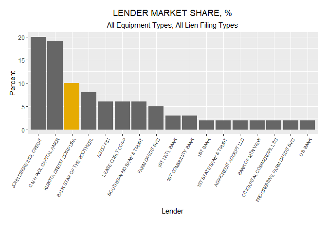
If I'm understanding correctly, you're trying to make a bar graph where all the bars are grey (#666666), except for one which will be yellow (#E6AB02). There are two ways I would approach this (I'm sure there are many others!)

The first is to use scale_fill_manual(), which allows you to pass a named vector of colors that will be matched by the values in the data you map to the fill aesthetic. In this case, I will explicit name #E6AB02 to be KUBOTA CREDIT CORP USA, and for the remaining 16 values I use #666666.

set up data
library(tidyverse)

Lender_vector <- c(
  "JOHN DEERE INDL CREDIT",
  "C N H INDL CAPITAL AMER",
  "KUBOTA CREDIT CORP USA",
  "BANK STAR OF THE BOOTHEEL",
  "AGCO FIN",
  "LEASE CNSLT CORP",
  "SOUTHERN MO BANK & TRUST",
  "FARM CREDIT SVC",
  "1ST COMMUNITY BANK",
  " 1ST NATL BANK",
  "1ST BANK",
  "1ST STATE BANK & TRUST",
  "AGRICREDIT ACCEPT LLC",
  "BANK OF MTN VIEW",
  "CITICAPITAL COMMERCIAL LSG",
  "PROGRESSIVE FARM CREDIT SVC",
  "U S BANK"
  )

Lender_percent_vector <- c(20, 19, 10, 8, 6, 6, 6, 5, 3, 3, 2, 2, 2, 2, 2, 2, 2)
test_data <- tibble(Lender_vector, Lender_percent_vector)
# define named vector of colors to use in scale_fill_manual()
my_colors <- c("KUBOTA CREDIT CORP USA" = "#E6AB02",
               rep("#666666", length(unique(test_data$Lender_vector)) - 1))

ggplot(
  test_data,
  aes(
    x = reorder(Lender_vector, -Lender_percent_vector), 
    y = Lender_percent_vector,
    fill = Lender_vector
    )
  ) +
  geom_col() +
  scale_fill_manual(values = my_colors, na.value = "#666666") + 
  labs(
    title = "LENDER MARKET SHARE, %",
    subtitle = "All Equipment Types, All Lien Filing Types",
    x = "Lender",  y = "Percent"
    ) +
  theme(
    plot.title = element_text(hjust = 0.5),
    plot.subtitle = element_text(hjust = 0.5),
    axis.text.x = element_text(size = 7, angle = 60, hjust = 1, vjust = 1),
    plot.margin = margin(l = .5, t = .5, b = 1, r = .5, "cm"),
    legend.position = "none"
    ) +
  ylim(0, 20)

The second approach uses the gghighlight package which allows us to choose elements to highlight based on a boolean condition. In this case, we say highlight when Lender_vector == "KUBOTA CREDIT CORP USA". Then we can style the highlighted and unhighlighted bars with the chosen colors.

library(gghighlight)

ggplot(
  test_data,
  aes(
    x = reorder(Lender_vector, -Lender_percent_vector),
    y = Lender_percent_vector
    ),
  ) +
  geom_col(fill = "#E6AB02") +
  gghighlight(
    Lender_vector == "KUBOTA CREDIT CORP USA",
    unhighlighted_colour = "#666666"
    ) +
  labs(
    title = "LENDER MARKET SHARE, %",
    subtitle = "All Equipment Types, All Lien Filing Types",
    x = "Lender", y = "Percent"
  ) +
  theme(
    plot.title = element_text(hjust = 0.5),
    plot.subtitle = element_text(hjust = 0.5),
    axis.text.x = element_text(size = 7, angle = 60, hjust = 1, vjust = 1),
    plot.margin = margin(l = .5, t = .5, b = 1, r = .5, "cm"),
    legend.position = "none"
  ) +
  ylim(0, 20)

Created on 2019-08-07 by the reprex package (v0.3.0)

5 Likes

Since you are passing a vector of colors to fill within aes(), you may be looking for the scale_fill_identity() function.

The scale_*_identity() function are useful when your variable already represents aesthetic values. Note they have no legend by default.

4 Likes

Rather than manually generating a vector of explicit color values for each row of the data frame, you can instead create a logical test for the fill aesthetic and then use scale_fill_manual to set the desired colors. For example:

ggplot(data=test_data,
       aes(x = reorder(Lender_vector, -Lender_percent_vector), 
           y = Lender_percent_vector,
           # Logical test to create fill mapping
           fill=Lender_vector == "KUBOTA CREDIT CORP USA")) +
  geom_col() +
  ggtitle("LENDER MARKET SHARE, %", subtitle = "All Equipment Types, All Lien Filing Types") +
  labs(x="Lender", y="Percent") +
  theme(plot.title = element_text(hjust = 0.5), 
        plot.subtitle = element_text(hjust = 0.5),
        axis.text.x = element_text(size=7, angle = 60, hjust=1, vjust = 1),
        plot.margin = margin(l=.5,t=.5,b=1,r=.5, "cm"), 
        legend.position = "none") +
  ylim(0, 20) +
  # Set the desired colors for the outcome of the logical test
  scale_fill_manual(values=c(`FALSE`="#666666", `TRUE`="#E6AB02"))

Rplot

3 Likes

Ah, this is much nicer than the named vector approach, thanks! Although I do really like gghighlight too, especially for adding labels to a subset of rows.

1 Like

@mfherman, @joels, and @aosmith,

I apologize for not acknowledging your very helpful responses earlier. Life got in the way of coding.

These look like excellent suggestions; although, I haven't had the opportunity to incorporate them into the code.

The gghighlight suggestion looks promising and very useful. I hadn't discovered this package so thanks for educating me.

I'll let you all know whether I've been able to solve my problem when life begins to cooperate with me.

Linda

2 Likes

@mfherman,

This is an elegant solution. I wouldn't have identified this solution because I wasn't aware of the gghighlight package, so thanks for introducing me to it!

My result with the real data set is exactly like your result.

Thanks for sharing your knowledge and experience with the rest of us!

Linda

ggplot(data=test_data,
       aes(x = reorder(Lender_vector, -Lender_percent_vector), 
           y = Lender_percent_vector,
           # Logical test to create fill mapping
           fill=Lender_vector == "KUBOTA CREDIT CORP USA")) +
  geom_col() +
  ggtitle("LENDER MARKET SHARE, %", subtitle = "All Equipment Types, All Lien Filing Types") +
  labs(x="Lender", y="Percent") +
  theme(plot.title = element_text(hjust = 0.5), 
        plot.subtitle = element_text(hjust = 0.5),
        axis.text.x = element_text(size=7, angle = 60, hjust=1, vjust = 1),
        plot.margin = margin(l=.5,t=.5,b=1,r=.5, "cm"), 
        legend.position = "none") +
  ylim(0, 20) +
  # Set the desired colors for the outcome of the logical test
  scale_fill_manual(values=c(`FALSE`="#666666", `TRUE`="#E6AB02"))
2 Likes

Thanks Matt! I wasn't aware of the gghighlight package so thanks for showing the gghighlight example.

2 Likes

This topic was automatically closed 7 days after the last reply. New replies are no longer allowed.