iAtlas
Authors: Andrew Lamb, James A. Eddy, Vésteinn Thorsson, David L. Gibbs, Carolina Heimann, Kristen Dang, Ilya Shmulevich, Justin Guinney
Working with Shiny more than 1 year
Abstract: The Cancer Research Institute (CRI) iAtlas is an interactive web platform for data exploration and discovery in the context of tumors and their interactions with the immune microenvironment. iAtlas allows researchers to study immune response characterizations and patterns for individual tumor types, tumor subtypes, and immune subtypes associated with clinical annotations. iAtlas supports computation and visualization of correlations and statistics among features related to tumor microenvironment, cell composition, immune expression signatures, tumor mutation burden, cancer driver mutations, adaptive cell clonality, patient survival, expression of key immunomodulators, and tumor infiltrating lymphocyte (TIL) spatial maps. iAtlas was launched in April 2018, and has since been expanded to include new capabilities such as user-defined loading of sample cohorts, tool for classifying expression data into immune subtypes, integration of TIL mapping from digital pathology images, and addition of annotated genomics datasets from immunotherapy clinical trials as comparative data sources. We expect that the CRI iAtlas will help to accelerate discovery and improve patient outcomes by providing researchers greater access to standardized immunogenomics data to better understand the immunological characteristics of the tumor immune microenvironment and its potential impact on patient responses to immunotherapy.
Full Description: Implementation
iAtlas is a web-based application to enable data exploration for clinicians, biologists, and informaticists and is accessible at www.cri-iatlas.org. All code is openly available on GitHub.
Data
The iAtlas app uses structured data and outputs from Ref.(Thorsson et al., 2018) and the TCGA PanCancer Atlas Initiative (Hutter and Zenklusen, 2018), which harmonized TCGA data, ensuring uniform quality control and sample inclusion, batch effect detection, normalization across platforms, combination mutation calling from multiple centers, and robustly compiled clinical and outcome data. A key source of data is the spreadsheet summarizing tumor-sample and immune characterizations for 10,080 TCGA patient participants of the TCGA, Table S1of Ref.(Thorsson et al., 2018)here termed the “PanImmune Feature Matrix”. Auxiliary data were sourced from files available on this manuscript’s data page at the NCI Genomic Data Commons (gdc.cancer.gov/about-data/publications/panimmune), from the TCGA PanCancer Atlas Data Mirror (Pan-Cancer Atlas BigQuery Data — ISB Cancer Gateway in the Cloud 2.0.0 documentation), and from iAtlas Data Manifest sheets. iAtlas data were formatted as data frames (tables) and stored as “feather” files (GitHub - wesm/feather: Feather: fast, interoperable binary data frame storage for Python, R, and more powered by Apache Arrow) on the application server for fast loading. Immunogenomics feature extractions were done and standardized in an analogous fashion from publicly available genomics datasets associated with immunotherapy treatment.
These files are available for download through the GitHub repository for the iAtlas portal (GitHub - CRI-iAtlas/shiny-iatlas: An interactive web portal for exploring immuno-oncology data. This repo now superseded by iatlas-app).
Annotation and browsing of the PanImmune Feature Matrix: iAtlas includes a Data Description page with details on all variables presented in individual modules, with the ability for users to “drill down” on related groups of variables to understand how values were derived. Variables are listed in a text-searchable table containing the name of the variable, the ‘Variable Class’, the unit (if applicable), and whether the variable is numeric or categorical. A ‘Variable Class’ is the name of a group of variables that are of similar type and are often the result of one particular analysis. Clicking on a row exposes a list of all variables in the ‘Variable Class’, and provides links to text descriptions of the analysis methods used to generate the variables.
R/Shiny Architecture
iAtlas is powered by Shiny (Chang et al., 2017). Shiny is a package written in R for the purpose of creating web applications. These applications translate R code into interactive UI and plots for the purpose of data analysis. iAtlas makes extensive use of Shiny Modules(Cheng, 2017) to organize code into decomposable units. Each iAtlas analysis module is designed as a Shiny module, allowing simple integration of new analytical functionality. iAtlas uses the tidyverse(Wickham et al., 2019) family of R packages (e.g., dplyr and tidyr). These functions power the data transformations of internal tabular data that are then used to create the interactive plots and data tables seen through the iAtlas modules. The core iAtlas application is hosted in shinyapps.io.
Analysis Modules
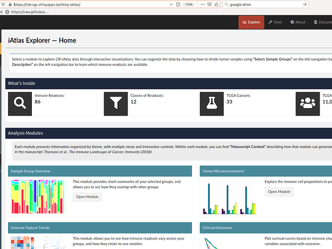
The main feature of the iAtlas interface is the iAtlas Explorer which provides several Analysis modules to explore and visualize results. Each module supports a type of analysis, with interactive views and controls to enhance and extend the results and analytics as initially described in our TCGA Pancancer study (Thorsson et al., 2018). The layout of pages and sections within the iAtlas Explorer is driven by the shinydashboard package.
Within each module in iAtlas, results are displayed as ‘Sample Groups’, corresponding to defined study cohorts. Several ‘Sample Groups’ are pre-loaded in the tool: first, TCGA tumor type (‘TCGA Study’), which are the standard TCGA tumor types collected and designated by the TCGA. Second, TCGA tumor subtypes (‘TCGA Subtype’), a compendium of further subdivision of TCGA studies into molecular subtypes according to publications by the TCGA Research Network (Colaprico et al., 2016). Finally, a division of tumor samples into distinct patterns of immune response in cancer (‘Immune Subtypes’) is provided (Thorsson et al., 2018). We also allow users to upload custom-grouped samples and analyze those with iAtlas modules. The selection of a sample group defines the samples utilized in all analysis modules. For convenience, group annotations can be displayed in visualizations within each module.
Sample Group Overview: View summary information for user-selected sample cohort groups. There are currently three sections: Custom Groups, Group Key, and Group Overlap. Respectively, these sections permit loading of user-defined sample groups, review of detailed annotations of sample groups in a table, and display of overlap between different types of groupings in a mosaic plot.
Tumor Microenvironment: Explore immune cell proportions in sample groups with two sets of faceted bar charts, one for overall cellular proportions (i.e., leukocyte, stromal, and tumor fraction) and one for computed immune cell proportions (e.g., monocytes, CD8+ T-cells, naive B-cells).
Immune Feature Trends: Visualize how immune readouts vary across sample groups. Violin or box plots show the distribution of individual values across samples in each group, while heatmaps and scatter plots can be used to explore the correlation between any pair of variables within each group.
Clinical Outcomes: Quantify the relationship between immune response and disease outcome, in terms of either overall survival (OS) or progression free interval (PFI) (Liu et al., 2018). Results are displayed as Kaplan Meier plots as well as heat maps showing the concordance index between variables and survival. For datasets with response class information (e.g. complete response, partial response, stable disease, progressive disease), immune features can be analyzed for association with response class.
Immunomodulators: Explore the expression of genes coding for immunomodulating proteins (Thorsson et al., 2018), which include therapeutically important immune checkpoint proteins. ‘Immunomodulators’ are organized by grouping into three categories: ‘Gene Family’ (such as TNF, MHC Class II, Immunoglobulin, or CXC chemokine), ‘Super Category’ (such as Ligand, Receptor, or Antigen Presentation) and ‘Immune Checkpoint’ (classified as Inhibitory or Stimulatory). Violin and box plots are again used to present distributions, and a table provides additional metadata about immunomodulator genes.
Driver Associations: Test and visualize associations between mutations and IO-related response variables. In Ref.(Thorsson et al., 2018) we reported on somatic driver alterations that are correlated with increases or decreases in overall immune cell content, or with the fraction of individual immune cell types. These and other variables can be selected to calculate the significance of relationships in each sample group and view results in a volcano plot.
TIL Maps: We recently reported on a method to assess which spatial regions of hematoxylin and eosin (H&E) whole slide images show evidence of tumor-infiltrating lymphocytes (TILs) (Saltz et al., 2018). The method, which uses deep learning, was applied to thousands of H&E slides of the TCGA, allowing slides to be characterized in terms of TIL density and patterns.
Why we didn't use rstudio cloud:
The the data us used by the portal is incompatible with rstudio cloud.
Category: Research
Keywords: Cancer, immuno-oncology, data sharing, reproducible research
Shiny app: https://isb-cgc.shinyapps.io/shiny-iatlas/
Repo: GitHub - CRI-iAtlas/shiny-iatlas: An interactive web portal for exploring immuno-oncology data. This repo now superseded by iatlas-app
RStudio Cloud: did not use
Thumbnail:

Full image:
