install.packages("ggplot2")
library(ggplot2)

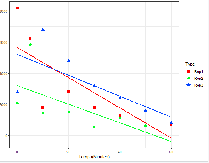
ggplot(Huitre_3, aes(x=Temps, y=Rep, color=Type, shape=Type))+
  geom_point(aes(size=Type)) +
  geom_smooth(method=lm, se=FALSE, fullrange=TRUE,formula = y ~ x)+
  scale_shape_manual(values=c(15, 16, 17))+
  scale_color_manual(values=c('#FF0000','#00FF23', '#0042FF'))+
  scale_size_manual(values=c(3,3,3))+
  theme_bw()+
  labs( x="Temps(Minutes)", y = "Concentration Cellule (C/mL)")
Is this the kind of thing you want to do?
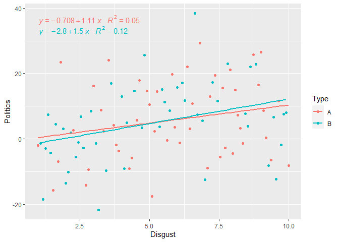
set.seed(16365)
df <- data.frame(Disgust = seq(1, 10, length.out = 100),
                 Politics = seq(1, 10, length.out = 100) + rnorm(100, 0, 11),
                 Type=sample(c("A","B"),100,replace = TRUE))

library(ggplot2)
library(ggpmisc)

ggplot(df, aes(Disgust, Politics,color=Type)) + geom_point()  +
  geom_smooth(method = "lm", se = FALSE) +
  stat_poly_eq(aes(label = paste(..eq.label.., ..rr.label..,
                                 sep = "~~~")))
#> `geom_smooth()` using formula 'y ~ x'

Created on 2022-01-24 by the reprex package (v2.0.1)
This topic was automatically closed 21 days after the last reply. New replies are no longer allowed.
If you have a query related to it or one of the replies, start a new topic and refer back with a link.
