As @FJCC points out, the specific type of diagram in the Sankey style that you are after is uncertain. It will help to reframe the problem analytically: y = f(x) where
- y is an object in
R that describes
- x the data in hand by applying
- f one or more functions
Usually, the best way to proceed is to write an abstact, such as
Urbanization land use dynamics in the Duckhorn province of Freedonia are assessed by examination of land cover (in hectares) surveys conducted at 24-year intervals in the province from 1900
This tells a hypothetical audience, and reminds the analyst, of the purpose of the exercise, describes the data as a time series (also called panel data) and identifies the observation unit as areal extent. Dynamics suggests that state changes may be implicated.
The first step should always be a preliminary exploratory data analysis better to understand what the data, x will bear in terms of the information that can be extracted from it. A homely example is a grocery receipt that names the foods and quantities. Without more, a caloric nutrional description can't be prepared.
For the data provided, consider what can be learned from:
(d <- data.frame(
  year = c(1900, 1924, 1948, 1972, 1996, 2019),
  urban = c(1086, 1142, 1225, 1986, 2794, 3194),
  cropand = c(11088, 11242, 12451, 16278, 16165, 19713),
  pasture = c(1094, 1256, 1460, 3789, 3792, 3823),
  forest = c(24623, 23939, 22430, 20808, 18604, 17742),
  scruband = c(14774, 15091, 15105, 9855, 11350, 8266),
  no.vegetation = c(167, 162, 161, 116, 127, 94),
  water = c(844, 844, 844, 844, 844, 844)
))
#>   year urban cropand pasture forest scruband no.vegetation water
#> 1 1900  1086   11088    1094  24623    14774           167   844
#> 2 1924  1142   11242    1256  23939    15091           162   844
#> 3 1948  1225   12451    1460  22430    15105           161   844
#> 4 1972  1986   16278    3789  20808     9855           116   844
#> 5 1996  2794   16165    3792  18604    11350           127   844
#> 6 2019  3194   19713    3823  17742     8266            94   844

# not a proper time series--just to show relativer trends
plot(ts(d[,2:8], start = 1996, frequency = 1))

(swing = apply(d[,2:8],2,range)[2,] - apply(d[,2:8],2,range)[1,])
#> urban cropand pasture forest scruband
#> 2108 8625 2729 6881 6839
#> no.vegetation water
#> 73 0
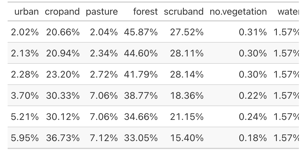
(tab <- prop.table(as.matrix(d[,2:8]), margin = 1))
#> urban cropand pasture forest scruband no.vegetation
#> [1,] 0.02023251 0.2065728 0.02038155 0.4587339 0.2752441 0.003111260
#> [2,] 0.02127580 0.2094418 0.02339966 0.4459908 0.2811499 0.003018109
#> [3,] 0.02282212 0.2319659 0.02720024 0.4178776 0.2814107 0.002999478
#> [4,] 0.03699978 0.3032640 0.07059021 0.3876593 0.1836016 0.002161115
#> [5,] 0.05205306 0.3011588 0.07064610 0.3465981 0.2114539 0.002366048
#> [6,] 0.05950518 0.3672591 0.07122364 0.3305388 0.1539981 0.001751248
#> water
#> [1,] 0.01572397
#> [2,] 0.01572397
#> [3,] 0.01572397
#> [4,] 0.01572397
#> [5,] 0.01572397
#> [6,] 0.01572397
library(gt)
tab |>
as.data.frame() |>
gt() |>
fmt_percent()
(tab / tab[,4]) |> round(x = _,2)
#>      urban cropand pasture forest scruband no.vegetation water
#> [1,]  0.04    0.45    0.04      1     0.60          0.01  0.03
#> [2,]  0.05    0.47    0.05      1     0.63          0.01  0.04
#> [3,]  0.05    0.56    0.07      1     0.67          0.01  0.04
#> [4,]  0.10    0.78    0.18      1     0.47          0.01  0.04
#> [5,]  0.15    0.87    0.20      1     0.61          0.01  0.05
#> [6,]  0.18    1.11    0.22      1     0.47          0.01  0.05
Created on 2023-12-23 with reprex v2.0.2
- Some categories go up, some trend down, some go generally down, back up again and down and one is constant
- Between any two 24 year periods (23-years for the last period), we know only the aggregate change. For example, there is no way of telling whether forested areas changed to urban areas or cropland or both.
- The water category is low-information. Nothing happened in the data, although in the ground truth rivers might have been converted to reservoirs.
- Scrubland may have more of a story than the numbers suggest. Normally we would expect openland, such as pasture or recently cut forest to undergo old field succession, crossing the threshold from open to scrub and then to forest at some level for accessions and undergoing transition to urban, cropland, or pasture for deaccessions. In one year, scrubland increased. This is a category where we particularly want to know the sources of gains and losses.
- The swing or dynamic range of categories can be dived into low medium and high (3-2-2).
- In all years, three categories constitute a supermajority of the raw area. Un-vegetated and water are practically rounding errors. Urban and pasture are minor. Compared to any of the large categories, any plot will be visually unimpressive.
- Forest is always the largest category. Compared to it, only pasture and scrubland will be discernible in displays at page size.
Given the results of the exploratory analysis, how should we think about y? Does a plot convey more information or convey information more easily interpretable as a table of nominal units or proportions?
Finally, what about the initial idea for f that to produce y from x, a Sankey presentation? Is that suitable? Here, looking at what the other kids do may help.
Sankey diagrams are a specific type of flow diagram, in which the thickness of the arrows is shown proportionally to the flow quantity. In this tutorial we'll be using a Sankey diagram to visualize from-to land cover change (emphasis added)
How does your dataset compared to the Las Vegas data used in the tutorial? In years in which more than one category changed in a positive direction and more than one category changed in a negative direction, is there anything to be said where the surplus came from or went?