Hello! I’m new to this so I’m sorry if it’s a bit confusing.
Basically, I have a dataset where I have a ton of variables in a bunch of different columns. To make things easier to explain the only 2 columns I’m currently trying to use are “name” and “mass”. So in mass I have around 100 numbers.
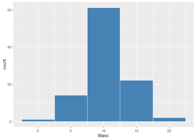
I created a plot on ggplot using name as the x axis and y being mass, and used geom_point so it just shows a point where the mass of each named point is. The problem with this is there are so many points the graph looks terrible. What I want to do is create a bar graph where it says how many points fall in a certain mass. basically it would be like 4 bars and each bars height is based on the amount of points that fall into that mass. so it’s like mass 1-5 is one bar and it’s height based on the amount of named points that have a mass between 1-5, and then the second bar would be 6-10, then 11-15 and so on.
Please let me know if you know how to do this! Thank you!
