Hi there,
I am trying to move everything (X-axis line, text & ticks) to Y = 0 point?
How can I do this?
I used this: geom_hline(yintercept = 0) but I am not that happy with this solution.
Here is the code:
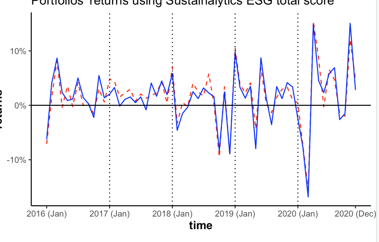
map(2016:2020, ~ make_returns(Data_m2, .x)) %>%
  do.call('rbind', .) %>%
  ggplot(aes(x = year_month, y = mean/100, colour = tercile)) +
  ggplot(aes(x = year_month, y = mean/100, colour = tercile)) +
  geom_line(aes(linetype=tercile))+
  scale_color_manual(name = "tercile", values = c("red", "blue"), labels = c("high CSR portfolio", "low CSR portfolio")) +
  scale_linetype_manual(name = "tercile", values = c("dashed", "solid"), labels = c("high CSR portfolio", "low CSR portfolio")) +
  labs(x = "time", y = "market returns", title = "Portfolios' returns using Sustainalytics ESG total score", font.main=4, font.lab=4) +
  scale_x_date(breaks = as.Date(c("2016-01-31", "2017-01-31", "2018-01-31","2019-01-31", "2020-01-31", "2020-12-31")), date_labels = "%Y (%b)") +
  geom_vline(xintercept = as.Date(c("2017-01-31", "2017-01-31", "2018-01-31","2019-01-31", "2020-01-31")), linetype = 2) +
  scale_y_continuous(labels = scales::percent) +
  geom_hline(yintercept = 0) +
  theme_classic() +
  theme(legend.position="bottom") +
  theme(legend.title=element_blank())
I would like to do something similar to this:
Thanks,
F