I can’t decide which packages to use

Hi all,

I’ve been engaged to write an intermediate statistics book using R, and I’m having a moment of crisis.

I’ve got my own way of doing things in R, and like most of you, they’ve just sort of grown up naturally. Now that I’m putting out something in print regarding stats using R, I feel the need to think and solicit other opinions.

Although this is a book about statistics and not about R, I want to develop good R habits in the reader. But what are they? I’d say R+RStudio is one. Is adding RCommander another?

Should I use base graphics, or ggplot2?

Should I introduce the whole tidyverse, or just pick out parts I need, like, say, the text mining?

There are 400 clustering methods, and I want to do Hierarchical, Kmeans, maybe SOMs...I’ve got a package, but I wonder if there’s one with more support, or a better future? I’ll keep the one I use to myself for now.

I’m asking the same of myself for Discriminant Analysis. And Design of Experiments (including optimal, at least D-optimal). And Neural Nets. And Regression trees. And MDS. And Item Response Theory. MANOVA. And on and on.

So maybe you could do this. If you feel like you have a strong opinion on the tidyverse question for a stat book, please, say it. Same if you do something like one of the topics I mentioned—is there a package you’re devoted to? Or is there a do you think “boy I wish someone had showed me package X when I was starting”?

Clearly, this isn’t a very specific question. And I assume a very very basic level of R knowledge already—maybe they used it in an intro class. No matter how much I learn, there always seem to be others whose brain I want to pick. If you feel you can help, pray do.
You could check what packages datacamp use in their courses, then you can't go too wrong. Check out also Hadley's book R for data science. I wouldn't spend too much time on the IDE, mentioning that R studio is the most popular option and comes bundled with packages and features for visualisations and reports should be enough. Good luck!

1 Like

I would highly recommend ggplot2. It utterly dominates in tutorials, blogs, etc. See here for why the BBC adopted it (sorry for the medium link):

As for tidyverse or not, it's probably the easiest way to learn, but lots of stats material will be written around base. And for performance you should look at data.table.

3 Likes

Are the readers/students assumed to have prior programming knowledge?

My initial idea would be to stick to base R as much as possible, only introducing libraries where they are necessary.

Things like ggplot2 and tidyverse would do well as appendices that are referenced in the main material. So like when talking about making a plot, mention that ggplot2 is an R library with powerful functionality and point the reader to an appendix with a brief introduction (that way those who are interested in furthering their R knowledge have that available, but it's not a requirement).

That being said, using ggplot2 or tidyverse in the main book would not be a bad thing, the most important thing is to be consistent with your context. So if you use ggplot2, make sure all plots are made using it. The worst thing you could do would be to switch back and forth.

2 Likes

My big thought about tidyverse is personally I use ggplot2 and my text mining has always used tidytext.

I also use data.table rather than data.frame, but wonder if my users will be comfortable with it. I mean, I could do a whole book (as most of us could) on “Best Ideas in R analyses as of 2019”, but my directive is to write a statistics book “for people that have a little R experience.” I suppose my problem is defining that last statement, and the embarrassment of riches we have available.

Also: thanks awfully for the Medium article on the BBC. I’m with them—I wouldn’t submit or publish something except from ggplot2. But i wonder if I’ll have to spend too much time explaining what the grammar is, and why aev() is a sensible thing.

If you're teaching statistics, your goal for code should be whatever's easiest to read and understand. Code is the price paid to convey the idea, so be frugal.

I agree with @slacey. Unless you're teaching students how to munge data or create pipelines, you shouldn't need most of the tidyverse. Every time you call library(something), that's one extra thing for readers to keep in mind. Base functions may not be as easy to work with, but that's not the reader's problem. An appendix of "suggested packages and practices" is a good idea.

Also, I personally dislike when authors ignore simple base functionality to push a package. Loading dplyr just to add one column with mutate() is ridiculous.

For ggplot2, it depends on readability. Most of the time, a function from the graphics package is perfectly succinct:

hist(Nile)

But ggplot2 can better express complex plots with multiple aesthetics:

titanic_df <- as.data.frame(Titanic)
ggplot(titanic_df, aes(x = Class, y = Freq, fill = Survived)) +
  geom_col() +
  facet_grid(Sex ~ Age)
4 Likes

Extremely well said, N.

As I sat to plan the book (which, again is intermediate-level, so linear model effect leverage plots, clustering dendrograms, Neural net and CART output, &c. I had gathered a long list of methods and wondered if ggplot2 would make a better choice for those cases. I love ggplot, but its default graphs aren't frightfully special, or any more special than base graphics. More thinking, and I saw all I'd need to discuss ggplot. Lots of base graphics from several platforms, or ggplots that use a bunch of the grammar. I hope I'm communicating my concern. I've written four or five other books, but the software didn't have the wealth of options R has. And teaching through a book is unlike any other teaching methods (which, I think, I've done most of).

Thanks for your input. Makes a lot of sense.

Maybe I should just gather the authors of all the tidyverse things and propose my question to them and see what they'd say. Would @hadley Wickham say ggplot2 in this situation?

So far the response has been great, but it's interesting that there have been people heaviliy ggplot and others heavy base graphics.

I'm used to doing text mining in tidyverse, mostly because I don't do text mining very often. I"m learning more and more about it (and increasing my page count) -- is there a go-to text mining package that someone could suggest for new text miners? I'm going to do some web scraping and, because my MA is in French Lit, we're gonna mine Marcel Proust's seven-volume À la recherche de temps perdu. For what I'm not sure. I do know he died as the last three volumes were being proofed and published, and his brother Robert put the last bit togethet. I should see if I can detect that. He also originally planned the work to be two volumes (what became the first and the last) and maybe their style is somehow different.

I'm rambling again.

Surely it is, if you actually want them to use what you’re teaching.

Absolutely. Since you’re focusing on the modelling side of things, I don’t think you’d need to discuss the visualisations in detail, and you can simply refer the interested reader to detailed coverage elsewhere.

1 Like

Well, see, there's the rub.

I'm a really, really, really big proponent of looking at data graphically. I can't decide if this will be an official or an unofficial theme of the book, but I want them looking at their data first. (I worked for more than a decade on a piece of software named JMP, from SAS, but not a part of The SAS System®. JMP was all about showing a graphic before showing tables and parameters and p-values.)

The graphs-first approach is something I believe in strongly, although figuring out how to teach statistics with R, while asking for graphics first, is a big ask. I mean, in many cases, you've got to run the model before graphics are even available. For the moment, with the book unwritten, I don't care. I'll run the model and show how to get the graph and focus on the graph first. There's gotta be a way.

@hadley: I'm getting diverse opinions on whether I should use data.frame or data.table. tidyverse adds the possibility of tibbles. They all emphasize the row by column flat file nature of data, I just need to figure which would be easiest (and depending on how much tidyverse is used, tibble might be fantastic). I"m leaning toward data.table, since it's derived from data.frame, and anything I show with data.table will immediately transfer to data.frame if need be.

I know that by asking all these questions, I am hoist by my own petard, but IMHO now's the time to wring these ideas out.

Well if you want to take a graphical approach, then I think ggplot2 would be even more important! That would allow you to focus on the important part of visualisation (mapping variables to things you can perceive) rather than the more mechanical drawing lines on paper metaphor of R.

I think you’re drawing a false equivalent between tibble and data.table. data.table is more like tibble + readr + tidyr + dplyr, and favours a somewhat different approach compared to both tidyverse and base R.

2 Likes

Of course @hadley's spot-on about tidyverse's tibble and the data.table package. Occasionally, I go all sixes-and-sevens when rushing my thinking about something important, and my communication suffers. I was simplifying data.table to only a large-data-set version of data.frame. Similarly, I was thinking of tibble in terms of data.frame. When I write fast responses, everyone gets to enjoy my trivial thinking and sloppy syllogisms. A good guy made a case for data.table, so it's part of another decision.

Confession: I'm a bit nervous that my ggplot2 skills aren't good enough to make what I think are essential representations. For example, I've never made a dendrogram using ggplot2. I've never produced a CART tree. I can't remember creating my graphical Factor Analysis and Principal Components summary with ggplot2. Clearly, I've been (lazily?) generating ad-hoc charts, using whatever the package author developed, or by firing up, for example, Tableau or OmniGraffle. Using GoG's approach (even when it's difficult for me) will make the graphical emphasis cohesive. Basically, think about what's best for the reader, not what's easiest for the writer.

I think it's obvious now: my knowledge hole (and associated fear) biases my thoughts about base R and ggplot2. Here is where @hadley's earlier point is informative: I believe in graphics first. I try to convince others to think that way. That means showing graph X, and communicating what makes it the best choice. Showing why graph Y is misleading, hiding something important, showing how to improve it. Ggplot2's graphics language is one more pedagogical tool in my toolbox.

I can hear my editor now: "You're not teaching R, You're teaching statistics." Have I convinced anyone that "Absolutely, I'm teaching statistics" is a reasonable answer to her when using ggplot2?

Using an external software to visualise is a big obstacle to your ideal of visualisations first, see it as an opportunity to improve, it will pay off.

"Mapping variables to things you can perceive", to borrow Hadley's terms, forces you to structure your approach, and makes it easy to switch variables, add/remove some, change geoms, add facets... It's of tremendous help to understand your data. Your editor should understand that you're bringing the student closer to the data by advertising its use.

Now if a package has a nice plot method or plotting functions and plot(fit) gives you 90% of what you'll ever need to see, I don't think it's wise to refuse to use it. This compromise between consistency and convenience is a big part or R too, especially in the exploratory phase, and your students might as well learn it from your book.

I've recently gone through a similar exercise as I am working with Paul Teetor to write the second edition of R Cookbook for O'Reilly. I'll share some of our thinking which may, or may not be helpful:

When I first went through the graphics chapter I refactored every recipe into both a Base R and a ggplot recipe. So for every task I showed two ways. Paul and I sat down after I rewrote the chapter and we hemmed and hawed and finally Paul says something to the effect of "It would annoy me if I had a food cookbook that told me two different ways to do everything. I think a recipe should just have one good way to do everything." I agreed. And we talked through what we would show a new learning who was just getting going and it was clearly ggplot. So I rewrote the chapter as ggplot only. It's a clearer text now. And better for a learner.

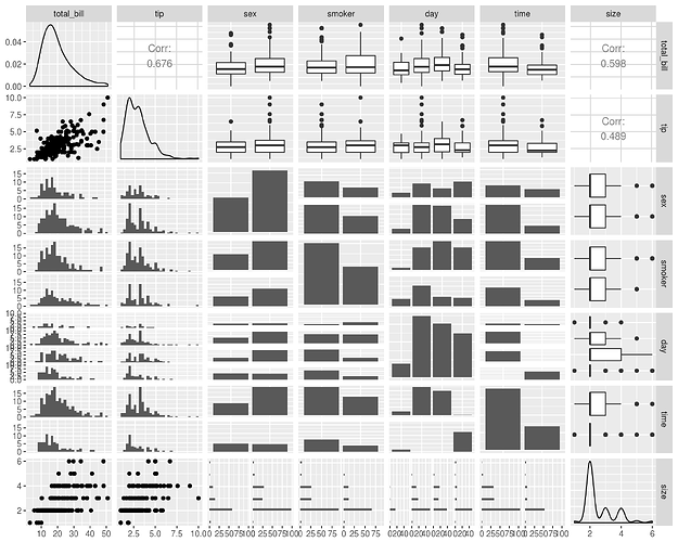
There are clear cases where base graphics give fast, easy, and clear output. The perfect example is plot(df) which shows a great pairs plot. To get that with ggplot I illustrated the GGally package:

But I added a paragraph in the text that just said, "sometimes we find it fast and easy to simply plot(df)". In the long run I think pushing ggplot forward as the first choice is the right thing to teach new users.

If you are illustrating specialized output from different methods, that's a slightly different situation, however. When doing specialized graphics like dendrograms or whatnot, you are sort of beholden to plotting methods that are built into the package or added by others. In those cases, the ability to ggplot the output is just one of many different tradeoffs you should consider when choosing which packages to teach. I'd give that some weight, but certainly not limit myself to only using package that integrate seamlessly with ggplot... although in most cases I run into outside of quant finance the packages do integrate with ggplot well.

One of the side effects of writing a book is it forces us to sharpen our thinking. We go from, "I just do things this way because I learned them this way" to "I think this is the right way for learners to learn things now."

I think this community is a really good place to ask questions like, "If you were teaching kmeans to new learners, which packages would you use? What are the trade offs?" Then you have to parse the comments and weigh those against your objective function as an author. And I think our job as an author is to exercise extreme empathy with the learner and help them learn one good solid method for everything we teach.

And never forget that the best book is a completed book. So don't get too hung up on optimizing that you fail to write the damn thing :slight_smile:

4 Likes

Congratulations!

I'm not sure if it helps trim down the short list too much, but since a book has long shelf life, you should really consider the longevity of your code examples. If a package looks really neat but has only been around for a year and is still under development, you probably shouldn't use it. For example, you probably wouldn't include the vctrs package, even maybe something like rstanarm. But base R and ggplot2 are long-established.

It may even be worth trying out, say, two-year old versions of packages/R/RStudio, just to remind you how things might have changed.

2 Likes

Thanks so much JD. Since this is book № 5 for me, you’d think I’d launch through these initial steps like a rocket. Clearly, not so. Each book is unique.

We’re thinking along the same lines, as well. Glancing at a residuals graph doesn’t require anything fancy, and I’d lose my “Graphics First!” imprimatur if I made everything ggplot2 when plot() would pop out a vanilla black-and-white visualization that does the job. I still like the language of GoG, but there will be exceptions.

If you need another manuscript reader, I’ll brag that I maintained almost 3000 pages of documentation at one time, and can spot errors from across a room.

Merci mille fois!

1 Like

whoa... I do well to maintain 4 or 5 good code comments so I'm very impressed :wink:

One of the reasons I agreed to do this book is to do a deep dive into R. I have a rag-tag group of packages that needs a good refresh. Until now, I picked a method and then went searching for packages, especially graphics that resembled previous software experience. Now I get to pick a philosophy (Grammar of Graphics, for example) knowing it’s made good o de the years and also made well by the team. Both Hadley Wickham and Lee Wilkinson are in my pantheon, and they keep popping up in my career. Twice at Joint Statistical Meetings, I’ve had extended conversations with Lee: one year on Item Response Theory (my dissertation topic) and another year on...Chernoff faces, available in Systat (and nowhere else at the time), where Lee called home for a while.

1 Like

I really like this framing! Obviously, I like it when people use ggplot2 in their books, but I think it's way more important to pick one approach and stick with — it makes it much harder for people to learn when they have to remember two approaches, and then figure out which one makes sense for their new problem.

3 Likes