Hi all
This question is a follow-up of this one:
https://forum.posit.co/t/how-to-let-count-the-checkboxgroup-in-a-cummulativ-manner-in-the-ggplot-on-shiny/151293/4
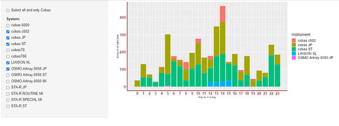
Here I wanted to make ggplot bar plot, when I clicked extra systems, they accumulate on the bar plot, but is it possible to have a stacked effect? Like if I clicked two systems, I can see that the bars are divided in two colors (with own labels), that represents the selected systems?
This is my server chunck:
 #Add the choices to the dropdown menu, those choises are extracted from the file:
    updateCheckboxGroupInput(session, 'system', label = NULL, choices = sort(unique(df1$InstrumentName)),
                             selected = 1, inline = FALSE)

    #create interactive barplot:
    output$barplot3 <- renderPlot({

      if(input$all_cobas == TRUE) {
        update_busy_bar(0)
        df1_filtered <- df1[grep("cobas", df1$InstrumentName), ]
      }
      else {
        df1_filtered <- df1[df1$InstrumentName %in% input$system,]
      }

      #Final amount of data rows/samples:
      output$total_amount_of_samples_system <- renderText({nrow(df1_filtered)})
      output$total_amount_of_samples_system_percentage <- renderText({scales::label_percent(accuracy = 0.01)(nrow(df1_filtered)/nrow(df1))})

      update_busy_bar(33.33)
      #Calculate the amount of Result-samples each hour:
      hours_set <- hms(df1_filtered$ResultTime)
      df2 <- as.data.frame(hours_set$hour)
      df_aggr_Result <- aggregate(df2, by=list(df2$`hours_set$hour`), FUN = length)
      #Renaming the columns:
      names(df_aggr_Result)[names(df_aggr_Result) == "Group.1"] <- "hour"
      names(df_aggr_Result)[names(df_aggr_Result) == "hours_set$hour"] <- "amount of samples"

      update_busy_bar(66.66)
      #Make sure that there are always 24 hours in a dataset, even if there are no counts for that hour:
      all_h <- tibble(hour = 0:23)
      df_plot = merge(x=all_h,y=df_aggr_Result,by="hour",all=TRUE)
      df_plot[is.na(df_plot)] <- 0
      #Create the labels in total amount and percentage:
      df_plot <-
        mutate(df_plot, p = df_plot$`amount of samples`/ sum(df_plot$`amount of samples`),
                p = scales::label_percent(accuracy = 0.01)(p),
                lab = paste(df_plot$`amount of samples`, p, sep = "\n"))

      update_busy_bar(99.99)
      update_busy_bar(100)
      ggplot(df_plot, aes(x = df_plot$hour, y = df_plot$`amount of samples`)) +
        geom_bar(fill = "#0073C2FF", stat = "identity") +
        theme(axis.text.x = element_text(face = "bold", color = "#993333", size = 15),
              axis.text.y = element_text(face = "bold", color = "#993333", size = 15),
              axis.line = element_line(color = "#993333", size = 1)) +
        scale_x_continuous(breaks=seq(0,23,1)) +
        scale_y_continuous(limits = c(0,max(df_plot$`amount of samples`)+(0.1*max(df_plot$`amount of samples`)))) + #Add another 10% of the max to the y-scale to improve visual of the labels.
        xlab("Hours in a day") + ylab("Amount of samples") +
        geom_text(
          label= if_else(df_plot$`amount of samples` > 0, df_plot$lab, ""),
          vjust = 0,
          nudge_y = 0.1,
          check_overlap = F
        )
    })
Thanks in advance!
