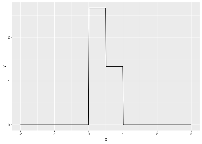
As other have already mentioned, your task involve at least three
steps:
- define a function
f()
- produce a set of paired points with it
(x, y = f(x))
- plot them
For the first step you can use the function case_when() from
the package {dplyr}, and create a standard R function, following
material already suggested, and looking at the internal helpo of R
(i.e., ?case_when)
For the second one you can take advantage from the {tibble} package
(which is loaded by {dplyr}, so you do not need to library() it
explicitely). That is not mandatory, but a tibble has few advantage
against standard data.frames you can explore whats and whys
here
For the third last step, you would love {ggplot2} packages. That
implements the effective “Grammar of graphics” to draw a statistical/
data science graph. At the very first level, you would start from the
data (a tibble); next you would define the link between information
into the data (i.e., column/variable) and information into the plot
(i.e., the so-called aesthetics: x, y, colour, …); and you would
decide how do you what to draw them (i.e. which _geom_etries would
you like to use). That is a very flexible, easy-to-use and
easy-to-learn tools I strongly suggest you to explore.
You can find a great instruments to learn all of this stuff in the
R 4 data science free-online book
(there there is all you need to start effectively to work with data
in R: cap 3: data visualization, cap. 5: data transformation,
cap. 10: tibbles, cap. 19 functions).
Here below, I report to you my purpose to solve you question,
considering all the suggestion you have already obtained by other.
I tried to keep as simple and readable as possible.
library(dplyr)
#>
#> Attaching package: 'dplyr'
#> The following objects are masked from 'package:stats':
#>
#>     filter, lag
#> The following objects are masked from 'package:base':
#>
#>     intersect, setdiff, setequal, union
library(ggplot2)

f <- function(x) {
    case_when(
        (x > 0) & (x < 1/2)  ~ 8/3,
        (x >= 1/2) & (x < 1) ~ 4/3,
        TRUE                 ~ 0 # TRUE at the end means -> "elsewhere"
    )
}

data_to_plot <- tibble(
    x = seq(from = -2, to = 3, length.out = 300), # 300 x points
    y = f(x)
)


ggplot(data = data_to_plot, mapping = aes(x, y)) +
    geom_line()

Created on 2020-09-03 by the reprex package (v0.3.0)
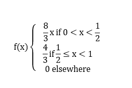
![]() I just began to learn how to use R because of my studies in economy. But I'm facing a "stupid" problem : I don't know how I am supposed to write a function like this :
I just began to learn how to use R because of my studies in economy. But I'm facing a "stupid" problem : I don't know how I am supposed to write a function like this :
![]() thank you in advance !
thank you in advance ! it could be this one or another, I just don't know which command is required to write a function...? I tried to understand on wikipedia but It didn't help much

