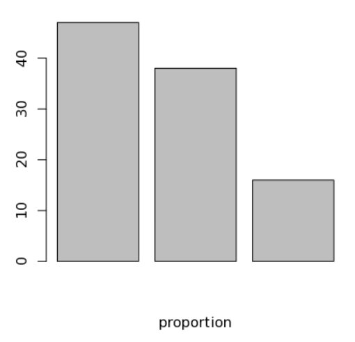
# Simple Bar Plot
library(tidyverse)
counts <- as.data.frame(table(mtcars$gear))
counts %>% mutate(prop_per = round(Freq/sum(Freq),2)*100) -> data
barplot(height = data$prop_per, width = .5, xlab= "proportion")
Above leads to plot as below:
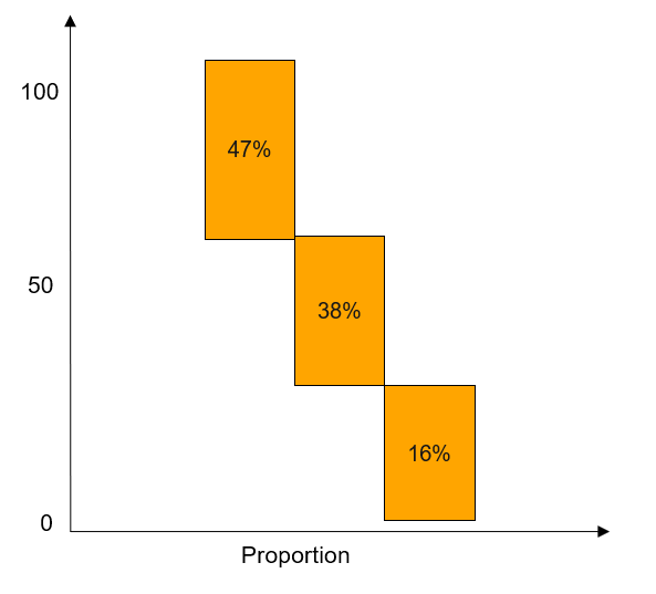
However, can we visualize as below ?
So that progressive decrease can be visible:
1 Like
I think what you are describing is a waterfall chart ?
Perhaps, I did not know the term.
I clicked your link but it seems complicated.
Is there a better and simple way ?
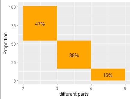
library(tidyverse)
counts <- as.data.frame(table(mtcars$gear))
counts %>% mutate(prop_per = round(Freq/sum(Freq),2)*100) -> data

data <- arrange(data,
                desc(Var1))
data <- mutate(data,
               x_start=as.numeric(as.character(Var1)),
               x_end=as.numeric(as.character(Var1))-1,
               y_start=cumsum(prop_per) - prop_per,
               y_end=cumsum(prop_per),
               proptext = paste0(prop_per,"%"))

ggplot(data=data,
       mapping=aes(xmin=x_start,
                   xmax=x_end,
                   ymin=y_start,
                   ymax=y_end)) +
  geom_rect(fill="orange") +
  geom_text(mapping=aes(x=(x_start+x_end)/2, y=(y_start+y_end)/2,
                        label=proptext)) +
  ylab("Proportion") +
  xlab("different parts")
1 Like
system
Closed
5
This topic was automatically closed 7 days after the last reply. New replies are no longer allowed.