I have a very small dataset that is 3 by 2. There is a column of source names (names), and a column of values (nums). I want to make a column graph that has y limits from 1.85 10^14 to 1.88 10^14. I tried doing so and I can't get it. Here is a screen shot: https://imgur.com/wRbGZG4
Here is my code that worked:
"
ggplot(data=Errors,aes(names, values)) + geom_col()
"
Here is what I want
"
Column graph with the data= errors, x = names, y = values, y limits from 1.85 * 10^14 to 1.88 * 10^14
x title = "Model type", y title = "Squared Error Number"
"
I do not think geom_col takes y limits and you have to scale the data manually as suggested in this stack overflow thread. Here is an example based on that.
library(dplyr)
#>
#> Attaching package: 'dplyr'
#> The following objects are masked from 'package:stats':
#>
#> filter, lag
#> The following objects are masked from 'package:base':
#>
#> intersect, setdiff, setequal, union
library(ggplot2)
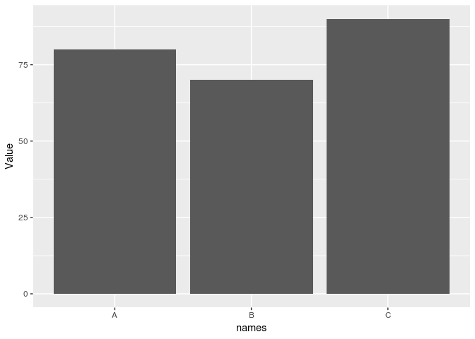
dat <- data.frame(names = c("A", "B", "C"), Value = c(80, 70, 90))
ggplot(dat, aes(x = names, y = Value)) + geom_col()
OFFSET = 60
dat <- dat %>% mutate(ValueOffset = Value - OFFSET)
ggplot(dat, aes(x = names, y = ValueOffset)) + geom_col() +
  scale_y_continuous(labels = function(x) x + OFFSET) +
  labs(x = "Model Type", y = "Squared Error Number")