Hi all,
So I'm doing a Bayesian ecological project regarding Monarch Butterflies in given ecological regions. More specifically, my objective is to build a statistical model for the ecological niche of monarch butterflies and test for local adaptation by ecoregion.
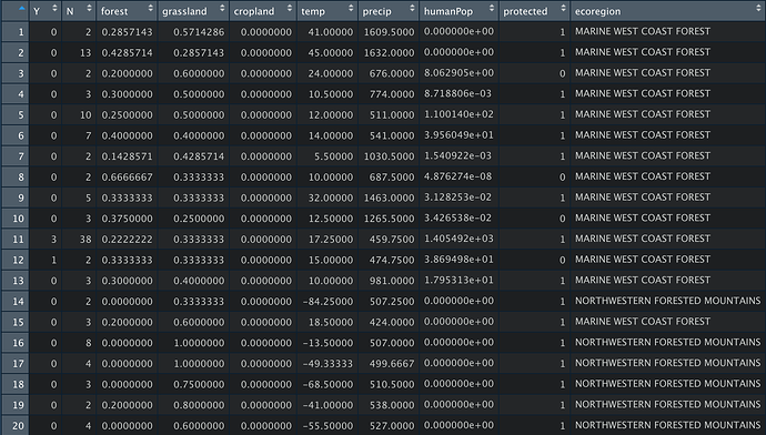
The variables in my data set and of interest are
- Y -- number of Monarch Butterfly reports and goes from 0 to some N.
- N -- the number of surveys submitted
- forest -- the proportion of the region that is forest
- grassland -- the proportion of the region that is grassland
- cropland -- the proportion of the region that is cropland
- temp -- annual average temperature
- precip -- annual average precipitation
- humanPop -- human population density (number of humans per square mile)
- protected -- Indicator of whether the region includes protected lands
- ecoregion -- Either “MARINE WEST COAST FOREST”, “MEDITERRANEAN CALIFORNIA”,“NORTH AMERICAN DESERTS” or “NORTHWESTERN FORESTED MOUNTAINS” (this is imported as a character variable, but of course can easily be converted to a factor variable)
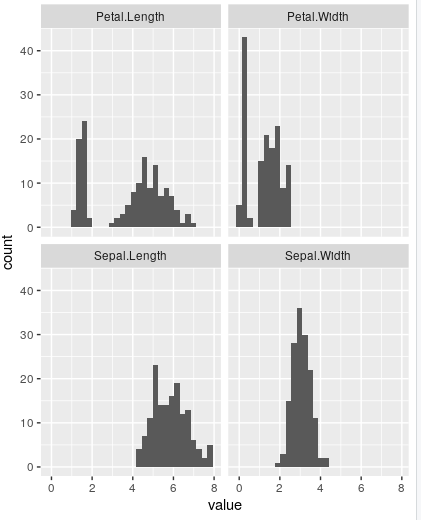
My goal is to create a set of histograms that look at for reach ecoregion, the number of Monarch Butterfly reports (Y) on both protected and not-protected parts of each ecoregion. Ideally, there would also be a kernel or density plot over these histograms too but I'm willing to forgo those if need be.
So specifically, I'd either have 8 total histograms or ideally 4 if I can overlay the protected and non-protected parts, but I'm absolutely willing to have 8 if it's cleaner and easier to do.
I think there is a way to do this in ggplot2 using the facet_wrap() or the facet_grid() command I just can't figure out how to get it working.
If it helps, here's what my data looks like:
Thanks!

