How to specify the numbers on the x scale in gg plot

Hi R community

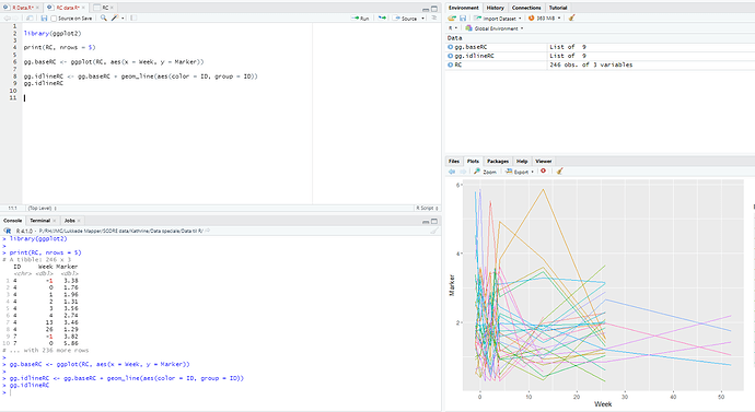
So i have made a ggplot showing my data. The majority of my measurements are in week -1 - 4 .

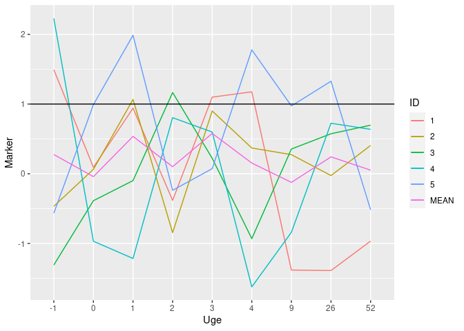
Can i make the graph where I have week -1, 0, 1, 2, 3, 4, 9, 26, 52 on the axis with equal amounts of space in between?

library(ggplot2)

print(RC, nrows = 5)

gg.baseRC <- ggplot(RC, aes(x = Uge, y = Marker))

gg.idlineRC <- gg.baseRC + geom_line(aes(color = ID, group = ID))
gg.idlineRC

Best, Kathrine

I think at the very least we need some sample data. A handy way to supply sample data is to use the dput() function. See ?dput. If you have a very large data set then something like head(dput(myfile), 100) will likely supply enough data for us to work with.

For general info on asking questions FAQ: How to do a minimal reproducible example ( reprex ) for beginners

I use something like the following example:

ggplot(data = my_data, 
       mapping = aes(x = discharge_year, y = n)) +
  geom_col() +
  scale_x_continuous(breaks = seq(2019, 2020, 1),
                     labels = c("2019",
                                "2020"))

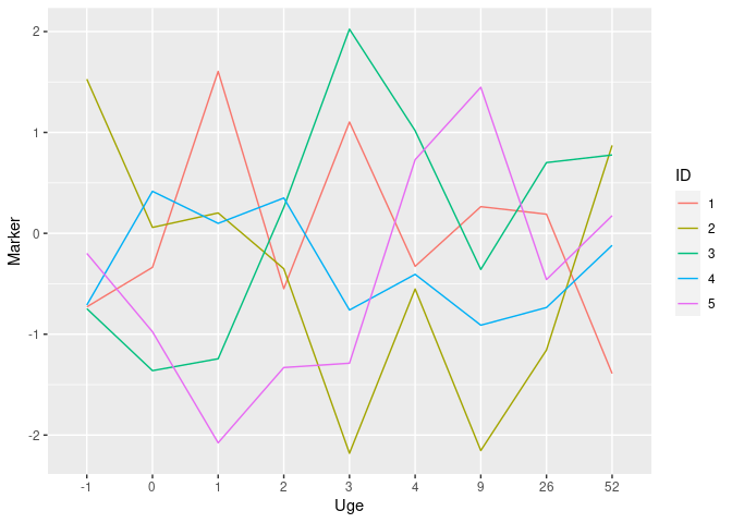
I think you want to use a discrete scale instead of a continuos one, see this example with made up date

library(tidyverse)

# Made up sample data in a copy/paste friendly format
RC <- data.frame(
    ID = rep(1:5, each = 9),
    Uge = rep(c(-1, 0, 1, 2, 3, 4, 9, 26, 52), 5),
    Marker = rnorm(45)
)

RC %>% 
    mutate(Uge = as_factor(Uge),
           ID = as_factor(ID)) %>% 
    ggplot(aes(x = Uge, y = Marker, group = ID, color = ID)) +
    geom_line()

Created on 2022-01-04 by the reprex package (v2.0.1)

If you need more specific help, please provide a proper REPRoducible EXample (reprex) illustrating your issue.

2 Likes

Yes, thank you, this is exactly what I want!

However I cannot figure out excatly how to apply it in my own data. Sorry I'm quite new in R studio.

My R comes out with "there is no package with the name tidyverse" when i try to run that.

And I don't know what %>% means?

This is my data :

structure(list(ID = c(1L, 1L, 1L, 1L, 1L, 1L, 1L, 1L, 1L, 2L, 
2L, 2L, 2L, 2L, 2L, 2L, 2L, 2L, 3L, 3L, 3L, 3L, 3L, 3L, 3L, 3L, 
3L, 4L, 4L, 4L, 4L, 4L, 4L, 4L, 4L, 4L, 5L, 5L, 5L, 5L, 5L, 5L, 
5L, 5L, 5L), Uge = c(-1, 0, 1, 2, 3, 4, 9, 26, 52, -1, 0, 1, 
2, 3, 4, 9, 26, 52, -1, 0, 1, 2, 3, 4, 9, 26, 52, -1, 0, 1, 2, 
3, 4, 9, 26, 52, -1, 0, 1, 2, 3, 4, 9, 26, 52), Marker = c(1.49317219635822, 
0.0916611159641762, 0.941268823167784, -0.381807588400895, 1.09962751780779, 
1.17596635205215, -1.38208894339733, -1.38888099157029, -0.966244942007395, 
-0.466929046204789, 0.0640663352278284, 1.06611365130939, -0.844138650646416, 
0.900307323227993, 0.369449030071903, 0.274034810149046, -0.0258490253601516, 
0.405927991645641, -1.30927075097787, -0.386440400472932, -0.0981381494402249, 
1.16579738644278, 0.222056225470917, -0.930999789253199, 0.355045225362826, 
0.574226360704632, 0.697146373838426, 2.22858397709099, -0.968770695064989, 
-1.21579333984626, 0.804869447819184, 0.598165314852854, -1.62324550653304, 
-0.840086985535465, 0.724722172063413, 0.637094967990687, -0.565666372808534, 
0.992345794114647, 1.98738245709519, -0.237507530574096, 0.0734188774509593, 
1.77783312631777, 0.973549221953173, 1.32779192474376, -0.516324049268455
)), class = "data.frame", row.names = c(NA, -45L))
tidyverse is an R package that you will need to install.

install.packages("tidyverse")

%>% is a pipe command. Using @ andresrcs example

RC %>% 
    mutate(Uge = as_factor(Uge),
           ID = as_factor(ID))

can be read as: Use the RC data.frame and apply this mutate operation to it. Then the the next %>% says go on to the next operation and so on....

See https://www.datacamp.com/community/tutorials/pipe-r-tutorial

1 Like

Thank you!
It makes sense now.

However when I set Uge as a Factor, I can no longer make a mean graph in the same plot for Uge, since this i now a factor.

Is there another way the alter the graph without making Uge a factor??

Best, Kathrine

You can set Uge as factor at the geom level, that way it will not affect other calculations or geoms

geom_line(aes(x = as_factor(Uge) )

But I suspect your problem actually is mixing a continuous and a discreet scale for the same axis which might not be possible, can you show your code?

Yes of course, my code looks like this:


# longitudinal display for each patient 

gg.baseRC <- ggplot(RC, aes(x = Uge, y = Marker))

gg.idlineRC <- gg.baseRC + geom_line(aes(color = ID, group = ID))
gg.idlineRC + geom_hline(yintercept=0,23) + geom_hline(yintercept=1)

dput(RC)

#same but with mean value 
gg.idline + stat_summary(aes(color = paste("MEAN")), geom = "line", fun = mean, size =3)+ 
  geom_hline(yintercept=1)

# Only mean 
gg.base + stat_summary(geom = "line", fun = mean, size = 3, col = "red")

Sorry but your code is hard to read for me, it is not clear what your desired plot should looks like, is it something like this?

library(tidyverse)

# Sample data
RC <- data.frame(
          ID = c(1L,1L,1L,1L,1L,1L,1L,1L,1L,2L,2L,
                 2L,2L,2L,2L,2L,2L,2L,3L,3L,3L,3L,3L,3L,3L,3L,3L,
                 4L,4L,4L,4L,4L,4L,4L,4L,4L,5L,5L,5L,5L,5L,5L,
                 5L,5L,5L),
         Uge = c(-1,0,1,2,3,4,9,26,52,-1,0,1,2,
                 3,4,9,26,52,-1,0,1,2,3,4,9,26,52,-1,0,1,2,3,
                 4,9,26,52,-1,0,1,2,3,4,9,26,52),
      Marker = c(1.49317219635822,0.0916611159641762,
                 0.941268823167784,-0.381807588400895,1.09962751780779,
                 1.17596635205215,-1.38208894339733,-1.38888099157029,-0.966244942007395,
                 -0.466929046204789,0.0640663352278284,1.06611365130939,
                 -0.844138650646416,0.900307323227993,0.369449030071903,
                 0.274034810149046,-0.0258490253601516,0.405927991645641,
                 -1.30927075097787,-0.386440400472932,-0.0981381494402249,
                 1.16579738644278,0.222056225470917,-0.930999789253199,0.355045225362826,
                 0.574226360704632,0.697146373838426,2.22858397709099,
                 -0.968770695064989,-1.21579333984626,0.804869447819184,
                 0.598165314852854,-1.62324550653304,-0.840086985535465,0.724722172063413,
                 0.637094967990687,-0.565666372808534,0.992345794114647,
                 1.98738245709519,-0.237507530574096,0.0734188774509593,
                 1.77783312631777,0.973549221953173,1.32779192474376,-0.516324049268455)
)

RC %>% 
    mutate(Uge = as_factor(Uge),
           ID = as_factor(ID)) %>% 
    ggplot(aes(x = Uge, y = Marker, color = ID, group = ID)) +
    geom_line() +
    stat_summary(aes(color = "MEAN", group = 1), geom = "line", fun = mean) +
    geom_hline(yintercept = 1)

Created on 2022-01-06 by the reprex package (v2.0.1)

2 Likes

Amazing, this is perfect. Thank you so much for all your help!

Re pipes
https://www.renemagritte.org/the-treachery-of-images.jsp

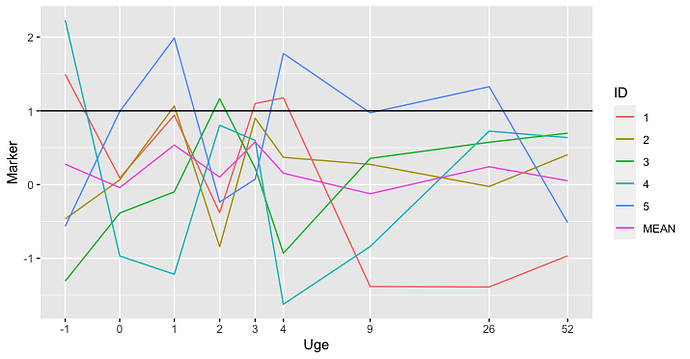
I like @andresrcs's solution. Another variation of that you might consider would be to use a transformation of the x axis like scales::pseudo_log_trans. It helps if you want to provide a sort of "fish-eye lens" distortion of the axis to give more detail around the origin, while including farther-out data too. In this case, the uneven spacing might be more confusing than clarifying, though.


RC %>% 
  mutate(Uge = Uge,
         ID = as_factor(ID)) %>% 
  ggplot(aes(x = Uge, y = Marker, color = ID, group = ID)) +
  geom_line() +
  stat_summary(aes(color = "MEAN", group = 1), geom = "line", fun = mean) +
  geom_hline(yintercept = 1) +
  scale_x_continuous(trans = scales::pseudo_log_trans(sigma = 1),
                     breaks = c(-1, 0, 1, 2, 3, 4, 9, 26, 52))

This topic was automatically closed 21 days after the last reply. New replies are no longer allowed.

If you have a query related to it or one of the replies, start a new topic and refer back with a link.