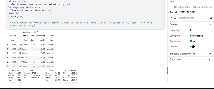
I was working with the Indian Premier League dataset on Kaggle. The d1 dataset is shown in the picture below.
Then i went to draw plot using ggplot.
library(ggplot2)
d1 %>% ggplot(mapping = aes(x = runs ,y = strikeRate)) +
geom_point(aes(size = strikeRate, color = strikeRate)) +
labs(
    title = "Runs made with respective strikerates",
    x = "Runs",
    y = "Strike rate",
    caption = 'Data Source credit : https://www.espncricinfo.com/'
  )
Then the plot appeared. But i also wanted to show the average strikeRate line in the plot. Please guide me how to do that.
Thanks a lot.
