shaggy
November 8, 2021, 4:19am
1
library(tidyverse)
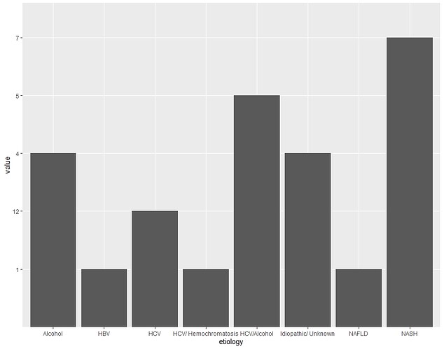
etiology <- rep(x = c("HCV","HCV/Alcohol","HCV/ Hemochromatosis","Alcohol","HBV","NAFLD","NASH","Idiopathic/ Unknown"))
value <- (x = c("12","5","1","4","1","1","7","4"))
data <- data.frame(etiology,value)
ggplot(data,aes(x=etiology, y=value))+ geom_bar(stat="identity", position = "dodge")
I want to create a plot but the y-axis just assigns the value as defined in y. I want to include the range in y-axis, say from 1:12 and then plot accordingly. Can you please help me with this?
Is this what you required?
library(tidyverse)

etiology <- rep(x = c("HCV","HCV/Alcohol","HCV/ Hemochromatosis","Alcohol","HBV","NAFLD","NASH","Idiopathic/ Unknown"))

value <- as.numeric((x = c("12","5","1","4","1","1","7","4")))

data <- data.frame(etiology,value)

ggplot(data,aes(x=etiology, y=value))+ geom_bar(stat="identity", position = "dodge")
Although I am not sure why you would define "value" that way. I would have used:
value <- c(12,5,1,4,1,1,7,4)
...which is much simpler.
Stephen
2 Likes
shaggy
November 8, 2021, 2:32pm
3
Thank you @mcneills Yes, this is exactly what I was trying to figure out. Also, yes I will use the simpler version as you suggested. Thanks, again.
Shakthi
1 Like
system
November 15, 2021, 2:33pm
4
This topic was automatically closed 7 days after the last reply. New replies are no longer allowed.
