dput(head(new_df))
structure(list(schedtime = structure(c(53700, 60000, 45900, 62100,
38340, 31200), class = c("hms", "difftime"), units = "secs"),
carrier = c("OH", "DH", "DH", "DH", "DH", "DH"), deptime = structure(c(53700,
60000, 45900, 61740, 38100, 31140), class = c("hms", "difftime"
), units = "secs"), dest = c("JFK", "JFK", "LGA", "LGA",
"LGA", "JFK"), distance = c(184, 213, 229, 229, 229, 228),
date = structure(c(12418, 12418, 12418, 12418, 12418, 12418
), class = "Date"), flightnumber = c(5935, 6155, 7208, 7215,
7792, 7800), origin = c("BWI", "DCA", "IAD", "IAD", "IAD",
"IAD"), weather = c(0, 0, 0, 0, 0, 0), dayweek = c(4, 4,
4, 4, 4, 4), daymonth = c(1, 1, 1, 1, 1, 1), tailnu = c("N940CA",
"N405FJ", "N695BR", "N662BR", "N698BR", "N687BR"), status = c("ontime",
"ontime", "ontime", "ontime", "ontime", "ontime"), time_difference = structure(c(0,
0, 0, -6, -4, -1), class = "difftime", units = "mins")), row.names = c(NA,
-6L), class = c("tbl_df", "tbl", "data.frame"))glimplse(new_df)
Error in glimplse(new_df) : could not find function "glimplse"
glimpse(new_df)
Rows: 2,201
Columns: 14
schedtime <time> 14:55:00, 16:40:00, 12:45:00, 17:15:00, 10:39:00, 08:40:00, 1… carrier "OH", "DH", "DH", "DH", "DH", "DH", "DH", "DH", "DH", "DH", "D…
deptime <time> 14:55:00, 16:40:00, 12:45:00, 17:09:00, 10:35:00, 08:39:00, 1… dest "JFK", "JFK", "LGA", "LGA", "LGA", "JFK", "JFK", "JFK", "JFK",…
distance <dbl> 184, 213, 229, 229, 229, 228, 228, 228, 228, 228, 229, 213, 21… date 2004-01-01, 2004-01-01, 2004-01-01, 2004-01-01, 2004-01-01, 2…
flightnumber <dbl> 5935, 6155, 7208, 7215, 7792, 7800, 7806, 7810, 7812, 7814, 79… origin "BWI", "DCA", "IAD", "IAD", "IAD", "IAD", "IAD", "IAD", "IAD",…
weather <dbl> 0, 0, 0, 0, 0, 0, 0, 0, 0, 0, 0, 0, 0, 0, 0, 0, 0, 0, 0, 0, 0,… dayweek 4, 4, 4, 4, 4, 4, 4, 4, 4, 4, 4, 4, 4, 4, 4, 4, 4, 4, 4, 4, 4,…
daymonth <dbl> 1, 1, 1, 1, 1, 1, 1, 1, 1, 1, 1, 1, 1, 1, 1, 1, 1, 1, 1, 1, 1,… tailnu "N940CA", "N405FJ", "N695BR", "N662BR", "N698BR", "N687BR", "N…
status <chr> "ontime", "ontime", "ontime", "ontime", "ontime", "ontime", "o… time_difference 0 mins, 0 mins, 0 mins, -6 mins, -4 mins, -1 mins, 3 mins, -1…
I need to do scatter plot for flights on time and delayed
I have created a new data frame
flight_status_df <-data.frame(new_df$time_difference,new_df$status)
I have used the filter() function on the status column
flight_status_df1 <- flight_status_df %>% filter(new_df.status %in% c("ontime"))
flight_status_df2 <- flight_status_df %>% filter(new_df.status %in% c("delayed"))
Code for the scatterplot
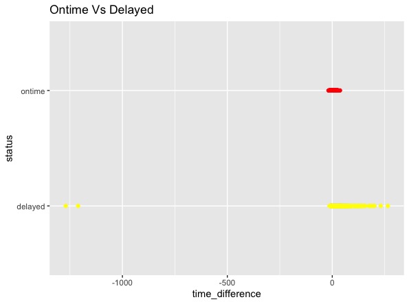
ggplot() +
-
geom_point(data=flight_status_df1, aes(x=time_difference, y=status), color='red') + -
geom_point(data=flight_status_df2, aes(x=time_difference, y=status), color='yellow') + labs(title = "Ontime Vs Delayed")
I want to deliver a better scatterplot graph to guide me. I know we can you bins here. what are other ways to do it?