Hello, I am trying to separate labels from overlaying each other and want to improve aesthetics of plot bit. If someone can please help me?
#read data
library(ggplot2)
#> Warning: package 'ggplot2' was built under R version 3.5.3
library(reprex)
#> Warning: package 'reprex' was built under R version 3.5.3
library(tidyverse)
#> Warning: package 'tidyverse' was built under R version 3.5.3
#> Warning: package 'tibble' was built under R version 3.5.3
#> Warning: package 'tidyr' was built under R version 3.5.3
#> Warning: package 'purrr' was built under R version 3.5.3
#> Warning: package 'dplyr' was built under R version 3.5.3
#> Warning: package 'stringr' was built under R version 3.5.3
library(reshape2)
#> Warning: package 'reshape2' was built under R version 3.5.3
#>
#> Attaching package: 'reshape2'
#> The following object is masked from 'package:tidyr':
#>
#>     smiths
mydata <-read.table("F:/Chapter2_Figures/CATAFileForR.csv", header = T, sep = ",")

#High resolution tiff image
tiff(file = "MDS.tiff", width = 4000, height = 4000, units = "px", res = 800)
#MDS for CATA code
mds <- cmdscale(1-cor(mydata[, -c(1:2,20)], use = "complete.obs"))
plot(mds, xlab = "Component 1", ylab = "Component 2", type="p", asp=1.2)
text(mds, col = "magenta", cex = 0.75, rownames(mds))
dev.off()
#> png
#>   2
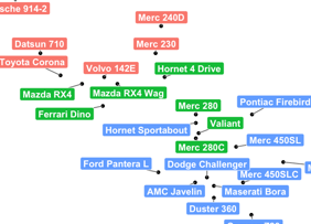
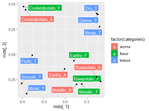
Thanks @jupev for the help, it worked. Can I also change the font of labels and color them into 3 categories, like I have some aroma (suffix _A), flavor (suffix _F) and texture (_T) variables so I was thinking to put them into different color background, like this picture had. Please let me know. Thanks a lot!
I don't have your data so I fabricate some points that are close to each other:
ggplot has lots of awesome options but it can be a pain in the a** to get everything right
I find this page very helpful:
and google 'ggplot cheat sheet'
# fabricated some data
mds_a <- cmdscale(1-cor(iris[, -5], use = "complete.obs"))
mds_b <- mds_a +0.0001
rownames(mds_b) <- paste0(rownames(mds_a),"2")

mds <- rbind(mds_a,mds_b)

# put these in the right order for your data  (or you can automate it for large numbers)
categories <- c("aroma","aroma","aroma","flavor","flavor","flavor","texture","texture")

# add this column to your dataframe
mds<- cbind(mds, categories)

ggplot(
  # define data
  data = as.data.frame(mds),
  # define what to plot
  aes(x =mds[,1], y = mds[,2])
) +
  # find other themes on ggplot documentation pages
  theme_bw() +
  # add labels that don't overlap
  geom_label_repel(
    # define esthetics for labels
    aes(label =  rownames(mds), # text on label
        fill = factor(categories) # on what column the background color for label is dependant
    ),
    color = 'white', # text color on label
    box.padding = unit(0.45, "lines"), # how far box is away from point + "lines" means connect a line between point and label
    segment.color = 'grey50' # color of said line
  ) +
  geom_point()
sorry if I overcommented the code, but I thought, better too much than too little
I got the graph, thanks @jupev. Can I also change the font type and font size, like Calibri. I also want to rename axis as Component 1 and Component 2. And can I remove "a" in the legend boxes..
That should be possible, but I don't know by heart how to do it. I'm sure you can find it if you google it and check the ggplot documentation. Good luck!