How to remove NA form the legend?

Hi all

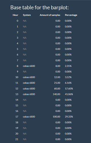
I am making a plot that represents the total amount of samples of each machine over 24 hours. You can choose your systems via a checkbos group.

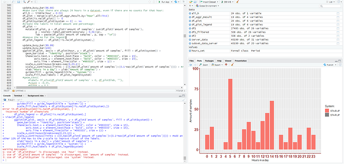
I want to give different colors to the different machines. But a some hours, there are no samples don an thus 0 in the input dataframe for the ggplot. This 0 come in the legend, but I want to get rid of it. I already changed it to NA, it remains in the plot. I made an extra dataframe for the legend, and removed the NA, but then I shows the one selected machine twice.

Here is my code for the plot (especially the last chunk is used for the plot):

 #Calculate the amount of Result-samples each hour:
      hours_set <- hms(df1_filtered$ResultTime)
      df2 <- as.data.frame(hours_set$hour)
      df2["system"] <- df1_filtered$InstrumentName
      df_aggr_Result <- aggregate(df2, by=list(df2$`hours_set$hour`, df2$system), FUN = length)
      #Renaming the columns:
      names(df_aggr_Result)[names(df_aggr_Result) == "Group.1"] <- "hour"
      names(df_aggr_Result)[names(df_aggr_Result) == "hours_set$hour"] <- "amount of samples"
      names(df_aggr_Result)[names(df_aggr_Result) == "Group.2"] <- "system"
      
      update_busy_bar(66.66)  
      #Make sure that there are always 24 hours in a dataset, even if there are no counts for that hour:
      all_h <- tibble(hour = 0:23)
      df_plot = merge(x=all_h,y=df_aggr_Result,by="hour",all=TRUE)
      df_plot[is.na(df_plot)] <- 0
      df_plot$system[df_plot$system == 0] <- NA
      #Create the labels in total amount and percentage:
      df_plot <-
        mutate(df_plot, p = df_plot$`amount of samples`/ sum(df_plot$`amount of samples`),
               p = scales::label_percent(accuracy = 0.01)(p),
               lab = paste(df_plot$`amount of samples`, p, sep = "\n"))
      #Remove the NA for the legend:
      df_plot_legend <- df_plot[!is.na(df_plot$system),]
      
      update_busy_bar(99.99)
      update_busy_bar(100)
      ggplot(df_plot, aes(x = df_plot$hour, y = df_plot$`amount of samples`, fill = df_plot$system)) +
        geom_bar(stat = "identity", position="stack") +
        theme(axis.text.x = element_text(face = "bold", color = "#993333", size = 15),
              axis.text.y = element_text(face = "bold", color = "#993333", size = 15),
              axis.line = element_line(color = "#993333", size = 1)) +
        scale_x_continuous(breaks=seq(0,23,1)) +
        scale_y_continuous(limits = c(0,max(df_plot$`amount of samples`)+(0.1*max(df_plot$`amount of samples`)))) + #Add another 10% of the max to the y-scale to improve visual of the labels.
        xlab("Hours in a day") + ylab("Amount of samples") +
        guides(fill = guide_legend(title = "System:")) +
        scale_fill_hue(labels = df_plot_legend$system)
      #geom_text(
          #label= if_else(df_plot$`amount of samples` > 0, df_plot$lab, ""), 
          #vjust = -0.25,
          #nudge_y = 0.1, 
          #check_overlap = F
        #)
    })    

How can I remove it? I already look on the internet, but it don't seems to work out for me.

Thanks in advance!
filter your data.frame so it doesnt include entries with amount of samples of zero ?
This is a tentative suggestion, as you have not provided a reprex

Take a look: How to remove NA (data with missing values) in geom_col? - #2 by Flm

The easiest way is to change the first line ggplot(df_plot, aes(...)) into

df_plot %>%
  drop_na() %>%
  ggplot(aes(x = df_plot$hour, y = df_plot$`amount of samples`, fill = df_plot$system)) +

Both don't seems to work. The plot is based on this table and as long it contains "NA", NA will be in the legend. Is there a work-around?

Thank you!

Can you provide part of your df using this command: dput(head(YOURDF, 20))?


EDIT:
oh, I think this should solve the problem:

df_plot %>%
  drop_na() %>%
  ggplot(aes(x = hour, y = `amount of samples`, fill = system)) +

Because now it is in a pipeline df_plot$ have to be removed. Remove it also in scale_y_continuous, scale_fill_hue etc...

Hi all

That did the trick. It worked! Thank you!

This is my final code:


      #Calculate the amount of Result-samples each hour:
      hours_set <- hms(df1_filtered$ResultTime)
      df2 <- as.data.frame(hours_set$hour)
      df2["system"] <- df1_filtered$InstrumentName
      df_aggr_Result <- aggregate(df2, by=list(df2$`hours_set$hour`, df2$system), FUN = length)
      #Renaming the columns:
      names(df_aggr_Result)[names(df_aggr_Result) == "Group.1"] <- "hour"
      names(df_aggr_Result)[names(df_aggr_Result) == "hours_set$hour"] <- "amount of samples"
      names(df_aggr_Result)[names(df_aggr_Result) == "Group.2"] <- "system"
      
      update_busy_bar(66.66)  
      #Make sure that there are always 24 hours in a dataset, even if there are no counts for that hour:
      all_h <- tibble(hour = 0:23)
      df_plot = merge(x=all_h,y=df_aggr_Result,by="hour",all=TRUE)
      df_plot[is.na(df_plot)] <- 0
      df_plot$system[df_plot$system == 0] <- NA
      #Create the labels in total amount and percentage:
      df_plot <-
        mutate(df_plot, p = df_plot$`amount of samples`/ sum(df_plot$`amount of samples`),
               p = scales::label_percent(accuracy = 0.01)(p))
      
      
      output$labels_system1 <- renderTable({
        df_plot_table <- data.frame(select(df_plot, -system.1))
        #df_plot_table <-setNames(df_plot_table, rep(" ", length(df_plot_trans)))
        colnames(df_plot_table) <- c("Hour","System","Amount of samples","Percentage")
        df_plot_table
      }, rownames = FALSE)
      
      update_busy_bar(99.99)
      update_busy_bar(100)
      df_plot %>%
        drop_na() %>%
        ggplot(aes(x = hour, y = `amount of samples`, fill = system)) +
        geom_bar(stat = "identity", position="stack") +
        theme(axis.text.x = element_text(face = "bold", color = "#993333", size = 15),
              axis.text.y = element_text(face = "bold", color = "#993333", size = 15),
              axis.line = element_line(color = "#993333", size = 1)) +
        scale_x_continuous(breaks=seq(0,23,1)) +
        scale_y_continuous(limits = c(0,max(df_plot$`amount of samples`)+(0.1*max(df_plot$`amount of samples`)))) + #Add another 10% of the max to the y-scale to improve visual of the labels.
        xlab("Hours in a day") + ylab("Amount of samples") +
        guides(fill = guide_legend(title = "System:"))
    })  

This topic was automatically closed 7 days after the last reply. New replies are no longer allowed.

If you have a query related to it or one of the replies, start a new topic and refer back with a link.