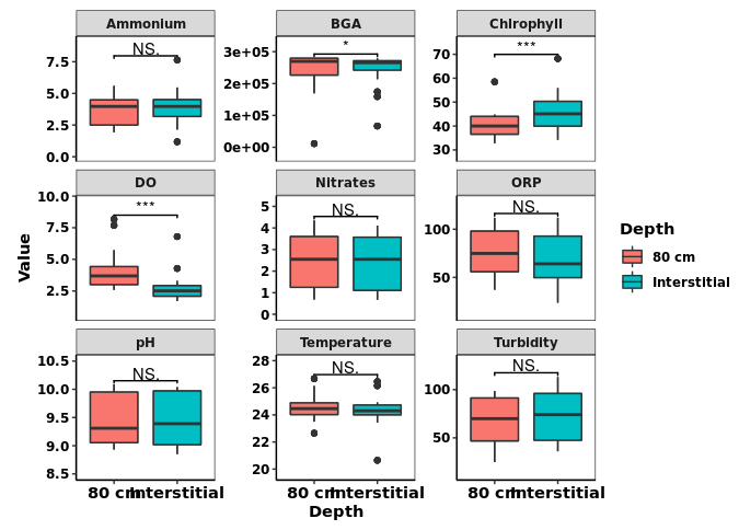
Hi! I am a beginner in RStudio, and I don't know how to do complex plotting. I would like to make the boxplot the same in this photo. I don't want to manually input all the data. I want to upload it to RStudio as a file.
Groups
Temperature
Humidity
NH3
CO2
Dust
Control
24.5
71
5
836.37
37
Control
24.5
62
5
843.00
15
Control
24.5
68
0
860.22
18
Control
24.5
74
0
874.47
37
Control
24.5
75
5
854.26
21
Control
24.5
78
0
856.67
24
Control
24.5
79
0
885.11
45
Control
24.5
81
5
861.77
17
Control
24.5
81
5
845.24
43
Control
24.5
80
5
876.35
17
Control
24.5
80
1
869.74
26
Control
24.5
78
2
922.25
32
Control
24.5
78
5
907.81
77
Control
24.5
75
2
914.46
26
Control
24.5
78
2
888.16
43
Control
25
77
5
858.79
46
Control
25
77
4
884.28
54
Control
24.5
76
0
888.59
18
Control
24.5
79
0
894.50
74
Control
24.5
77
0
889.48
16
Control
25
77
6
918.86
41
Control
25
77
5
946.65
17
Control
25
79
5
962.78
14
Control
25.5
81
0
1006.41
11
Control
25.5
79
0
1003.43
35
Control
25
79
0
993.75
47
Control
25.5
79
4
1058.68
40
Control
25.5
80
10
963.79
5
Treatment
28
73
20
1366.64
41
Treatment
27.5
73
15
1378.89
30
Treatment
27.5
74
20
1430.82
35
Treatment
28.5
75
20
1496.02
45
Treatment
28.5
74
17
1416.31
24
Treatment
28.5
75
22
1441.09
32
Treatment
29
76
20
1487.65
58
Treatment
29.5
76
10
1505.16
26
Treatment
29.5
75
17
1488.01
56
Treatment
30
77
15
1575.61
19
Treatment
30
78
15
1537.48
39
Treatment
29.5
78
13
1560.28
34
Treatment
30
78
25
1586.12
74
Treatment
30
76
25
1519.39
40
Treatment
30
76
23
1523.35
55
Treatment
30.5
77
25
1537.46
54
Treatment
30.5
79
22
1616.99
63
Treatment
30.5
79
18
1636.41
48
Treatment
30.5
81
19
1677.99
89
Treatment
30.5
79
20
1592.36
19
Treatment
30.5
80
25
1653.60
47
Treatment
31
82
15
1763.91
24
Treatment
31
84
20
1875.77
20
Treatment
32
87
25
1940.81
16
Treatment
32
86
30
1869.95
40
Treatment
32
88
20
1857.33
56
Treatment
32.5
86
25
1985.47
58
Treatment
32
90
23
1505.03
17
Thank you for your help!
FJCC
July 15, 2023, 2:35am
2
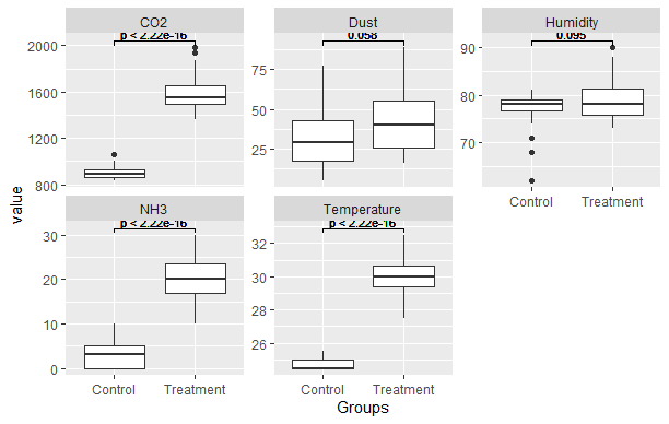
You can do this sort of thing with the ggsignif package.
library(ggplot2)
library(tidyr)
library(ggsignif)
DF <- read.csv("~/R/Play/Dummy.csv")
DFlng <- DF |> pivot_longer(cols = -Groups, names_to = "Param")
ggplot(DFlng, aes(x = Groups, y = value)) + geom_boxplot() +
  facet_wrap(~Param, scales = "free_y") +
  geom_signif(comparisons = list(c("Control", "Treatment"),
                                 c("Control", "Treatment"),
                                 c("Control", "Treatment"),
                                 c("Control", "Treatment"),
                                 c("Control", "Treatment")),
              test = "t.test", textsize = 3)
Created on 2023-07-14 with reprex v2.0.2
FJCC:
DFlng <- DF |> pivot_longer(cols = -Groups, names_to = "Param")
ggplot(DFlng, aes(x = Groups, y = value)) + geom_boxplot() +
  facet_wrap(~Param, scales = "free_y") +
  geom_signif(comparisons = list(c("Control", "Treatment"),
                                 c("Control", "Treatment"),
                                 c("Control", "Treatment"),
                                 c("Control", "Treatment"),
                                 c("Control", "Treatment")),
              test = "t.test", textsize = 3)
Also, I want to add color to the box to distinguish the groups.
FJCC
July 15, 2023, 3:58am
5
You can adjust the spacing below and above the plotted data by adjusting the first and second values in expand = expansion(mult = c(0.05,0.1)). By adjusting that and the textsize argument, you can make the display of the p values pretty. I believe 0.05 is the default value for both bottom and top spacing.fill = Groups colors the interior of the boxes.theme_bw() sets a white background.
ggplot(DFlng, aes(x = Groups, y = value, fill = Groups)) + geom_boxplot() +
  facet_wrap(~Param, scales = "free_y") +
  geom_signif(comparisons = list(c("Control", "Treatment"),
                                 c("Control", "Treatment"),
                                 c("Control", "Treatment"),
                                 c("Control", "Treatment"),
                                 c("Control", "Treatment")),
              test = "t.test", textsize = 3) +
  scale_y_continuous(expand = expansion(mult = c(0.05,0.1))) +
  theme_bw()
FJCC:
ggplot(DFlng, aes(x = Groups, y = value, fill = Groups)) + geom_boxplot() +
  facet_wrap(~Param, scales = "free_y") +
  geom_signif(comparisons = list(c("Control", "Treatment"),
                                 c("Control", "Treatment"),
                                 c("Control", "Treatment"),
                                 c("Control", "Treatment"),
                                 c("Control", "Treatment")),
              test = "t.test", textsize = 3) +
  scale_y_continuous(expand = expansion(mult = c(0.05,0.1)))
Thank you very much for your time in helping me. I appreciate it so much.
system
July 22, 2023, 8:09am
7
This topic was automatically closed 7 days after the last reply. New replies are no longer allowed.