How to put all the time in the x axis in ggplot2

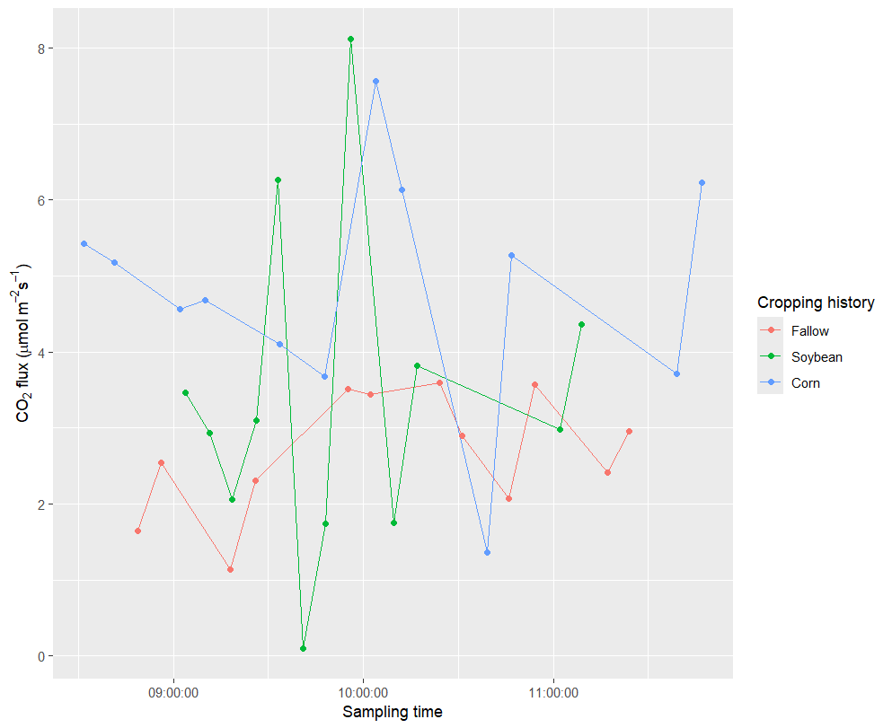
Please considering this plot, where I am using the hms package to convert the time to actual time. how can I show all the time point in this plot using ggplot2 ?. Also I need the errorbar to appear in each point?
Thank you very much for the help.

library(tidyverse)
library(hms)

Data

dat2 <- structure(
list(
Cropping history = structure(
c(
3L,
3L,
1L,
1L,
2L,
2L,
2L,
2L,
3L,
3L,
1L,
1L,
2L,
2L,
1L,
1L,
3L,
3L,
3L,
3L,
1L,
1L,
2L,
2L,
2L,
2L,
3L,
3L,
1L,
1L,
2L,
2L,
1L,
1L,
3L,
3L
),
levels = c("Fallow", "Soybean", "Corn"),
class = "factor"
),
[YYYY-MM-DD HH:MM:SS] = structure(
c(
1746435720,
1746436200,
1746436680,
1746437160,
1746437580,
1746438060,
1746438480,
1746438960,
1746439440,
1746439920,
1746441960,
1746442440,
1746442920,
1746443340,
1746443820,
1746444240,
1746445140,
1746445620,
1747297902,
1747298477,
1747298923,
1747299366,
1747299827,
1747300281,
1747300719,
1747301164,
1747301609,
1747302462,
1747302910,
1747303338,
1747303780,
1747304220,
1747304649,
1747305075,
1747305538,
1747305999
),
class = c("POSIXct", "POSIXt"),
tzone = "UTC"
),
FCO2_DRY LIN = c(
4.56358,
4.68132,
1.14151,
2.30355,
6.26688,
0.09713,
1.73805,
8.12184,
7.56254,
6.1318,
2.07687,
3.57559,
2.97575,
4.36482,
2.41366,
2.96188,
3.71283,
6.22674,
5.42002,
5.17549,
1.64929,
2.54588,
3.46512,
2.93409, 2.05559, 3.09399, 4.09809, 3.6724, 3.51691, 3.44157,
1.75552, 3.81452, 3.59866, 2.9023, 1.36774, 5.27381)), row.names = c(NA,
-36L), class = c("tbl_df", "tbl", "data.frame"))

ghg$date <- lubridate::ymd_hms(ghg$[YYYY-MM-DD HH:MM:SS])

ggplot(data = ghg,aes(x = as_hms(date),y = FCO2_DRY LIN,colour=Cropping history,group=Cropping history))+
stat_summary(geom = 'line',fun = mean)+
stat_summary(geom = 'point',fun = mean)+
stat_summary(geom = 'errorbar',fun.data = mean_se)+
#scale_x_time()+
labs(x='Sampling time', y = expression(paste(CO[2], " flux (", mu, "mol "*m^{-2}*s^{-1}, ")")))

I am having a problem reading your data. I am getting repeated errors. Could you resend the dput() enclosed between

```

```

This helps preserve the formatting.

It is also a good idea to paste code between
```
```
Again, it preserves formatting and gives us much more readable code .

Thanks.

dat2 <- 
  structure(list(`Cropping history` = structure(c(3L, 3L, 1L, 1L, 
                                                  2L, 2L, 2L, 2L, 3L, 3L, 1L, 1L, 2L, 2L, 1L, 1L, 3L, 3L, 3L, 3L, 
                                                  1L, 1L, 2L, 2L, 2L, 2L, 3L, 3L, 1L, 1L, 2L, 2L, 1L, 1L, 3L, 3L
  ), levels = c("Fallow", "Soybean", "Corn"), class = "factor"), 
  `[YYYY-MM-DD HH:MM:SS]` = structure(c(1746435720, 1746436200, 
                                        1746436680, 1746437160, 1746437580, 1746438060, 1746438480, 
                                        1746438960, 1746439440, 1746439920, 1746441960, 1746442440, 
                                        1746442920, 1746443340, 1746443820, 1746444240, 1746445140, 
                                        1746445620, 1747297902, 1747298477, 1747298923, 1747299366, 
                                        1747299827, 1747300281, 1747300719, 1747301164, 1747301609, 
                                        1747302462, 1747302910, 1747303338, 1747303780, 1747304220, 
                                        1747304649, 1747305075, 1747305538, 1747305999), class = c("POSIXct", 
                                                                                                   "POSIXt"), tzone = "UTC"), `FCO2_DRY LIN` = c(4.56358, 4.68132, 
                                                                                                                                                 1.14151, 2.30355, 6.26688, 0.09713, 1.73805, 8.12184, 7.56254, 
                                                                                                                                                 6.1318, 2.07687, 3.57559, 2.97575, 4.36482, 2.41366, 2.96188, 
                                                                                                                                                 3.71283, 6.22674, 5.42002, 5.17549, 1.64929, 2.54588, 3.46512, 
                                                                                                                                                 2.93409, 2.05559, 3.09399, 4.09809, 3.6724, 3.51691, 3.44157, 
                                                                                                                                                 1.75552, 3.81452, 3.59866, 2.9023, 1.36774, 5.27381)), row.names = c(NA, 
                                                                                                                                                                                                                      -36L), class = c("tbl_df", "tbl", "data.frame"))

@jrkrideau I have attached the dataset again. Thank you very much!

It's not clear to me what your goal is.

how can I show all the time point in this plot using ggplot2

The plot produced by your code does show all the data. By using as_hms(), you have transformed the date-time values to time-of-day and the date information is not displayed. Do you want to include the date information on the plot? If so, us x = date in ggplot(). However, the data points within each day will be hard to read because of the 10 day gap between the data from May 5 and May 15.

Also I need the errorbar to appear in each point

stat_summary() calculates on each unique x value. Since you have one value at each time, the standard error is zero. How do you want to calculate the standard error?

For some reason I still cannot to read that data set though it looks fine so I dismantled the dput() into its constituent parts and read the variables back into a data.table. Note: data.table not data.frame or tibble.

I also changed the names of the variables. Something like [YYYY-MM-DD HH:MM:SS] as a variable name is stylistically bad form in R and likely to be extremely error prone.It is much easier and safer to change axes names, etc., in the plot.

So here is what I tried in two parts
PART 1 Create a usable data set

# load packages -----------------------------------------------------------
suppressMessages(library(data.table))
suppressMessages(library(tidyverse))

# Extract data from dput() ------------------------------------------------

Cropping_history = structure(c(3L, 3L, 1L, 1L, 
  2L, 2L, 2L, 2L, 3L, 3L, 1L, 1L, 2L, 2L, 1L, 1L, 3L, 3L, 3L, 3L, 
  1L, 1L, 2L, 2L, 2L, 2L, 3L, 3L, 1L, 1L, 2L, 2L, 1L, 1L, 3L, 3L
  ), levels = c("Fallow", "Soybean", "Corn"), class = "factor")

dmytime = structure(c(1746435720, 1746436200, 
    1746436680, 1746437160, 1746437580, 1746438060, 1746438480, 
    1746438960, 1746439440, 1746439920, 1746441960, 1746442440, 
    1746442920, 1746443340, 1746443820, 1746444240, 1746445140, 
    1746445620, 1747297902, 1747298477, 1747298923, 1747299366, 
    1747299827, 1747300281, 1747300719, 1747301164, 1747301609, 
    1747302462, 1747302910, 1747303338, 1747303780, 1747304220, 
    1747304649, 1747305075, 1747305538, 1747305999), class = c("POSIXct", 
  "POSIXt"), tzone = "UTC")

dry = c(4.56358, 4.68132, 
 1.14151, 2.30355, 6.26688, 0.09713, 1.73805, 8.12184, 7.56254, 
 6.1318, 2.07687, 3.57559, 2.97575, 4.36482, 2.41366, 2.96188, 
 3.71283, 6.22674, 5.42002, 5.17549, 1.64929, 2.54588, 3.46512, 
 2.93409, 2.05559, 3.09399, 4.09809, 3.6724, 3.51691, 3.44157, 
 1.75552, 3.81452, 3.59866, 2.9023, 1.36774, 5.27381)


# Put data into data.table ------------------------------------------------

DT <- data.table(Cropping_history, dmytime, dry) |> clean_names()

fwrite(DT, "raw.data.csv")

PART 2 Increase time interval labels on x-axis

# load packages -----------------------------------------------------------
suppressMessages(library(data.table))
suppressMessages(library(tidyverse))
library(hms)
library(scales)

# Load data ---------------------------------------------------------------
DT <- fread("raw_data.csv")
DT[, tims := as_hms(dmytime)]

ggplot(DT, aes(tims, dry, colour = cropping_history, group=cropping_history)) +
  geom_point() + geom_line() + scale_x_time(breaks = scales::breaks_width("15 min") ) + 
  labs(x='Sampling time', y = expression(paste(CO[2], 
  " flux (", mu, "mol "*m^{-2}*s^{-1}, ")")))

@ FJCC has alrready asked about the error bars.

Oh, the

group=cropping_history

is redundant. I forgot to remove it.

Thank you very much. This is what I was looking for. I wanted all the time to show up in the x axis.

I glad it works.

It occurred to me that I did not mention that while I used {data.table} to do this, there is no reason that you could not do it with a data.frame or a tibble. It was just easier for me to use {data.table}

I think the only real change needed would be a different way to define "tims".

This topic was automatically closed 7 days after the last reply. New replies are no longer allowed.

If you have a query related to it or one of the replies, start a new topic and refer back with a link.