I am creating some plots that have some alignment issues in rmarkdown editor & html documents.
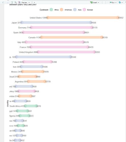
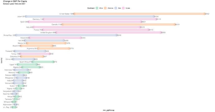
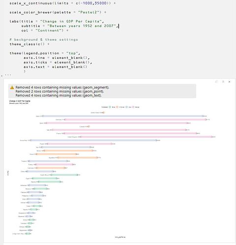
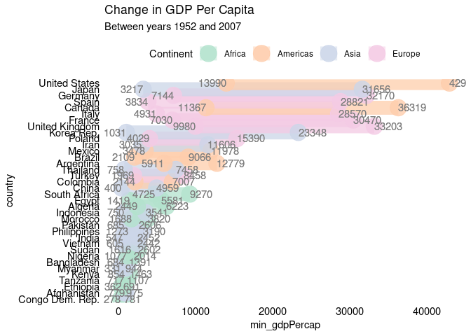
Graph is not aligning in center even on using fig.align='center' and its also cutting out at edges (PS in attached image: names of the countries have been cut out on left side).
How can I have the chart scrollable on x axis rather than cutting out or scaling down as that makes it unreadable.
For example charts on this webpage is scrollable rather than scaled down: https://cran.r-project.org/web/packages/gapminder/README.html
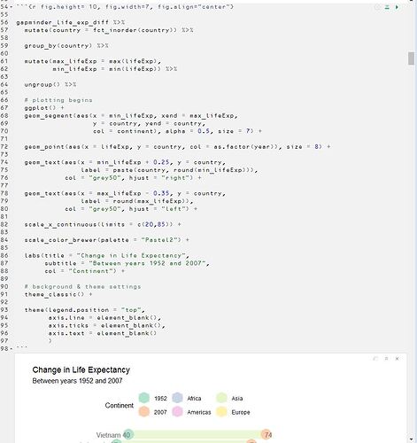
Use of chunk settings is shown in below image:
I have also used these chunk settings:
knitr::opts_chunk$set(echo = TRUE, message = FALSE, warning = FALSE, dpi = 300, cache = FALSE, attr.output='style="max-height: 300px;"')
Issue of country names getting cut out is shown in below image
Code for Ref.
library(tidyverse)

gapminder <- read.csv("https://raw.githubusercontent.com/swcarpentry/r-novice-gapminder/gh-pages/_episodes_rmd/data/gapminder-FiveYearData.csv")

# Converting char to factors
gapminder <- gapminder %>% mutate_if(is.character, as.factor)

gapminder_gdpPercap_diff  <- gapminder %>%
                              filter(year %in% c(1952,2007)) %>%

                              # filter(country %in% c("India","Vietnam")) %>%

                              arrange(country, year) %>%

                              group_by(country) %>%

                              mutate(gdpPercap_diff = gdpPercap[2] - gdpPercap[1],
                                     max_pop = max(pop)) %>%

                              ungroup() %>%

                              arrange(gdpPercap_diff) %>%

                              filter(max_pop > 30000000) %>%

                              mutate(country = droplevels(country)) %>%
                              select(country, year, continent, gdpPercap, gdpPercap_diff)

gapminder_gdpPercap_diff %>%
  mutate(country = fct_inorder(country)) %>%

  group_by(country) %>%

  mutate(max_gdpPercap = max(gdpPercap),
         min_gdpPercap = min(gdpPercap)) %>%

  ungroup() %>%

 # plotting begins
  ggplot() +
  geom_segment(aes(x = min_gdpPercap, xend = max_gdpPercap,
                   y = country, yend = country,
                   col = continent), alpha = 0.5, size = 7) +

  geom_point(aes(x = gdpPercap, y = country, col = continent), size = 8, alpha = .8) +

  geom_text(aes(x = min_gdpPercap + 10, y = country,
                label = paste(country, round(min_gdpPercap))),
            col = "grey50", hjust = "right") +

  geom_text(aes(x = max_gdpPercap - 8.0, y = country,
                label = round(max_gdpPercap)),
            col = "grey50", hjust = "left") +

  # scale_x_continuous(limits = c(20,85)) +

  scale_color_brewer(palette = "Pastel2") +

  labs(title = "Change in GDP Per Capita",
       subtitle = "Between years 1952 and 2007",
       col = "Continent") +

  # background & theme settings
  theme_classic() +

  theme(legend.position = "top",
        axis.line = element_blank(),
        axis.ticks = element_blank(),
        axis.text = element_blank()
        )
