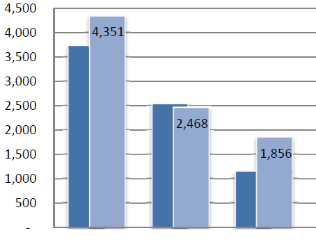
I am wondering if i could produce this chart via plotly r

Blockquote
I am wondering if i could produce this chart via plotly r

Blockquote
library(tidyverse)

(example_data <- tibble(a=10*(3:1),
       b=8*(2:4),
       grp=1:3))

ggplot(data=example_data,
       mapping=aes(x=grp,y=a))+
  geom_col(fill="darkblue",position = position_nudge(x=-.1),width=.5)+
  geom_col(mapping = aes(y=b),
           fill="lightblue",position=position_nudge(x=.05),width=.5) +
geom_text(aes(y=b,label=b),nudge_y = -5)Using ggplot it is possible for sure!
df = tibble(Kat = rep(c("A", "B", "C"), 2),
            SubKat = rep(c(1,2), each = 3),
            value = c(3750, 2500, 1100,
                       4351, 2468, 1856)) %>%
  mutate(label = if_else(SubKat == 2, value, NULL))

ggplot(df, aes(x = Kat, y = value,
               group = SubKat, label = label)) +
  geom_col(aes(fill = as.factor(SubKat)),
           width = 0.8,
           colour = "grey90", size = 1,   # outline
           position = position_dodge(width = 0.5)  # overlap
           ) +
  theme_classic() +
  scale_y_continuous(expand = expansion(mult = c(0, 0.1)),
                     breaks = seq(0,4500, 500)) +
  scale_fill_manual(values = c("#4474a5", "#93a9d0")) +  # colours
  geom_text(position = position_dodge(width = 0.5),
            vjust = 2) +
  theme(axis.line = element_line(colour = "#868686"),
        axis.ticks = element_blank(),
        panel.grid.major.y = element_line(colour = "#868686"),
        legend.position = "none",
        axis.title = element_blank())
This topic was automatically closed 21 days after the last reply. New replies are no longer allowed.
If you have a query related to it or one of the replies, start a new topic and refer back with a link.