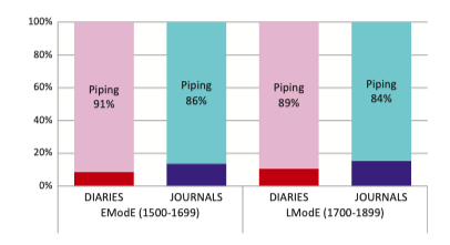
I am wondering how to plot two sets of variables as x. This is a picture that I'd like to plot. In this pic, (1) time (EModE and LModE) and genre (Diaries and Journals) are plotted. (2) Diaries and Journals are with different colors.
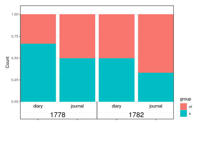
With facet_wrap(), I can plot a similar one, with the four columns in two diagrams and the color for all columns are the same (red and blue).
Here is a test dataset and my code:
test
# A tibble: 10 x 4
    date gender genre   group
   <dbl> <chr>  <chr>   <chr>
 1  1778 female diary   s
 2  1778 female journal of
 3  1778 male   diary   s
 4  1778 male   diary   of
 5  1778 male   journal s
 6  1782 female diary   of
 7  1782 female diary   s
 8  1782 female journal of
 9  1782 female journal s
10  1782 male   journal of

ggplot(test) +
  geom_bar(mapping = aes(x = genre, fill = group, color = group), position = "fill") +
  facet_wrap(~ date, scales = "free_x") +
  labs(x = "Date", y = "Count") +
  theme_bw() +
  theme(legend.justification = c(1, 0))
To help us help you, could you please prepare a reproducible example (reprex) illustrating your issue? Please have a look at this guide, to see how to create one: