How to plot overlapped normal distribution curves in R (preferably in ggplot)

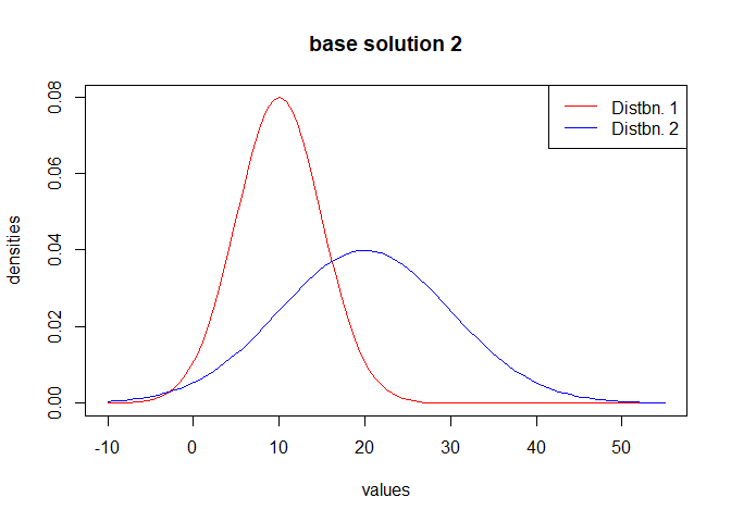
Please consider the below normal distribution curves with different mean values and standard deviation.
Tried to regenerate them in ggplot but couldnt because x axis needs to be fixed always.

How can we plot all the below (preferably their area in different colors) in the same figure ?

similar question:

x <- seq(0, 2*m_, length=1000)
y <- dnorm(x, mean= m_, sd= std_)
plot(x, y, type="l", lwd=1)
x1 <- seq(1, 4*m_, length=1000)
y1 <- dnorm(x1, mean= 2*m_, sd= 2*std_)
plot(x1, y1, type="l", lwd=1)
x2 <- seq(1, 6*m_, length=1000)
y2 <- dnorm(x2, mean= 3*m_, sd= 3*std_)
plot(x2, y2, type="l", lwd=1)

# Tried but this overshoots to outer axis
plot(x1, dnorm(x1,2*m_,2*std_), type="l")
lines(x, dnorm(x,m_,std_), col="red")
1 Like
mean_sim <- 10
std_sim <- 5

lcb <- ((mean_sim - (3 * std_sim)) - 5)
ucb <- (((2 * mean_sim) + (3 * (2 * std_sim))) + 5)

u <- seq(from = lcb,
         to = ucb,
         length.out = 1e+5)
v1 <- dnorm(x = u,
            mean = mean_sim,
            sd = std_sim)
v2 <- dnorm(x = u,
            mean = (2 * mean_sim),
            sd = (2 * std_sim))

matplot(x = u,
        y = cbind(v1, v2),
        type = "l",
        lty = 1,
        col = c("red", "blue"),
        xlab = "values",
        ylab = "densities",
        main = "base Solution 1")
legend(x = "topright",
       legend = paste("Distbn.", 1:2),
       col = c("red", "blue"),
       lty = 1)


plot.function(x = function(t) dnorm(x = t, mean = mean_sim, sd = std_sim),
              from = -10,
              to = 55,
              col = "red",
              xlab = "values",
              ylab = "densities",
              main = "base solution 2")
plot.function(x = function(t) dnorm(x = t, mean = (2 * mean_sim), sd = (2 * std_sim)),
              from = -10,
              to = 55,
              col = "blue",
              add = TRUE)
legend(x = "topright",
       legend = paste("Distbn.", 1:2),
       col = c("red", "blue"),
       lty = 1)

library(ggplot2)


ggplot(data = data.frame(u = c(lcb, ucb)),
       mapping = aes(x = u)) +
  stat_function(mapping = aes(colour = "Distbn. 1"),
                fun = dnorm,
                args = list(mean = mean_sim,
                            sd = std_sim)) +
  stat_function(mapping = aes(colour = "Distbn. 2"),
                fun = dnorm,
                args = list(mean = (2 * mean_sim),
                            sd = (2 * std_sim))) +
  scale_colour_manual(values = c("red", "blue")) +
  labs(x = "values",
       y = "densities",
       title = "ggplot solution")

Created on 2019-07-12 by the reprex package (v0.3.0)

Hope this helps.

2 Likes

Thanks @Yarnabrina, excellent solutions

If we want to find the area under the curve on the left hand side of 0. How to go about
(Understand it's different question but in case if it is quick, please let me know here)

Just find the value of the corresponding pnorm at 0. Don't change the default values of lower.tail and log.p.

1 Like

Thanks for your suggestion. pnorm can be used if we are using standard plot but
when our plot is as below.

plot(x = seq(from = 0,to = 5,length.out = 1e+3),y = dnorm(x = seq(from = 0,to = 5,length.out = 1e+3), mean = 2.5, sd = 1)

How can we know the area below x = 1, 2, 3, 4 
(when x = 5, area = 1)

This topic was automatically closed 7 days after the last reply. New replies are no longer allowed.