Hi guys, could you help me?
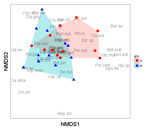
I'm trying to plot an NMDS graph using ggplot, however I'm not able to graph it the way I want (but it could be another package, I just need it to have a similar result to the link image).
I would like something like the image available in the link below. (The polygons would like the points).

I'm sending my data sheet, which It shows the abundance of species found in samples at 4 monitoring points, with collections in the morning and afternoon. At NMDS I will use the Bray Curtis similarity index.
Thank you for your help
