How to plot both numeric value and character value in x-axis of a connected scatter plot?

I have a dataframe and using the following code to generate the plot:

df2 <- data.frame(a=c(02, 04, 08, 16, 32, 64, "all"),
                  china=c(0.61,0.63,0.67,0.65, 0.65,0.67, 0.67))
library(ggplot2)
theme_set(
  theme_classic() +
    theme(legend.position = "top")
)
p <- ggplot(data = df2, aes(x = a, y = china, group = 1)) 
# Basic line plot with points
p + geom_line() + geom_point()

# Change line type and color
p + geom_line(linetype = "dashed", color = "steelblue")+
  geom_point(color = "steelblue")

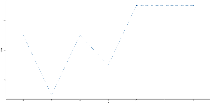
I am getting this plot:

Please see that the values in x-axis are not arranged in ascending order which I actually want. Hoiw can I get that done? Can anyone please help me?

Many thanks,
DC7
df2 <- data.frame(a=c(02, 04, 08, 16, 32, 64, "all"),
                  china=c(0.61,0.63,0.67,0.65, 0.65,0.67, 0.67))
library(tidyverse)

theme_set(
  theme_classic() +
    theme(legend.position = "top")
)

p <- ggplot(data = 
                  df2 %>%mutate(a=
                   as_factor(as.character(a))),
            aes(x = a, y = china, group = 1)) 
# Basic line plot with points
p + geom_line() + geom_point()

# Change line type and color
p + geom_line(linetype = "dashed", color = "steelblue")+
  geom_point(color = "steelblue")

This topic was automatically closed 21 days after the last reply. New replies are no longer allowed.

If you have a query related to it or one of the replies, start a new topic and refer back with a link.