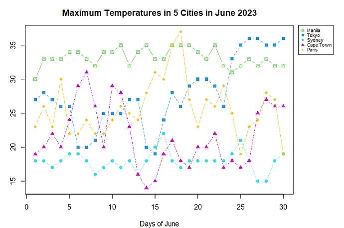
How to plot a legend outside the matplot?

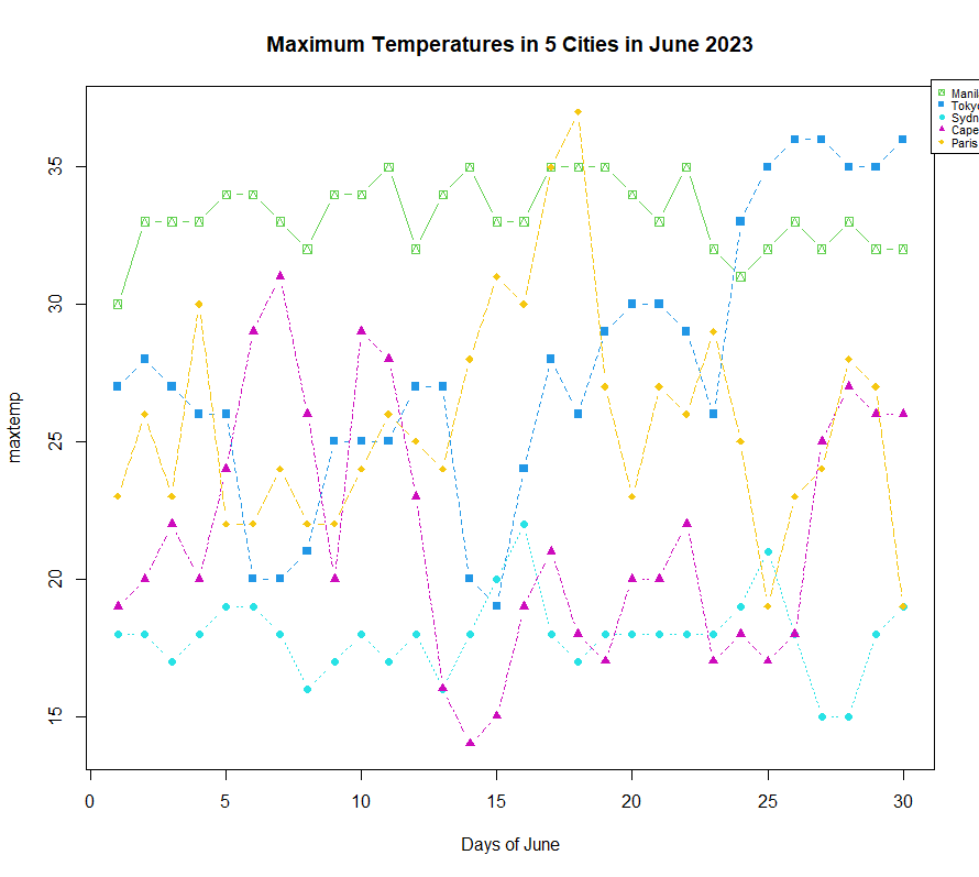
I tried doing it but the legend always gets cut. Here's the code I made:

maxtemp = c(30, 33, 33, 33, 34, 34, 33, 32, 34, 34, 35, 32, 34, 35, 33, 33, 35, 35, 35, 34, 33, 35, 32, 31, 32, 33, 32, 33, 32, 32, 27, 28, 27, 26, 26, 20, 20, 21, 25, 25, 25, 27, 27, 20, 19, 24, 28, 26, 29, 30, 30, 29, 26, 33, 35, 36, 36, 35, 35, 36, 18, 18, 17, 18, 19, 19, 18, 16, 17, 18, 17, 18, 16, 18, 20, 22, 18, 17, 18, 18, 18, 18, 18, 19, 21, 18, 15, 15, 18, 19, 19, 20, 22, 20, 24, 29, 31, 26, 20, 29, 28, 23, 16, 14, 15, 19, 21, 18, 17, 20, 20, 22, 17, 18, 17, 18, 25, 27, 26, 26, 23, 26, 23, 30, 22, 22, 24, 22, 22, 24, 26, 25, 24, 28, 31, 30, 35, 37, 27, 23, 27, 26, 29, 25, 19, 23, 24, 28, 27, 19)
dim(maxtemp) = c(30,5)
matplot(maxtemp, type = "b", pch = 14:18, col = 3:7)
title (main = "Maximum Temperatures in 5 Cities in June 2023", xlab = "Days of June")
par (mar = c(4,3,3,1), xpd = TRUE)
Cities = c("Manila", "Tokyo", "Sydney", "Cape Town", "Paris")
legend ("topright", inset = c(-0.1, -0.01), legend = c(Cities), pch = 14:18, col = 3:7, bg = "White", cex = 0.7)

Here's what I get:
I think the par(mar line should be the first graphic command you give, so that the plot will draw with the margin lines you request. I increased the rightmost to 6 to make some empty space.


maxtemp = c(30, 33, 33, 33, 34, 34, 33, 32, 34, 34, 35, 32, 34, 35, 33, 33, 35, 35, 35, 34, 33, 35, 32, 31, 32, 33, 32, 33, 32, 32, 27, 28, 27, 26, 26, 20, 20, 21, 25, 25, 25, 27, 27, 20, 19, 24, 28, 26, 29, 30, 30, 29, 26, 33, 35, 36, 36, 35, 35, 36, 18, 18, 17, 18, 19, 19, 18, 16, 17, 18, 17, 18, 16, 18, 20, 22, 18, 17, 18, 18, 18, 18, 18, 19, 21, 18, 15, 15, 18, 19, 19, 20, 22, 20, 24, 29, 31, 26, 20, 29, 28, 23, 16, 14, 15, 19, 21, 18, 17, 20, 20, 22, 17, 18, 17, 18, 25, 27, 26, 26, 23, 26, 23, 30, 22, 22, 24, 22, 22, 24, 26, 25, 24, 28, 31, 30, 35, 37, 27, 23, 27, 26, 29, 25, 19, 23, 24, 28, 27, 19)
dim(maxtemp) = c(30,5)

par (mar = c(4,3,3,6), xpd = TRUE)
matplot(maxtemp, type = "b", pch = 14:18, col = 3:7)
title (main = "Maximum Temperatures in 5 Cities in June 2023", xlab = "Days of June")


Cities = c("Manila", "Tokyo", "Sydney", "Cape Town", "Paris")
legend ("topright", inset = c(-0.15, 0), legend = c(Cities), pch = 14:18, col = 3:7, bg = "White", cex = 0.7)

Note that the layout is dependent on the size of your plot view when you call the commands. I made mine nice and big

1 Like

Thank you so much for this! I'm still new to R so your response really helped me a lot. God bless!

This topic was automatically closed 42 days after the last reply. New replies are no longer allowed.

If you have a query related to it or one of the replies, start a new topic and refer back with a link.