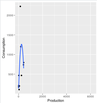
How to plot a figure based on a specific data and with a line showing the curve.

I would like to plot my consumption data from my df dataframe similar to the image below.

df<-structure(list(Locations=c(1,2,3,4,5,6,7,8,9,10,11,12,13,14,15), Production = c(239.936, 422.18352, 5.863376, 23.9936, 406.09168, 143.9616, 42.348704, 61.67968, 12.956544, 182.058268,6168.5,714.593,268.545,175.2,227.5775), Consumption = c(467.36, 795.2, 176.2, 467.36, 
+ 738.5, 2226.36, 107.13, 198.63,210.3, 1198.96,"","","","","")), row.names = c(NA, 15L), class = "data.frame")
> df
   Locations  Production Consumption
1          1  239.936000      467.36
2          2  422.183520       795.2
3          3    5.863376       176.2
4          4   23.993600      467.36
5          5  406.091680       738.5
6          6  143.961600     2226.36
7          7   42.348704      107.13
8          8   61.679680      198.63
9          9   12.956544       210.3
10        10  182.058268     1198.96
11        11 6168.500000            
12        12  714.593000            
13        13  268.545000            
14        14  175.200000            
15        15  227.577500
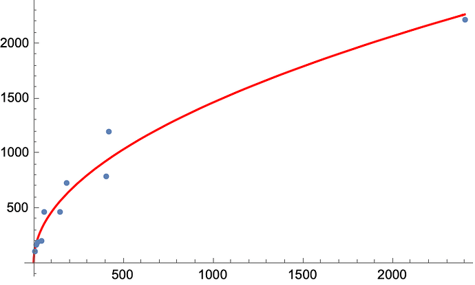
Perhaps play around with the smoothed conditional means?

library(tidyverse)
df %>% 
  mutate(Consumption = as.numeric(Consumption)) %>% 
  ggplot(aes(Production, Consumption)) +
  geom_point() +
  geom_smooth(se = FALSE,
              method = "lm",
              formula = "y ~ poly(x, 2)")

image

1 Like

This topic was automatically closed 21 days after the last reply. New replies are no longer allowed.

If you have a query related to it or one of the replies, start a new topic and refer back with a link.