Hi all,
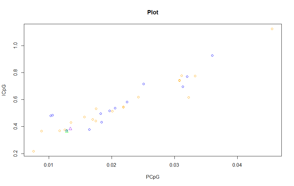
here is my script without ggplot
data <- read.csv("plotdata.csv", header=T)


#making plot


#plot
plot(data$PCpG, data$ICpG, main = "Plot", col = "orange",
     xlab = "PCpG", ylab= "ICpG")

points(data$PCpG.1, data$ICpG.1, col = "blue")
points(data$PCpG.2, data$ICpG.2, col = "green", pch=2)
points(data$PCpG.3, data$ICpG.3, col = "purple", pch=2)
Does anyone know or can give me suggestion how to make plot like this using ggplot?data
Thank you in advance
Best
I'd suggest reading the ggplot2 webpage.
A system for declaratively creating graphics, based on "The
Grammar of Graphics". You provide the data, tell ggplot2 how to map
variables to aesthetics, what graphical primitives to use, and it
takes care of the details.
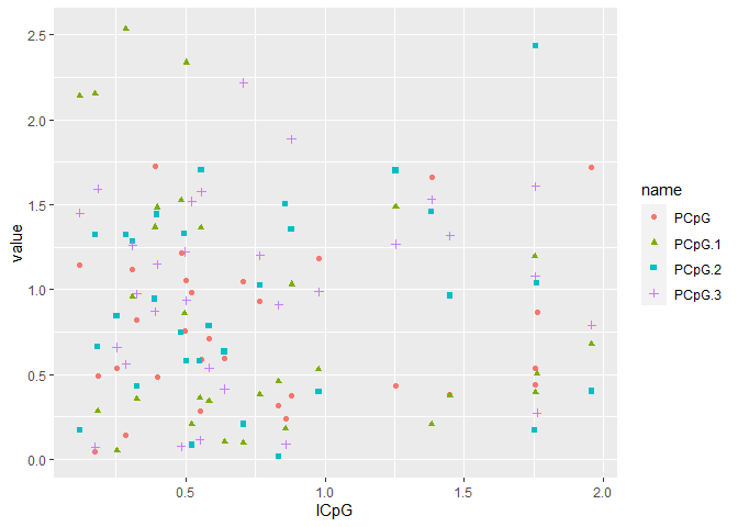
Though I think it could be useful to look up tidyr too and learn a bit about data tidying. Half the battle is formatting your data correctly! Your data doesn't quite look complete in your link, so I've created a reproducible example using dummy data here:
library(tidyverse)

dat = tibble(ICpG   = rnorm(30) |> abs(),
             PCpG   = rnorm(30) |> abs(),
             PCpG.1 = rnorm(30) |> abs(),
             PCpG.2 = rnorm(30) |> abs(),
             PCpG.3 = rnorm(30) |> abs())

dat |>
  pivot_longer(-ICpG) |>
  ggplot(aes(x = ICpG, y = value)) +
  geom_point(aes(color = name, shape = name))
Created on 2021-12-06 by the reprex package (v2.0.1)
system
December 13, 2021, 5:07pm
4
This topic was automatically closed 7 days after the last reply. New replies are no longer allowed.

