How to make neat, interpretable time series plot with multiple dataframes?

Dear R users,

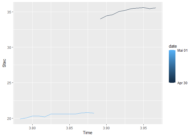
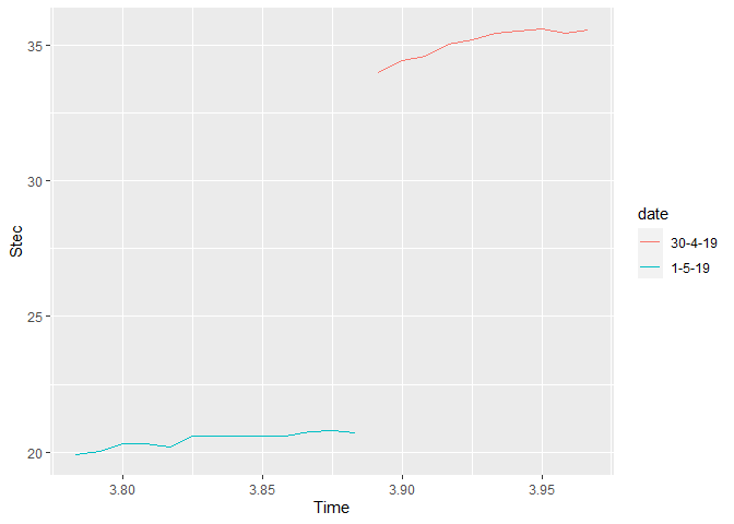
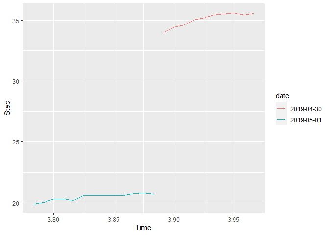
I am trying to create a multiple time-series plot using R and trying to create legend based on the dates. I have obtained the graph but it doesn't look so neat and the legends are not in proper order.
The script which I used is,

library(ggplot2)
library(readxl)

D1 <- read_excel("E:/Gokul/R 1.xlsx", 
                 sheet = "30-4-19")
D2 <- read_excel("E:/Gokul/R 1.xlsx", 
                 sheet = "1-5-19")
D3 <- read_excel("E:/Gokul/R 1.xlsx", 
                 sheet = "2-5-19")
D4 <- read_excel("E:/Gokul/R 1.xlsx", 
                 sheet = "3-5-19")
D5<- read_excel("E:/Gokul/R 1.xlsx", 
                sheet = "4-5-19")
D6 <- read_excel("E:/Gokul/R 1.xlsx", 
                 sheet = "5-5-19")
D7 <- read_excel("E:/Gokul/R 1.xlsx", 
                 sheet = "6-5-19")
D8 <- read_excel("E:/Gokul/R 1.xlsx", 
                 sheet = "7-5-19")  
D9 <- read_excel("E:/Gokul/R 1.xlsx", 
                 sheet = "8-5-19")
D10 <- read_excel("E:/Gokul/R 1.xlsx", 
                  sheet = "9-5-19")
D11 <- read_excel("E:/Gokul/R 1.xlsx", 
                  sheet = "10-5-19")   
D12 <- read_excel("E:/Gokul/R 1.xlsx", 
                  sheet = "11-5-19")
D13 <- read_excel("E:/Gokul/R 1.xlsx", 
                  sheet = "12-5-19")
D14 <- read_excel("E:/Gokul/R 1.xlsx", 
                  sheet = "13-5-19")
D15 <- read_excel("E:/Gokul/R 1.xlsx", 
                  sheet = "14-5-19")

ggplot(D1,aes(x=Time,y=Stec))+
  geom_line(aes(color="30-4-19"))+
  geom_line(data=D2,aes(color="1-5-19"))+
  geom_line(data=D3,aes(color="2-5-19"))+
  geom_line(data=D4,aes(color="3-5-19"))+
  geom_line(data=D5,aes(color="4-5-19"))+
  geom_line(data=D6,aes(color="5-5-19"))+
  geom_line(data=D7,aes(color="6-5-19"))+
  geom_line(data=D8,aes(color="7-5-19"))+
  geom_line(data=D9,aes(color="8-5-19"))+
  geom_line(data=D10,aes(color="9-5-19"))+
  geom_line(data=D11,aes(color="10-5-19"))+
  geom_line(data=D12,aes(color="11-5-19"))+
  geom_line(data=D13,aes(color="12-5-19"))+
  geom_line(data=D14,aes(color="13-5-19"))+
  geom_line(data=D15,aes(color="14-5-19"))+
  labs(color="Legend text")

The graph which I got is
image

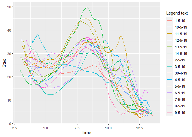
How do I make the graph more appealing, interpretable and make the legends in ascending order.?

Kindly suggest the solution for the above problem

Thank you.

Hi, you have to transform your dates in proper dates (e.g. via as.Date() or lubridate::ymd()) or into an ordered factor to make them appear in the order you want. Now they are ranked in an ascending order. You could, to make it easier to compare, use facets via facet_wrap() and also try the {gghighlight} package to show all other lines in the background.

Please provide a reproducible exampel next time so we are able to create and modif your code and plot. This helps both sides. For more see here.

1 Like

Another note: It is way easier and the preferred approach to combine the data frames into one and then call geom_line(aes(color = date)) once.

1 Like

I tried my best to get the reproducible examples.

library(ggplot2)
library(readxl)

D1 <- read_excel("E:/Gokul/R 1.xlsx", 
                 sheet = "30-4-19")
D2 <- read_excel("E:/Gokul/R 1.xlsx", 
                     sheet = "1-5-19")
D3 <- read_excel("E:/Gokul/R 1.xlsx", 
                         sheet = "2-5-19")

# data for D1
structure(list(Time = c(3.891667, 3.9, 3.908333, 3.916667, 3.925, 
3.933333, 3.941667, 3.95, 3.958333, 3.966667), PRN = c(1, 1, 
1, 1, 1, 1, 1, 1, 1, 1), Lat = c(-10.728, -10.649, -10.571, -10.494, 
-10.417, -10.341, -10.266, -10.192, -10.119, -10.046), Lon = c(141.988, 
142.036, 142.084, 142.131, 142.177, 142.223, 142.268, 142.313, 
142.357, 142.4), Stec = c(33.99, 34.41, 34.58, 35.01, 35.18, 
35.44, 35.52, 35.58, 35.41, 35.54)), row.names = c(NA, -10L), class = c("tbl_df", 
"tbl", "data.frame"))

#Data for D2
structure(list(Time = c(3.783333, 3.791667, 3.8, 3.808333, 3.816667, 
3.825, 3.858333, 3.866667, 3.875, 3.883333), PRN = c(1, 1, 1, 
1, 1, 1, 1, 1, 1, 1), Lat = c(-11.116, -11.033, -10.951, -10.87, 
-10.789, -10.71, -10.399, -10.324, -10.249, -10.175), Lon = c(141.746, 
141.798, 141.849, 141.899, 141.949, 141.998, 142.187, 142.233, 
142.278, 142.322), Stec = c(19.93, 20.03, 20.3, 20.32, 20.2, 
20.59, 20.59, 20.74, 20.8, 20.72)), row.names = c(NA, -10L), class = c("tbl_df", 
"tbl", "data.frame"))

#Data for D3
structure(list(Time = c(3.716667, 3.725, 3.733333, 3.741667, 
3.75, 3.758333, 3.766667, 3.775, 3.783333, 3.791667), PRN = c(1, 
1, 1, 1, 1, 1, 1, 1, 1, 1), Lat = c(-11.098, -11.015, -10.933, 
-10.852, -10.772, -10.692, -10.614, -10.536, -10.459, -10.383
), Lon = c(141.758, 141.81, 141.861, 141.911, 141.961, 142.009, 
142.058, 142.105, 142.152, 142.198), Stec = c(33.48, 33.43, 33.38, 
33.41, 33.24, 33.05, 33.08, 32.91, 32.71, 32.53)), row.names = c(NA, 
-10L), class = c("tbl_df", "tbl", "data.frame"))

ggplot(D1,aes(x=Time,y=Stec))+
  geom_line(aes(color="30-4-19"))+
  geom_line(data=D2,aes(color="1-5-19"))+
  geom_line(data=D3,aes(color="2-5-19"))+
  labs(color="Legend text")

I hope it works.

An example with two of your data frames. It might be a bit of repetitive work though. If you want to automate, you could read several files in one go but that's more advanced. For an example see here and here.

library(tidyverse)

#Data for D1
d1 <- structure(list(Time = c(3.891667, 3.9, 3.908333, 3.916667, 3.925, 3.933333, 3.941667, 3.95, 3.958333, 3.966667), PRN = c(1, 1, 1, 1, 1, 1, 1, 1, 1, 1), Lat = c(-10.728, -10.649, -10.571, -10.494, -10.417, -10.341, -10.266, -10.192, -10.119, -10.046), Lon = c(141.988, 142.036, 142.084, 142.131, 142.177, 142.223, 142.268, 142.313, 142.357, 142.4), Stec = c(33.99, 34.41, 34.58, 35.01, 35.18, 35.44, 35.52, 35.58, 35.41, 35.54)), row.names = c(NA, -10L), class = c("tbl_df", "tbl", "data.frame"))

#Data for D2
d2 <- structure(list(Time = c(3.783333, 3.791667, 3.8, 3.808333, 3.816667, 3.825, 3.858333, 3.866667, 3.875, 3.883333), PRN = c(1, 1, 1, 1, 1, 1, 1, 1, 1, 1), Lat = c(-11.116, -11.033, -10.951, -10.87, -10.789, -10.71, -10.399, -10.324, -10.249, -10.175), Lon = c(141.746, 141.798, 141.849, 141.899, 141.949, 141.998, 142.187, 142.233, 142.278, 142.322), Stec = c(19.93, 20.03, 20.3, 20.32, 20.2, 20.59, 20.59, 20.74, 20.8, 20.72)), row.names = c(NA, -10L), class = c("tbl_df", "tbl", "data.frame"))

df1 <- 
  d1 %>% 
  mutate(id = "30-4-19") %>% 
  bind_rows(d2 %>% mutate(id = "1-5-19")) %>% 
  mutate(date = lubridate::dmy(id))

ggplot(df1, aes(x = Time, y = Stec))+ 
    geom_line(aes(color = date, group = date))

df2 <- 
  d1 %>% 
  mutate(id = "30-4-19") %>% 
  bind_rows(d2 %>% mutate(id = "1-5-19")) %>% 
  mutate(date = factor(id, levels = c("30-4-19", "1-5-19")))

ggplot(df2, aes(x = Time, y = Stec))+ 
  geom_line(aes(color = date, group = date))

Created on 2020-07-06 by the reprex package (v0.3.0)

Dear @Z3tt,
One more help required. How do I add multiple data frames to the second example like df3, df4,df5...etc?

Hi Gokul,

if you do not want to use the functional programming approach with lapply() or map_df() you have to copy the same step again and again:

df2 <- 
  d1 %>% 
  mutate(id = "30-4-19") %>% 
  bind_rows(d2 %>% mutate(id = "1-5-19")) %>% 
  bind_rows(d3 %>% mutate(id = "2-5-19")) %>% 
  bind_rows(d4 %>% mutate(id = "3-5-19")) %>% 
  bind_rows(d5 %>% mutate(id = "4-5-19")) %>% 
  bind_rows(d6 %>% mutate(id = "5-5-19")) %>% 
  mutate(date = factor(id, levels = c("30-4-19", "1-5-19", "2-5-19", "3-5-19", "4-5-19", "5-5-19")))

(Note: I just made up some dates here)

1 Like

Btw, a simpelr way would be to use the date approach since you don't have to manually sort your factor. But I guess you do not like that it is used as a continuous variable. You can easily change that:

library(tidyverse)

#Data for D1
d1 <- structure(list(Time = c(3.891667, 3.9, 3.908333, 3.916667, 3.925, 3.933333, 3.941667, 3.95, 3.958333, 3.966667), PRN = c(1, 1, 1, 1, 1, 1, 1, 1, 1, 1), Lat = c(-10.728, -10.649, -10.571, -10.494, -10.417, -10.341, -10.266, -10.192, -10.119, -10.046), Lon = c(141.988, 142.036, 142.084, 142.131, 142.177, 142.223, 142.268, 142.313, 142.357, 142.4), Stec = c(33.99, 34.41, 34.58, 35.01, 35.18, 35.44, 35.52, 35.58, 35.41, 35.54)), row.names = c(NA, -10L), class = c("tbl_df", "tbl", "data.frame"))

#Data for D2
d2 <- structure(list(Time = c(3.783333, 3.791667, 3.8, 3.808333, 3.816667, 3.825, 3.858333, 3.866667, 3.875, 3.883333), PRN = c(1, 1, 1, 1, 1, 1, 1, 1, 1, 1), Lat = c(-11.116, -11.033, -10.951, -10.87, -10.789, -10.71, -10.399, -10.324, -10.249, -10.175), Lon = c(141.746, 141.798, 141.849, 141.899, 141.949, 141.998, 142.187, 142.233, 142.278, 142.322), Stec = c(19.93, 20.03, 20.3, 20.32, 20.2, 20.59, 20.59, 20.74, 20.8, 20.72)), row.names = c(NA, -10L), class = c("tbl_df", "tbl", "data.frame"))

df3 <- 
  d1 %>% 
  mutate(id = "30-4-19") %>% 
  bind_rows(d2 %>% mutate(id = "1-5-19")) %>% 
  mutate(date = factor(lubridate::dmy(id)))

ggplot(df3, aes(x = Time, y = Stec))+ 
  geom_line(aes(color = date, group = date))

Created on 2020-07-07 by the reprex package (v0.3.0)

1 Like

This topic was automatically closed 7 days after the last reply. New replies are no longer allowed.