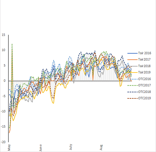
I am trying to produce a similar graph using ggplot but facing a difficult time in writing the correct code. As I have two temp variable and 4 years and i want to plot the difference upon each in a way that one variable should show solid line and the other dotted.
Hi, welcome!
We don't really have enough info to help you out. Could you ask this with a minimal REPRoducible EXample (reprex)? A reprex makes it much easier for others to understand your issue and figure out how to help.
If you've never heard of a reprex before, you might want to start by reading this FAQ:
Alright. i will re-post with all necessary elements
thank you
No need to re-post (please don't do it) just edit your original post.
This topic was automatically closed 21 days after the last reply. New replies are no longer allowed.
