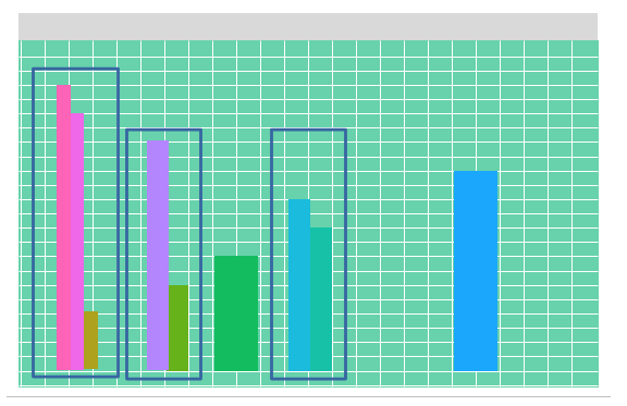
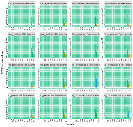
How to make an histogram with vertical bars ? Not horizontal

Hi , I want to make a histograms, which I did but bars are runnin horizontally,
how to change them to vertical but leaving axises intact ?

data <- structure(list(
  Lp = c(
    "1", "2", "3", "4", "5", "6", "7", "8",
    "9", "10", "11", "12", "13", "14", "15", "16", "17", "18", "19",
    "20", "21", "22", "23", "24", "25", "26", "27", "28", "29", "30",
    "31", "32"
  ), Group = structure(c(
    1L, 1L, 2L, 2L, 1L, 1L, 2L,
    2L, 1L, 1L, 2L, 2L, 1L, 1L, 2L, 2L, 1L, 1L, 2L, 2L, 1L, 1L, 2L,
    2L, 1L, 1L, 2L, 2L, 1L, 1L, 2L, 2L
  ), levels = c(
    "Radiowaves",
    "Soniccurrents"
  ), class = "factor"), Gender = structure(c(
    1L,
    1L, 1L, 1L, 1L, 1L, 1L, 1L, 1L, 1L, 1L, 1L, 1L, 1L, 1L, 1L, 2L,
    2L, 2L, 2L, 2L, 2L, 2L, 2L, 2L, 2L, 2L, 2L, 2L, 2L, 2L, 2L
  ), levels = c(
    "K",
    "M"
  ), class = "factor"), Time = structure(c(
    1L, 1L, 1L, 1L, 2L,
    2L, 2L, 2L, 3L, 3L, 3L, 3L, 4L, 4L, 4L, 4L, 1L, 1L, 1L, 1L, 2L,
    2L, 2L, 2L, 3L, 3L, 3L, 3L, 4L, 4L, 4L, 4L
  ), levels = c(
    "before_treatment",
    "two_procedures", "three_procedures", "after_treatment"
  ), class = "factor"),
  Value_measured = c(
    3, 5, 3, 7, 1, 5, 3, 5, 3, 1, 5, 7, 0,
    5, 1, 5, 2, 4, 1, 4, 2, 5, 4, 6, 2, 5, 4, 2, 2, 4, 6, 1
  )
), class = c(
  "grouped_df",
  "tbl_df", "tbl", "data.frame"
), row.names = c(NA, -32L), groups = structure(list(
  Gender = structure(c(
    1L, 1L, 1L, 1L, 1L, 1L, 1L, 1L, 2L,
    2L, 2L, 2L, 2L, 2L, 2L, 2L
  ), levels = c("K", "M"), class = "factor"),
  Time = structure(c(
    1L, 1L, 2L, 2L, 3L, 3L, 4L, 4L, 1L, 1L,
    2L, 2L, 3L, 3L, 4L, 4L
  ), levels = c(
    "before_treatment", "two_procedures",
    "three_procedures", "after_treatment"
  ), class = "factor"),
  Group = structure(c(
    1L, 2L, 1L, 2L, 1L, 2L, 1L, 2L, 1L, 2L,
    1L, 2L, 1L, 2L, 1L, 2L
  ), levels = c("Radiowaves", "Soniccurrents"), class = "factor"), .rows = structure(list(
    1:2, 3:4, 5:6,
    7:8, 9:10, 11:12, 13:14, 15:16, 17:18, 19:20, 21:22,
    23:24, 25:26, 27:28, 29:30, 31:32
  ), ptype = integer(0), class = c(
    "vctrs_list_of",
    "vctrs_vctr", "list"
  ))
), row.names = c(NA, -16L), class = c(
  "tbl_df",
  "tbl", "data.frame"
), .drop = TRUE))

and the rest of the code:

lst3 <- split(data, data[c("Time", "Group", "Gender")], drop = TRUE)
  
  mydf0 <- do.call(rbind, unname(Map(cbind, colour = names(lst3), lst3)))
  
  ggplot(mydf0) +
    geom_histogram(aes(y = Value_measured, fill = "red"), fill = "#E61EEB", orientation = "y") +
    scale_x_continuous(breaks = seq(0, 10, by = 1), limits = c(0, 11)) +
    scale_y_continuous(breaks = seq(0, 10, by = 1), limits = c(0, 11)) +
    facet_wrap(~colour, scales = "free") +
       labs(x = "Counts") +
    labs(y = "VRNS scale values") +
    theme(panel.background = element_rect(
      fill = "#64D2AA", color = "#64D2AA"))+
    theme(legend.position = "none") 

Any help will be greatly appreciated,
thank you.
If I understand you correctly, just add to your ggplot() call:

+
  coord_flip()

Stephen

2 Likes

No it doesn't work, I do not want to swap x and y axis, I just want to have vertical bars.

Is this what you want?

mydf0 %>%
  # data grouping is same as was in your original histogram 
  group_by(colour, Value_measured) %>%
  # count before plotting
  summarise(V_count = n())%>%
  ggplot() +
  # make a col plot
  # NOTE: as number of counts was identical and equial to 1 for all conditions
  # I added 'fill = as.factor(Value_measured)' and 'position = position_dodge()'
  # to highlight the difference. You may remove them, but in this case plot 
  # does not have any sense (for me)
  geom_col(aes(x = V_count,
               y = Value_measured,
               fill = as.factor(Value_measured)),
           position = position_dodge()) +
  scale_x_continuous(breaks = seq(0, 10, by = 1), limits = c(0, 11)) +
  scale_y_continuous(breaks = seq(0, 10, by = 1), limits = c(0, 11)) +
  facet_wrap(~colour, scales = "free") +
  labs(x = "Counts") +
  labs(y = "VRNS scale values") +
  theme(panel.background = element_rect(
    fill = "#64D2AA", color = "#64D2AA"))+
  theme(legend.position = "none")
2 Likes

Thank you very much indeed @Dobrokhotov1989 , this is exactly what I wanted.

Of course my data here are excerpt from larger data, and your code nicely works with it.
For example value 10 was recorded only once and this is reflected in the plot.
obraz

Can you please advise how to sort these bars according to Value_measured in descending order and secondly how to sort these bars according to Counts with descending order as well. I assume that sorting will affect all bars in all subgroups called in

facet_wrap( ~colour)

thank you and best regards,

mydf0 %>%
  # data grouping is same as was in your original histogram 
  group_by(colour, Value_measured) %>%
  # count before plotting
  summarise(V_count = n()) %>%
  ggplot() +
  # make a col plot
  # NOTE: as number of counts was identical and equial to 1 for all conditions
  # I added 'fill = as.factor(Value_measured)' and 'position = position_dodge()'
  # to highlight the difference. You may remove them, but in this case plot 
  # does not have any sense (for me)
  geom_col(aes(x = V_count,
               y = Value_measured,
               fill = as.factor(Value_measured)),
           # Use `position_dodge2(reverse = TRUE)` for descending order of Value
           position = position_dodge2(reverse = TRUE)) +
  # Use `scale_x_reverse()` for descending order of counts
  scale_x_reverse(breaks = seq(10, 0, by = -1), limits = c(11, 0)) +
  scale_y_continuous(breaks = seq(0, 10, by = 1), limits = c(0, 11)) +
  facet_wrap(~colour, scales = "free") +
  labs(x = "Counts") +
  labs(y = "VRNS scale values") +
  theme(panel.background = element_rect(
    fill = "#64D2AA", color = "#64D2AA"))+
  theme(legend.position = "none") 
1 Like

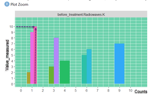
Thank you, this is good as well, my apologies, I do not want to add work for you, what I really had in mind was that sorting you showed in your last post plus something like this:
obraz

which looks nice sorted from highest to lowest according to Value_measured as well.

I didn't catch it, do you need any extra adjustments to the plot from my previous post?
Using the sample data you've provided and the code from the previous post, I got the following plot where all bars are sorted from highest value_measured to lowest.

Thank you for your reply, my apologies, I must have mixed up something.

This topic was automatically closed 7 days after the last reply. New replies are no longer allowed.

If you have a query related to it or one of the replies, start a new topic and refer back with a link.