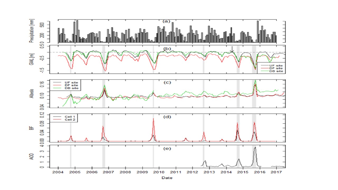
Hi All,
Please help me to build this kind of tidy graph (picture as example). I think which type of graph that I should use?
Basically the simple graph theme_bw.
Thank you
Hi All,
Please help me to build this kind of tidy graph (picture as example). I think which type of graph that I should use?
Basically the simple graph theme_bw.
Thank you
With facet_grid() and facet_wrap() from ggplot2?
If you can provide a reprex example, we would be able to give you more details. Without more details, you can try using:
your_graph +
facet_wrap( ~ your_variable)
Keep in mind that you will need a specific variable by which to split the data.
If this does not help, please provide a reprex and we can give you more details.
What exactly you want to reproduce from this plot? There is a lot of thing going on.
To have a five distinct graphs arranged together, I would make them separately and arrange with cowplot packege (Introduction to cowplot).
Since, your y-axis is different on all individual plots, I don't think facet_ would work in this case.
I would like to produce a y-tick-right-graph, top axis ticks, graph border and the graph close together.
I have tried with theme(axis.ticks.y.right), but not working. Also the legend inside the graph/
p4 <- ggplot() +
geom_line(data = df,aes(x=datetime,y=SWC_1_1_1.x))+
labs(y= "SWC ", x="Datetime")
p4<- p4 + theme(axis.ticks.y.right = element_line(size=5,color="black"),
axis.ticks.length=unit(.2,"cm"),
panel.grid.minor = element_blank(),
panel.background = element_rect(fill = "white", colour = "grey50")+
scale_x_continuous(sec.axis = dup_axis(labels = NULL)) + # NEW
scale_y_continuous(sec.axis = dup_axis(labels = NULL)))
p4
Here is my code.But not working as I expected
What is in df? Can you provide a reproducible example?
Example:
| datetime | micro.form | Exp_Flux | SWC_1_1_1.x | Ts_1_1_1.x |
|---|---|---|---|---|
| 31/08/2018 12:48 | HP | 6.12 | 0.26 | 29.25 |
| 31/08/2018 12:52 | PB | 2.89 | 0.26 | 29.15 |
| 31/08/2018 12:55 | FP | 3.22 | 0.261 | 29.25 |
| 31/08/2018 12:59 | HP | 10.07 | 0.261 | 29.2 |
| 31/08/2018 13:02 | PB | 5.87 | 0.26 | 29.175 |
| 31/08/2018 13:06 | FP | 2.95 | 0.259 | 29.3 |
| 31/08/2018 13:09 | HP | 4.27 | 0.259 | 29.225 |
| 31/08/2018 13:13 | PB | 2.27 | 0.259 | 29.4 |
| 31/08/2018 13:16 | FP | 3.77 | 0.261 | 29.3 |
| 31/08/2018 13:20 | HP | 10.71 | 0.259 | 29.4 |
| 31/08/2018 13:24 | PB | 6.15 | 0.259 | 29.3 |
| 31/08/2018 13:27 | FP | 3.18 | 0.258 | 29.375 |
Something like this?
library(tidyverse)
library(cowplot)

df <- mpg

p4 <- ggplot() +
  geom_line(data = df,
            aes(x=displ,
                y=cty,
                color = as.factor(year)))+
  labs(y= "SWC ", x="Datetime")

p4 <- p4 +
  #Top x axis with no labels and title
  scale_x_continuous(sec.axis = dup_axis(labels = NULL, name = NULL)) +
  #Right y axis with no labels and title
  scale_y_continuous(sec.axis = dup_axis(labels = NULL, name = NULL)) +
  #Simple theme with wight background and without guides
  theme_classic()+
  theme(
    #Direction of ticks (negative value means it will be inward)
    axis.ticks.length.y.right = unit(-3, "pt"),
    axis.ticks.length.x.top = unit(-3, "pt"),
    #Legend position inside the plot
    legend.position = c(.99, .99),
    legend.justification = c("right", "top"),
    #Line around legend plate
    legend.background = element_rect(color = "grey50")
    )

# p5 same as p4 but without x-axis labels and title
p5 <- p4 +
  labs(x = NULL)+
  theme(axis.text.x.bottom = element_blank())

# arrange them together
plot_grid(p5, p4, ncol = 1)
Thank you so much.
That really helps.
Hye..
Unfortunately, another issue came up
Error in as.POSIXct.numeric(value) : 'origin' must be supplied
Hmm,
You can try to replace scale_x_continuous() with scale_x_datetime().
If it doesn't work, please run the following code dput(head(df)) where df is data.frame with your data and post the output here (should look like structure(list(....),..., class = ...). It will give me a sample of your data which I can simply copy-paste.
Hye,
I am using (scale_x_datetime) and it's worked..Thank you very much. I wonder what the difference between datetime and continuous?
The difference in the class of data. From the name, it implied that scale_*_continuous() is for continuous x or y (i.e. numeric), while scale_*_datetime() is for the data of class datetime (i.e. date and time). There are also scale_*_date() for dates, scale_*_time() for times , scale_*_discrete() for discrete data (i.e. integers, factors, etc.).
Perhaps, the error appeared because ggplot tried to transform data of one class to another, which requires extra argument 'origin'.
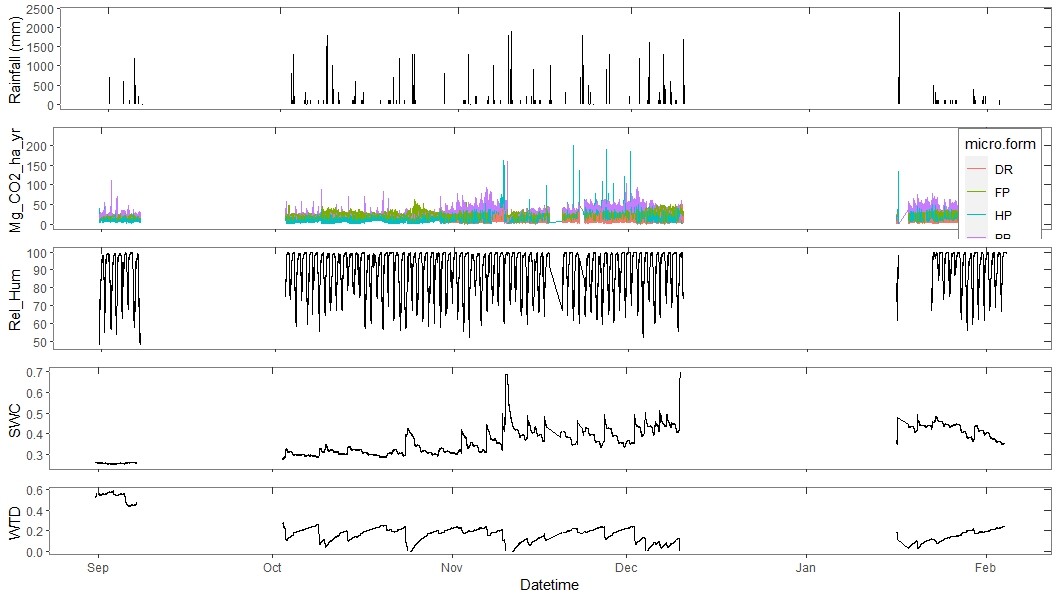
Hi,
This is the final output I produce. It was good. Just a little bit I have to add to be the same as sample picture (above).
p1 <- ggplot(data=df,aes(x=datetime, y=P_Rain_mm))+
geom_bar(stat="identity",width =2.0,color="black")+
labs(y= "Rainfall (mm) ", x="Datetime")
p1
p1<- p1+
#Top x axis with no labels and title
scale_x_datetime(sec.axis = dup_axis(labels = NULL, name =element_blank())) +
#Right y axis with no labels and title
scale_y_continuous(sec.axis = dup_axis(labels = NULL, name=element_blank()))+
theme(
axis.ticks.length.x.top = unit(-5, "pt"),
#Direction of ticks (negative value means it will be inward)
axis.ticks.length.y.right=unit(-5,"pt"),
panel.grid.minor = element_blank(),
panel.background = element_rect(fill = "white", colour = "grey50")
)
p1
p1<- p1 +labs(x = NULL)+
theme(axis.text.x.bottom = element_blank())
p1
p2 <- ggplot(data = df,aes(x=datetime,y=Mg_CO2_ha_yr_exp_flux,group=month(datetime))) +
geom_line(aes(color=micro.form))+
labs(y= "Mg_CO2_ha_yr ", x="Datetime")
p2
p2<- p2+#Top x axis with no labels and title
scale_x_datetime(sec.axis = dup_axis(labels = NULL, name =element_blank())) +
#Right y axis with no labels and title
scale_y_continuous(sec.axis = dup_axis(labels = NULL, name=element_blank()))+
theme(
axis.ticks.length.x.top = unit(-5, "pt"),
#Direction of ticks (negative value means it will be inward)
axis.ticks.length.y.right=unit(-5,"pt"),
#Legend position inside the plot
legend.position = c(.99, .99),
legend.justification = c("right", "top"),
#Line around legend plate
legend.background = element_rect(color = "grey50"),
panel.grid.minor = element_blank(),
panel.background = element_rect(fill = "white", colour = "grey50")
)
p2
p2<- p2 +labs(x = NULL)+
theme(axis.text.x.bottom = element_blank())
p3 <- ggplot() +
geom_line(data = df,aes(x=datetime,y=RH_1_1_1.x, group=month(datetime)))+
labs(y= "Rel_Hum ", x="Datetime")+
theme(legend.position= "none")
p3
p3<- p3 +
#Top x axis with no labels and title
scale_x_datetime(sec.axis = dup_axis(labels = NULL, name =element_blank())) +
#Right y axis with no labels and title
scale_y_continuous(sec.axis = dup_axis(labels = NULL, name=element_blank()))+
theme(
axis.ticks.length.x.top = unit(-5, "pt"),
#Direction of ticks (negative value means it will be inward)
axis.ticks.length.y.right=unit(-5,"pt"),
panel.grid.minor = element_blank(),
panel.background = element_rect(fill = "white", colour = "grey50")
)
p3
p3<- p3 +labs(x = NULL)+
theme(axis.text.x.bottom = element_blank())
p4 <- ggplot() +
geom_line(data = df,aes(x=datetime,y=SWC_1_1_1.x,group=month(datetime)))+
labs(y= "SWC ", x="Datetime")
p4
p4 <- p4 +
#Top x axis with no labels and title
scale_x_datetime(sec.axis = dup_axis(labels = NULL, name =element_blank())) +
#Right y axis with no labels and title
scale_y_continuous(sec.axis = dup_axis(labels = NULL, name=element_blank()))+
theme(
axis.ticks.length.x.top = unit(-5, "pt"),
#Direction of ticks (negative value means it will be inward)
axis.ticks.length.y.right=unit(-5,"pt"),
panel.grid.minor = element_blank(),
panel.background = element_rect(fill = "white", colour = "grey50")
)
p4
p4<- p4 +labs(x = NULL)+
theme(axis.text.x.bottom = element_blank())
p4
p5 <- ggplot() +
geom_line(data = df,aes(x=datetime,y=WTD_1_1_1.x, group=month(datetime)))+
labs(y= "WTD ", x="Datetime")
p5
p5<- p5 +
#Top x axis with no labels and title
scale_x_datetime(sec.axis = dup_axis(labels = NULL, name =element_blank())) +
#Right y axis with no labels and title
scale_y_continuous(sec.axis = dup_axis(labels = NULL, name=element_blank()))+
theme(
axis.ticks.length.x.top = unit(-5, "pt"),
#Direction of ticks (negative value means it will be inward)
axis.ticks.length.y.right=unit(-5,"pt"),
panel.grid.minor = element_blank(),
panel.background = element_rect(fill = "white", colour = "grey50")
)
p5
library(gridExtra)
ggarrange(p1, p2,p3, p4,p5,
ncol = 1, nrow= 5)
For horizontal line, you need to use geom_hline() so your code should be something like this:
p1 +
  geom_hline(yintercept = 1000, linetype = "dashed")
I'm not sure what do you mean by a "vertical" smooth line. Perhaps, you need geom_smooth(method = ...). There are several methods for smoothing, so check the documentation for details.
P.S. I suggest you read a good tutorial about ggplot2. I found this one quite useful: A-ggplot2-tutorial-for-beautiful-plotting-in-r
Thank you very much!!!!
Really appreciate that!!
This topic was automatically closed 7 days after the last reply. New replies are no longer allowed.
If you have a query related to it or one of the replies, start a new topic and refer back with a link.