how to make a graph with a list class variable?

Hello, I'm a completely new user to R and general statistics.
Right now I'm trying to make a dotplot by using ggplot2
but the problem is, the data that I downloaded has the variable that I want to use as x-axis as a 'list' class(e.g. c(110, 43).

To be specific, I want to make a dotplot for the landing locations from a soccer corner.
Basically, c(120,1) is where the corner is taken, and c(110,43) is where the cross landed.
So I want to make a dotplot of all the landing spots of a corner, and if the number 110 and 43 were separated, I could just put 110 in the x-axis and 43 in the y, but since they're grouped together in one variable, I'm confused as to whether it is possible to make a graph in this situation.

Thank you for taking the time to read this... I would follow up with any confusions
I would try to separate the data to get a tidy format before trying to plot it.
This could help

If you can provide an example of your data, we also could help.

index period timestamp duration location

446 446 1 00:13:41.347 1.960 120, 79
447 447 1 00:13:43.307 NA 110, 39
448 448 1 00:13:43.307 NA 10, 41
449 449 1 00:13:43.307 1.973 111, 42
450 450 1 00:13:45.280 NA 2, 40

thank you for the reply. I'll make sure to look into the book you suggested!
as for the data itself, I did bring in a portion of the data. i'm trying to make a graph out of the 'location' column

Can you try to follow advice here to provide example dataset for reprex ?

it is important here because issue comes from the data itself.

Since you are new to R, I'm going to give you a hand with your reprex this time.

You have to share your sample data on a copy/paste friendly format, the easiest way to do that is using datapasta package, so let's say your data frame is called df you would have to do this:

install.packages("datapasta") # This is only requiered if you dont have datapaste installed already
datapasta::df_paste(df)
# This output is what you have to paste in your post to share sample data
data.frame(stringsAsFactors=FALSE,
       index = c(446, 447, 448, 449, 450),
      period = c(446, 447, 448, 449, 450),
   timestamp = c("0:13:41", "0:13:43", "0:13:43", "0:13:43", "0:13:45"),
    duration = c(1.96, NA, NA, 1.973, NA),
    location = c("120, 79", "110, 39", "10, 41", "111, 42", "2, 40")
)

Now that we have sample data, we can solve your problem

df <- data.frame(stringsAsFactors=FALSE,
                 index = c(446, 447, 448, 449, 450),
                 period = c(446, 447, 448, 449, 450),
                 timestamp = c("0:13:41", "0:13:43", "0:13:43", "0:13:43", "0:13:45"),
                 duration = c(1.96, NA, NA, 1.973, NA),
                 location = c("120, 79", "110, 39", "10, 41", "111, 42", "2, 40")
)

library(dplyr)
library(ggplot2)
library(tidyr)

df %>% 
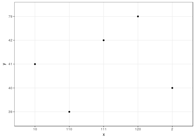
    separate(location, sep = ",",into = c('x', 'y')) %>% 
    ggplot(aes(x = x, y = y)) +
    geom_point() +
    theme_bw()

Created on 2019-02-02 by the reprex package (v0.2.1)

1 Like

This topic was automatically closed 21 days after the last reply. New replies are no longer allowed.

If you have a query related to it or one of the replies, start a new topic and refer back with a link.