Dear all,
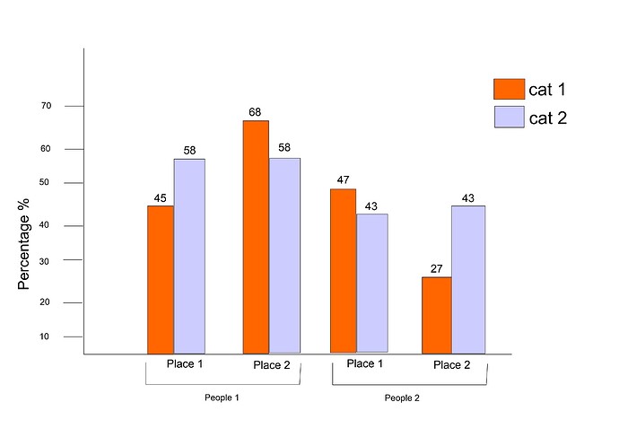
I am completely a beginner to R programming but I can understand if I get help. I need to make a dodged bar graph using multple CSV files, around 4 files. I need to combine them to make a graph similar to in the representation added below. I want to plot the count of each file in the same graph as percentages in the x-axis and add only labels to the y-axis.
I am attaching a single .csv data here in the codes.Similarly, I have to add 3 more sets to the project. I need to consider only the Type field.
I would be really helpful if anyone could give me a fix for this.
Thank you for your patience
library(datapasta)

Ascending_VV <- tibble::tribble(
~FID, ~SourceID,        ~Type,
   0,         1, "Lineaments",
   1,         3, "Lineaments",
   2,         4, "Lineaments",
   3,         5, "Lineaments",
   4,         6, "Lineaments",
   5,         7, "Lineaments",
   6,         8, "Lineaments",
   7,         9, "Lineaments",
   8,        10, "Lineaments",
   9,        11, "Lineaments",
  10,        12, "Lineaments",
  11,        14, "Lineaments",
  12,        15, "Lineaments",
  13,        16, "Lineaments",
  14,        17, "Lineaments",
  15,        18, "Lineaments",
  16,        19,  "Artifacts",
  17,        20, "Lineaments",
  18,        26, "Lineaments",
  19,        27, "Lineaments",
  20,        28,  "Artifacts"
)
head(Ascending_VV)
#> # A tibble: 6 x 3
#>     FID SourceID Type
#>   <dbl>    <dbl> <chr>
#> 1     0        1 Lineaments
#> 2     1        3 Lineaments
#> 3     2        4 Lineaments
#> 4     3        5 Lineaments
#> 5     4        6 Lineaments
#> 6     5        7 Lineaments
