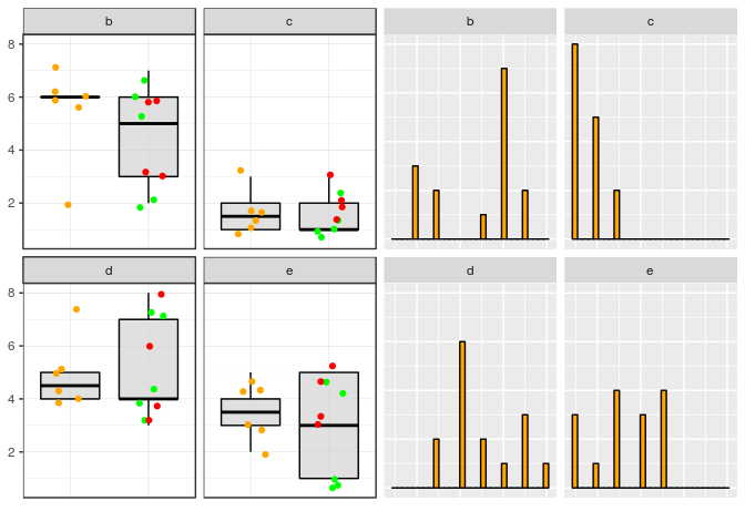
I'm somewhat new to R and have tried to create a code that helps me loop trough a large dataset and thereby produce 2 graphs per column. In doing so it has to take into account some specified variables and differentiate between them (see code). In the first graph it should make a boxplot/scatterplot where I need to differentiate between the control and the diseased cohort. in addition to that I want to see the difference between people with an event vs no event.
This is actually the code that does work. I now what to add a code where I combine that graph with a histogram of the variable so I can have some clue about the distribution of the data. I tried to add that to the function but that somehow does not work
In addition I would like to combine both graphs into 1 page and in the end loop through the whole set of variables and save it as an image (see code)
please find below the code I have so far. Any suggestions are very much appreciated
library(ggplot2)
library(purrr)
Create a dataframe with random numbers and 2 groups
group <- c("Control","PAD","Control","PAD","PAD", "Control","PAD","Control","PAD","PAD", "Control","PAD","Control","PAD","PAD")
b <- round(runif(15, 1, 7))
c <- round(runif(15, 1, 3))
d <- round(runif(15, 3, 8))
e <- round(runif(15, 1, 5))
event <- c("no event", "event" , "no event" , "no event" , "no event", "no event", "event", "no event", "no event" , "no event" , "no event" , "no event", "no event", "event", "event")
Join the variables to create a data frame
df <- data.frame(group, b,c,d, e, event)
df

rm(group, b, c, d, e, event)
make a new color that gives a specific color the the labels (used # for color labeling the groups in 1 graph)
df$color <- "color"
for (i in 1:dim(df)[1]){
  if (df$group[i]=="Control") {
    df$color[i] <- "Control" # in de column PAD, if the control is control give the color the string "control"
  }
}
for (i in 1:dim(df)[1]){
  if (df$group[i] == "PAD" && df$event[i] == "event") {
    df$color[i] <- "PAD with event" # in de column PAD, if the PAD has event give the color the string "event"
  }
}
for (i in 1:dim(df)[1]){
  if (df$group[i] == "PAD" && df$event[i] == "no event") {
    df$color[i] <- "PAD without event"
  }
}
rm(i)
pull the names out by index create 1 explanatory variable used as explanatory value (column 1)
expl = names(df[1])
used for looping through the columns 2:5
response = names(df[2:5])
use named vectors
response = set_names(response)
response

expl = set_names(expl)
expl
scatterplot the first part of the functions works PART 1 of the function
scatter_fun = function(x, y) {
  ggplot(df, aes(x = .data[[x]], y = .data[[y]], color=color) ) +
    geom_boxplot(fill="lightgrey", colour= "black", alpha=0.7,
                 outlier.shape=NA) +


geom_point(position = position_jitter(0.2)) +
    scale_color_manual(values= c("Control"="Orange", "PAD with event" = "Red", "PAD without event"="Green")) + # color the values as as you please
    labs(x = "",
         y = y,
         caption = "") +
    theme_bw() +
    theme(panel.grid.major = element_line(size = 0.1, linetype = 'solid',
                                          colour = "grey"),
          panel.grid.minor = element_line(size = 0.05, linetype = 'solid',
                                          colour = "grey"),

          legend.title = element_blank(),
          legend.text = element_text(size=13),
          legend.key.size = unit(3,"line"))
PART 2 of the function (which does not work) add a histogram to the function this is the part where it gets complicated to me. I want to get 3 things out of the function 1 the upper part that gives me a boxplot combined with a scatter plot 2 the part below where I want to have the histogram of the looped column (in this case b) to get a feeling about the distribution of the value 3 With the function in the end I would like to transfer both columns on one page two a PDF file while looping through the columns to get an idea of what is going on this plot can be removed and the example below can be used to get an example add a histogram to the function
ggplot(df, aes(x =.data[[x]])) +
    geom_histogram(fill="Orange", color="black", stat = "count")

}
example of how it works when you just specify the name of the column
loopplots = map(expl, ~scatter_fun(.x, "b") )
loopplots
when I run this it separates control and PAD however I don't want them to be separated but just want an overall idea of the distribution of both groups together
the whole loop: when I run this part it saves only the latter part of the function
event_vs_no_event = map(response,
                        ~map(expl, scatter_fun, y = .x) )
check what is saved on b
event_vs_no_event$b
save all the images into 1 PDF --> here I want to have both the histogram and the scatter plot corresponding to 1 column save into 1 page.
pdf("event_vs_no_event.pdf")
event_vs_no_event
dev.off()
