Hi all!
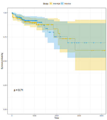
I don't know how to interpret this plot. Patients with low-TMB had a better prognosis? What does mean p=0.71?
You have not shown the code that produced the plot, so this answer is my best guess.
The lines in the plot show the derived survival probabilities and the colored bans show the calculated X% confidence intervals on those values where X is probably 95. If the experiment was run many times, we would expect that the "true" survival probabilities would be within the confidence interval X% of the time. Since the confidence intervals of the curves have a lot of overlap, we cannot tell whether the "true" value of one curve is higher or lower than the value of the other curve.
The value labeled p is meant to answer the following question. "Assume that the two populations have the same survival probability. If the experiment were run many times, what fraction of the time would the observed difference be at least as extreme as the difference that was observed in the actual experiment?" The answer is that the difference would be as large or larger than the one you observed 71% of the time. In other words, the observed difference is not inconsistent with the assumption that the survival probabilities are equal. The survival probabilities could be equal and produce similar data frequently.
Keep in mind that I constructed those answers without knowing how the plot was made. Think carefully about whether they make sense.
Oh, im sorry, here is the code:
km <- survfit(Surv(days_to_last_follow_up, vital_status)~tmb, data=new)
ggsurvplot(km,
pval = TRUE, conf.int = TRUE,
linetype = "strata",
surv.median.line = "hv",
ggtheme = theme_bw(),
palette = c("#E7B800", "#2E9FDF"))
I think my previous comments remain valid.
Hi!
A great resource for survival analysis in R is this tutorial from Emily Zabor: Survival Analysis in R
I highly recommend it!
As far as the example you showed, the p-value is from a log-rank test. My interpretation of that result would be: “these groups have similar survival estimates”
I don’t know what method was used to group TMB high and low, but I am guessing that the continuous TMB variable maybe have been split by the median value. You might consider instead splitting into three groups (tertiles) to visualize the KM and also using coxph to test the effect of TMB as a continuous variable.
Thanks for all your guidance, really helped ![]()
This topic was automatically closed 21 days after the last reply. New replies are no longer allowed.
If you have a query related to it or one of the replies, start a new topic and refer back with a link.
