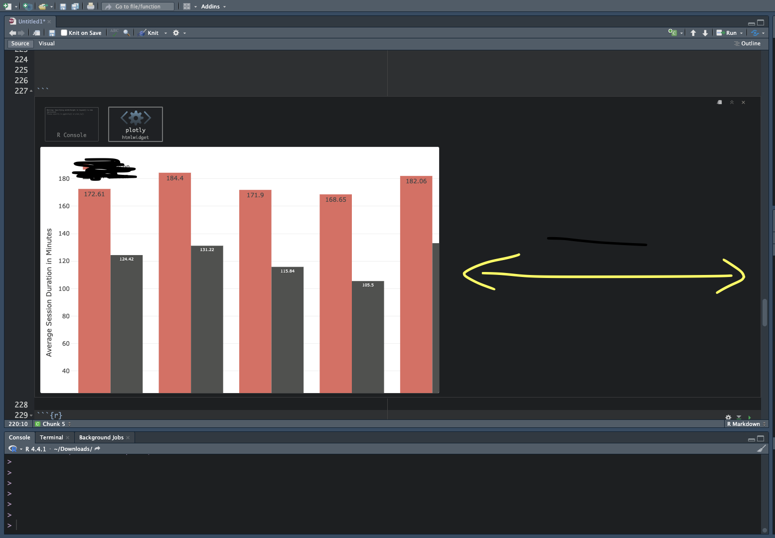
Hi I created a plotly bar chart. However the result which is displayed horizontally getting cut. How can I increase the plot pane so that I can view the whole chart in a single view ?
season_grouped <- season_clean %>%
  group_by(session_start_dow) %>%
  summarise(session_duration = mean(session_duration)) %>%
  arrange(factor(session_start_dow, levels = day_order))

off_season_grouped <- off_season_clean %>%
  group_by(session_start_dow) %>%
  summarise(session_duration = mean(session_duration)) %>%
  arrange(factor(session_start_dow, levels = day_order))


fig <- plot_ly() %>%
  add_trace(x = season_grouped$session_start_dow,
            y = season_grouped$session_duration,
            name = 'Season',
            type = 'bar',
            marker = list(color = '#e16a60'),
            text = round(tax_season_grouped$session_duration, 2),
            textposition = 'inside',
            textfont = list(size = 12)) %>%
  add_trace(x = off_season_grouped$session_start_dow,
            y = off_season_grouped$session_duration,
            name = 'Off Season',
            type = 'bar',
            marker = list(color = '#50514F'),
            text = round(off_season_grouped$session_duration, 2),
            textposition = 'inside',
            textfont = list(size = 8))


fig <- fig %>%
  layout(barmode = 'group',
         xaxis = list(title = 'Day of Week', tickangle = 0),
         yaxis = list(title = 'Average Session Duration in Minutes'),
         width = 1200,
         height = 600,
         legend = list(yanchor = "top", y = 1, xanchor = "left", x = 0.01))


# Show the plot
fig