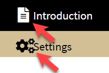
I am new to Rshiny Dashbaord creation and want to increase the padding/margin between the icon and the tabname as appearing in the sidebar menu of my Rshiny dashboard. How can this be done?
Please provide help.
Hi, you could probably do it by adding some CSS to it.
A reproducible example would be useful.

thanks for the reply but I am not sure if I understood it. I am using the following css code and want to add more space as marked by the arrow in snapshot:
/* Sidebar */
.skin-blue .main-sidebar {
background-color: #d3bf96;
font-size: 15px;
}
/* Sidebar other items */
.skin-blue .main-sidebar .sidebar a{
color: #000000;
}
/* Sidebar when active/hover */
.skin-blue .main-sidebar .sidebar .sidebar-menu a:hover ,
.skin-blue .main-sidebar .sidebar .sidebar-menu .active a{
background-color: #000000;
color: #ffffff;
padding-top: 10px;
padding-left: 20px;
padding-bottom: 10px;
display: block;
border-color: transparent;
}
It is hard to tell without actually playing around with the app. It looks like you have a decent grasp on CSS.
This topic was automatically closed 54 days after the last reply. New replies are no longer allowed.
If you have a query related to it or one of the replies, start a new topic and refer back with a link.