how to improve the appearance of this network graph using ggraph?

I have this data set here:

library(igraph)

data = structure(list(Adenocalymma_adenophorum = c(NA, 0, 0, 0, 0.003122927, 
0.00999241, 0.008685473, 0.007730365, 0, 0, 0, 0, 0, 0, 0, 0, 
0, 0.003573423, 0, 0, 0, 0, 0), Adenocalymma_cf_bracteosum = c(0L, 
NA, 0L, 0L, 0L, 0L, 0L, 0L, 0L, 0L, 0L, 0L, 0L, 0L, 0L, 0L, 0L, 
0L, 0L, 0L, 0L, 0L, 0L), Adenocalymma_flaviflorum = c(0L, 0L, 
NA, 0L, 0L, 0L, 0L, 0L, 0L, 0L, 0L, 0L, 0L, 0L, 0L, 0L, 0L, 0L, 
0L, 0L, 0L, 0L, 0L), Adenocalymma_japurensis = c(0L, 0L, 0L, 
NA, 0L, 0L, 0L, 0L, 0L, 0L, 0L, 0L, 0L, 0L, 0L, 0L, 0L, 0L, 0L, 
0L, 0L, 0L, 0L), Adenocalymma_longilinium = c(0.18893711, 0, 
0, 0, NA, 0.183237263, 0.139293056, 0.120902907, 0, 0, 0, 0, 
0, 0, 0, 0, 0, 0, 0, 0.132071652, 0, 0.457142857, 0.114500717
), Adenocalymma_moringifolium = c(0.322255215, 0, 0, 0, 0.097676062, 
NA, 0.261095249, 0.131416203, 0, 0, 0, 0, 0, 0, 0, 0, 0, 0, 0.146191646, 
0, 0, 0, 0), Adenocalymma_neoflavidum = c(0.086854728, 0, 0, 
0, 0.023023646, 0.080959767, NA, 0.034786642, 0, 0, 0, 0, 0, 
0, 0, 0, 0, 0, 0, 0, 0, 0, 0), Adenocalymma_tanaeciicarpum = c(0.09469697, 
0, 0, 0, 0.024480341, 0.049917782, 0.042613636, NA, 0, 0, 0, 
0, 0, 0, 0, 0, 0, 0, 0.255554962, 0, 0, 0, 0), Amphilophium_parkeri = c(0L, 
0L, 0L, 0L, 0L, 0L, 0L, 0L, NA, 0L, 0L, 0L, 0L, 0L, 0L, 0L, 0L, 
0L, 0L, 0L, 0L, 0L, 0L), Anemopaegma_robustum = c(0L, 0L, 0L, 
0L, 0L, 0L, 0L, 0L, 0L, NA, 0L, 0L, 0L, 0L, 0L, 0L, 0L, 0L, 0L, 
0L, 0L, 0L, 0L), Bignonia_aequinoctialis = c(0L, 0L, 0L, 0L, 
0L, 0L, 0L, 0L, 0L, 0L, NA, 0L, 0L, 0L, 0L, 0L, 0L, 0L, 0L, 0L, 
0L, 0L, 0L), Bignonia_prieurei = c(0L, 0L, 0L, 0L, 0L, 0L, 0L, 
0L, 0L, 0L, 0L, NA, 0L, 0L, 0L, 0L, 0L, 0L, 0L, 0L, 0L, 0L, 0L
), Calichlamys_latifolia = c(0L, 0L, 0L, 0L, 0L, 0L, 0L, 0L, 
0L, 0L, 0L, 0L, NA, 0L, 0L, 0L, 0L, 0L, 0L, 0L, 0L, 0L, 0L), 
    Fridericia_cf_trailli = c(0, 0, 0, 0, 0, 0, 0, 0, 0, 0, 0.765625, 
    0, 0, NA, 0, 0, 0, 0, 0, 0, 0, 0, 0), Fridericia_chica = c(0L, 
    0L, 0L, 0L, 0L, 0L, 0L, 0L, 0L, 0L, 0L, 0L, 0L, 0L, NA, 0L, 
    0L, 0L, 0L, 0L, 0L, 0L, 0L), Fridericia_cinamomea = c(0L, 
    0L, 0L, 0L, 0L, 0L, 0L, 0L, 0L, 0L, 0L, 0L, 0L, 0L, 0L, NA, 
    0L, 0L, 0L, 0L, 0L, 0L, 0L), Fridericia_nigrescens = c(0L, 
    0L, 0L, 0L, 0L, 0L, 0L, 0L, 0L, 0L, 0L, 0L, 0L, 0L, 0L, 0L, 
    NA, 0L, 0L, 0L, 0L, 0L, 0L), Fridericia_prancei = c(0.040201005, 
    0, 0, 0, 0, 0, 0, 0, 0, 0, 0, 0, 0, 0, 0, 0, 0, NA, 0, 0, 
    0, 0, 0), Fridericia_triplinervia = c(0, 0, 0, 0, 0, 0.041930937, 
    0, 0.192970073, 0, 0, 0, 0, 0, 0, 0, 0, 0, 0, NA, 0, 0, 0, 
    0), Pachyptera_aromatica = c(0, 0, 0, 0, 0.030562035, 0, 
    0, 0, 0, 0, 0, 0, 0, 0, 0, 0, 0, 0, 0, NA, 0, 0, 0), Pleonotoma_albiflora = c(0L, 
    0L, 0L, 0L, 0L, 0L, 0L, 0L, 0L, 0L, 0L, 0L, 0L, 0L, 0L, 0L, 
    0L, 0L, 0L, 0L, NA, 0L, 0L), Pleonotoma_melioides = c(0, 
    0, 0, 0, 0.151121606, 0, 0, 0, 0, 0, 0, 0, 0, 0, 0, 0, 0, 
    0, 0, 0, 0, NA, 0.039751553), Tynanthus_panurensis = c(0, 
    0, 0, 0, 0, 0.026693325, 0, 0, 0, 0, 0, 0, 0, 0, 0, 0, 0, 
    0, 0, 0, 0, 0.011428571, NA)), class = "data.frame", row.names = c("Adenocalymma_adenophorum", 
"Adenocalymma_cf_bracteosum", "Adenocalymma_flaviflorum", "Adenocalymma_japurensis", 
"Adenocalymma_longilinium", "Adenocalymma_moringifolium", "Adenocalymma_neoflavidum", 
"Adenocalymma_tanaeciicarpum", "Amphilophium_parkeri", "Anemopaegma_robustum", 
"Bignonia_aequinoctialis", "Bignonia_prieurei", "Calichlamys_latifolia", 
"Fridericia_cf_trailli", "Fridericia_chica", "Fridericia_cinamomea", 
"Fridericia_nigrescens", "Fridericia_prancei", "Fridericia_triplinervia", 
"Pachyptera_aromatica", "Pleonotoma_albiflora", "Pleonotoma_melioides", 
"Tynanthus_panurensis"))

View (data)

class (data)

data= data.matrix(data, rownames.force = NA) # 
class (data)

network <- graph_from_adjacency_matrix (data)

Graph construction:

library(ggraph)

ggraph(graph,layout = "circle")+
  geom_node_point(shape=19, size=3)+
  geom_node_text(aes(size =40, label = name),family="serif")+
  geom_edge_link0(aes(edge_width = weight),edge_colour = "black",
arrow = arrow(angle = 30, length = unit(2, "mm"),
ends = "last", type = "closed"))+
scale_fill_manual()+
scale_edge_width(range = c(0.2,2))+
scale_size(range = c(1,10))+
theme_graph()+
theme(legend.position = "none")

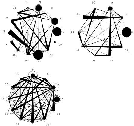
I tried to make my graph look like this one:

However, I’ve been trying for a few hours, but I haven’t been able to:

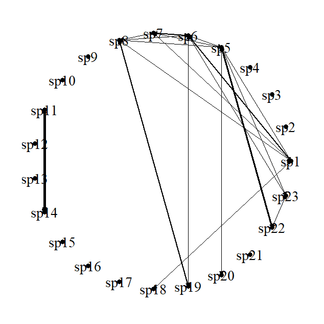
  1. increase the nodes according to their values (I managed to do this using the igraph, but not using the ggraph, I migrated to the ggraph because I was not able to change the width of the edges according to their values by the igraph);
  2. Modify the location of the label vertex so that it is visible;

Thank you in advance to anyone who can help me. If you know how to change the width of the edges according to their values through the igraph, it can also be. I think my chart is a little bit more advanced by igraph.

Hi! And welcome to the forum,

I see that the question is still open. Apologies for late answer, but I had to look into some documentation as well. For networks graphs, R is not always friendly to find the right plotting options. As for myself, I only incidentally use network graphs, and never the circular type, I used your data, but lead it through my own workflow. In this case I started with a tidy tibble and use tidygraph to make the node and edge frames.

Some remarks

  • seizing the nodes requires seizing information. There is none in your data, I could see. I use a centrality-measure in this case (squared it to make the differences more pronounced, but up to you)
  • I don't know the edge type used in your example graphs. I tweaked the arrow-parameters a bit, but in your case you have double arrows, which make it fuzzy. Therefore, it looks a bit ugly
  • plotting the labels ouside the circle, I could not find anything in the documentation of ggraph to do so. A way to work around this is to extract the x-y-coordinates using layer_data() from ggplot() and then just make a new tibble where you extend the 'circle'. See code-chunck below on node_circle <- ... Tune yourself with the parameters to get the plot size you want.
  • Your label names are long, so I needed to tweak with the plot area and switching of clip in the coordinate frame-work

It still is not where you want to be, but hopefully this gives you some hooks how to tune either data or code to bring you closer to what you want to achieve.

JW

#my workflow
#make data tidy
require(tidygraph,warn.conflicts = FALSE)
#> Loading required package: tidygraph
#> Warning: package 'tidygraph' was built under R version 4.0.5
require(ggraph, warn.conflicts = FALSE)
#> Loading required package: ggraph
#> Warning: package 'ggraph' was built under R version 4.0.5
#> Loading required package: ggplot2
#> Warning: package 'ggplot2' was built under R version 4.0.3
require(igraph, warn.conflicts = FALSE)
#> Loading required package: igraph
#> Warning: package 'igraph' was built under R version 4.0.3
require(dplyr, warn.conflicts = FALSE)
#> Loading required package: dplyr
#> Warning: package 'dplyr' was built under R version 4.0.4
require(tibble, warn.conflicts = FALSE)
#> Loading required package: tibble
#> Warning: package 'tibble' was built under R version 4.0.4
require(tidyr, warn.conflicts = FALSE)
#> Loading required package: tidyr
#> Warning: package 'tidyr' was built under R version 4.0.4

#restructure your data in a tidy tibble
tidy_data <- data %>% rownames_to_column() %>% 
                      as_tibble() %>% 
                      pivot_longer(2:24, names_to = "species", values_to = "value") %>% 
                      filter(!is.na(value), value>0)   #leave out the ones with no edges
graph_data <- as_tbl_graph(tidy_data)

#first make a simple graph to have the basic plotting 

my_simple_graph <- graph_data %>% ggraph(layout = "linear", circular = TRUE)+
    geom_node_point(aes(size = centrality_degree()^2 ))+
    geom_edge_link0(aes(width = value*10),colour = "black") + 
    theme_void()+
    theme(legend.position = "none")

#extract the node-values from the circle and extend outside
node_circle <- layer_data(my_simple_graph, i=1L ) %>% 
                left_join(my_simple_graph$data) %>% 
               select(x,y,name) %>% 
               transmute(label = name,
                           xe = sqrt(1.2)*x,         #move outwards by 10% 
                           ye = sqrt(1.2)*y,         
                           hjust = if_else(xe > 0, 0, 1), #left or right h_just depending on circle position
                           vjust = if_else(ye > 0, 1, -1))
#> Joining, by = c("x", "y")

my_graph <- graph_data %>% ggraph(layout = "linear", circular = TRUE)+
    geom_node_point(aes(size = centrality_degree()^2 ))+
    #geom_node_text(aes(size =6, label = name),family="serif")+
    geom_edge_link0(aes(width = value*10),colour = "black", 
                    arrow = arrow(angle = 2, length = unit(4,"cm"),
                                  ends = "last", type = "closed")) +
    scale_size(range = c(1,10))+
    theme_void()+
    theme(legend.position = "none")


my_graph + geom_text(aes(x = xe, y = ye,label = label, hjust = hjust, vjust = vjust ),
                     size = 4, family="serif", data = node_circle) +
          coord_cartesian(ylim = c(-1.1, 1.1), xlim = c(-1.2, 1.2), clip = "off") +
          theme(plot.margin = margin(0,1.5,0,1.5,"cm"))

Wow, thank you very much! You helped me a lot! I'm making the adjustments and I've already reduced the size of the vertex labels to make them more organized.
I will put you in the thanks of my dissertation. :slight_smile:

Carol

Oh, much obliged... but I hope you'll be able to tune it towards a more appealing one :blush:. May I ask you to please check this question for being solved?

All the best with your dissertation!

Cheers, JW

This topic was automatically closed 7 days after the last reply. New replies are no longer allowed.

If you have a query related to it or one of the replies, start a new topic and refer back with a link.