How to ggplot a stacked and dodge bar chart in one?

FINAL %>%
  ggplot(aes(x = V1, y = as.numeric(V3)/1000000, fill = V2)) + 
  geom_bar(stat= "identity", position = "dodge") + 
  labs(x=NULL, y=NULL, fill = NULL) +
  theme_classic() +
  theme(legend.position = c(0.9,0.8))
  scale_fill_grey() 

FINAL: (V1: are categories, V2: are years, V3/V4/V5 are numbers)

As you can see I created a dodge barplot. But now I would like that for each year the variables V3 (it's already in) V4 and V5 (also numbers similar to V3) are stacked on top of each other so that one year eaquals V3+V4+V5 (but that the differentiation between V3,V4 and V5 is still visible so not just sum them together and make another dodge plot).

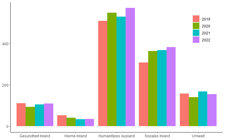
I hope I could explain it good enough, thanks a lot

Please post the output of

dput(FINAL)

so others can use your data.

I don't know how to do this without some manual calculations and then using geom_rect(). Here is a sketch of one method.

#Invent data
set.seed(123)
DF <- data.frame(V1 = rep(c("A","B"), each = 12),
                 V2 = rep(c(2019,2020,2021,2022),6),
                 V3 = runif(24, min = 1, max = 2),
                 V4 = rep(rep(c("X","Y","Z"), each = 4),2))
library(dplyr)
#> 
#> Attaching package: 'dplyr'
#> The following objects are masked from 'package:stats':
#> 
#>     filter, lag
#> The following objects are masked from 'package:base':
#> 
#>     intersect, setdiff, setequal, union
library(ggplot2)
DFsumm <- DF |> group_by(V1,V2) |>  arrange(V1, V2, V4) |> 
  mutate(Total = cumsum(V3), 
         Offset = lag(Total), 
         Offset = ifelse(is.na(Offset),0,Offset)
         ) |> 
  ungroup() |> 
  mutate(MainX = as.numeric(factor(V1)),
         Jog = case_when(
           V2 == 2019 ~ -0.3,
           V2 == 2020 ~ -0.1,
           V2 == 2021 ~ 0.1,
           V2 == 2022 ~ 0.3),
         Xoffset = MainX + Jog)

ggplot(DFsumm, aes(xmin = Xoffset - 0.1, xmax = Xoffset + 0.1, 
                   ymin = Offset, ymax = Total, fill = as.factor(V2),
                   alpha = V4)) + 
  geom_rect(color = "black") +
  scale_alpha_manual(values = c(X = 0.4, Y = 0.75, Z = 1)) +
  scale_x_continuous(breaks = c(1,2), labels=c("A","B"))

Created on 2023-09-28 with reprex v2.0.2

I was wondering, if a solution might be to do two graphs, a stacked graph for Gesundheit & Heime island and another for the other three sites and glue them together with something like {patchwork} or {cowplot}.

We really need to see some data. A handy way to supply some sample data is the dput() function. In the case of a large dataset something like dput(head(mydata, 100)) should supply the data we need. Just do dput(mydata) where mydata is your data. Copy the output and paste it here.

This topic was automatically closed 42 days after the last reply. New replies are no longer allowed.

If you have a query related to it or one of the replies, start a new topic and refer back with a link.