How to get data labels on a bar plot of means

Dear Community,

I need your help!

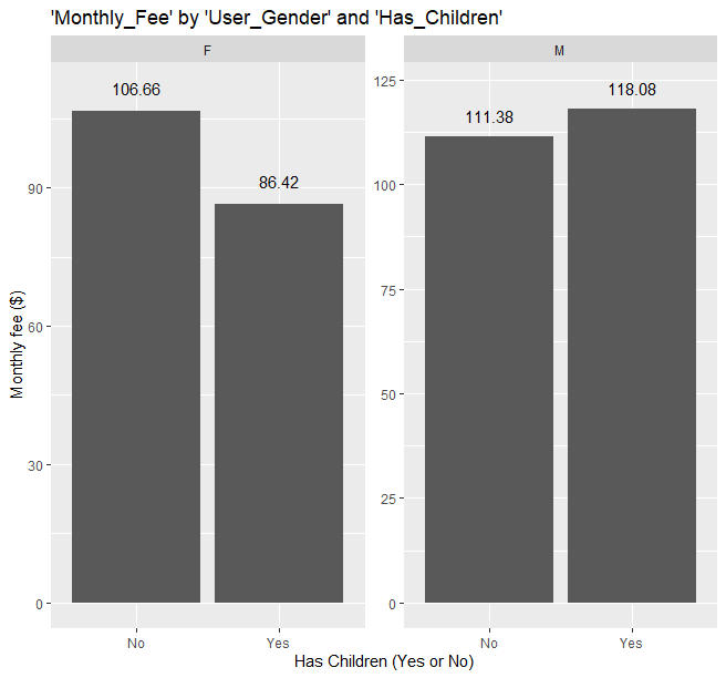
I want to add labels to a bar plot of the average 'Monthly_Fee' grouped by 'User_Gender' and 'Has_Children'. This means that we are dealing with a continuous dependent variable and two binary independent variables. I would really appreciate your input on how to add data labels on top of the bars showing the mean for each group.

I have used the following code to generate the bar plot:

plot_001 <- ggplot(data = df, mapping = aes(x = Has_Children, y = Monthly_Fee)) +
geom_bar(stat = "summary", fun = "mean") +
labs(title = "'Monthly_Fee' by 'User_Gender' and 'Has_Children'", x = "Has Children (Yes or No)", y = "Monthly fee ($)",) +
facet_wrap(vars(User_Gender), scales = "free", nrow = 1, strip.position = "top")

plot_001

I have tried to add the following code in order to add the data labels: "geom_text(aes(label = Monthly_Fee)) +". However, it is displaying data labels for ALL rows in the dataset, which is not preferred as I only want it to display the mean value for the group.

Thanks!
Have you looked at geom_text and/or geom_label ?

Hi,

Thanks for your answer. Yes, I have and I just edited my post by adding the following:

I have tried to add the following code in order to add the data labels: "geom_text(aes(label = Monthly_Fee)) +". However, it is displaying data labels for ALL rows in the dataset, which is not preferred as I only want it to display the mean value for the group.

I would separate the calculations out from the plotting for full control.
You have provided code but not data so your example is not easily reproducible.

library(tidyverse)

# example data as wasnt provided
(df <- expand_grid(Has_Children=c("Yes","No"),
                   User_Gender=c("M","F"),
                   rnum = 1:3) %>% mutate(Monthly_Fee=rnorm(12,100,25)))

# solution
(smry_df <- group_by(df,
                    Has_Children,
                    User_Gender) %>% summarise(mean_fee = mean(Monthly_Fee)))
ggplot(smry_df,
       mapping=aes(x = Has_Children, y = mean_fee)) +
  geom_col() +
  labs(title = "'Monthly_Fee' by 'User_Gender' and 'Has_Children'", x = "Has Children (Yes or No)", y = "Monthly fee ($)",) +
  facet_wrap(vars(User_Gender), scales = "free", nrow = 1, strip.position = "top") +
  geom_text(aes(label = scales::comma(mean_fee,accuracy = 0.01)),nudge_y = 5)

For the future ; you can share your data in a forum friendly way by passing the data to share to the dput() function.
If your data is too large you can use standard methods to reduce it before sending to dput().
When you come to share the dput() text that represents your data, please be sure to format your post with triple backticks on the line before your code begins to format it appropriately.

```
( example_df <- structure(list(Sepal.Length = c(5.1, 4.9, 4.7, 4.6, 5, 5.4, 4.6, 
5, 4.4, 4.9), Sepal.Width = c(3.5, 3, 3.2, 3.1, 3.6, 3.9, 3.4, 
3.4, 2.9, 3.1), Petal.Length = c(1.4, 1.4, 1.3, 1.5, 1.4, 1.7, 
1.4, 1.5, 1.4, 1.5), Petal.Width = c(0.2, 0.2, 0.2, 0.2, 0.2, 
0.4, 0.3, 0.2, 0.2, 0.1), Species = structure(c(1L, 1L, 1L, 1L, 
1L, 1L, 1L, 1L, 1L, 1L), .Label = c("setosa", "versicolor", "virginica"
), class = "factor")), row.names = c(NA, -10L), class = c("tbl_df", 
"tbl", "data.frame")))
```
1 Like

Thank you so much! It solved my problem.

This topic was automatically closed 7 days after the last reply. New replies are no longer allowed.

If you have a query related to it or one of the replies, start a new topic and refer back with a link.