#How to Exclude Variable Observations
##Household Survey
###Honduran Bean Producers 2012
######Data set is: HND_plotlevel_Sec_B_df
#>*trying to take data set and get a bar graph of observations of variable B36, specifically when those observations record values of 1,2,3,4,5,6, 7, and 99 - these eight options were the only values the survey gave as options.*
HND_plotlevel_Sec_B_df %>%
  filter(B36 !="8-98") %>%
  geom_bar(mapping=aes(x=B36))
#>I tried to exclude values of 8 thru 98 hoping that would leave me with only the ones I want listed above (1,2,3,4,5,6,7,99), but that don't seem to work. And when I plot without the filter function, it gives me a huge spread on the x axis which makes the bar graph look dumb. It'd be great to just compare the frequency of these specific observation values (1,2,3,4,5,6,7,99)
library(ggplot2)
#> Warning: package 'ggplot2' was built under R version 4.3.1
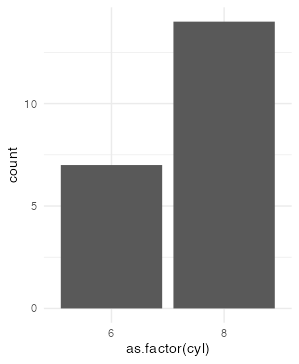
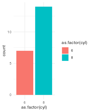
mtcars |>
dplyr::filter(cyl != 4) |>
ggplot(aes(as.factor(cyl))) +
geom_bar() +
theme_minimal()
lets do a quick review of some R basics.
"8-98" is just a string, whose contents is 8-98
without the string quotations it would be arithmatic subtracting 98 from 8
to make a sequence over integers in R, there is a particular syntax involving colon (and more syntax using seq())
equality testing via == and != is vectorised so that one thing on the left will be evaluated against all the things on the right, and multiple TRUE/FALSE would be given, you could apply a summaristation to this in two general ways
#compare and contrast
"8-98"
8-98
8:98

# 3 more statements to look at
9 != 8:98
!any(9 == 8:98)
! (9 %in% 8:98)
Yo this totally worked! Thank you so much. Last night when I saw this I couldn't make sense of it at first - it was like a fast ball whizzing right above my head. But I plugged it all in this morning and it gave me the precise chart that I was looking for. Thanks so much!!!