How to ensure R renders plot exactly like RStudio

Hello everyone.

I'm trying to find out how exactly RStudio renders plots for the preview window.

My issue is that my plots look great in the preview, but if I export them using functions such as png, svg and dev.off(), there is always something off. Text labels are large and clear in the RStudio window, but small and blurry in the file resulting from using png and dev.off(). See attached image

Is there a function or argument letting me render an .svg or .png file exactly the way RStudio does it?
Or alternatively, is there a way to automate saving the images from the RStudio preview window using code?

Thanks in advance for your help

1 Like

Hi @mschrumpf

Did you try ggsave() function? When I recall correctly it defaults to the view-parameters and hence should render approximately the same graph. Next to this it accepts many parameters to fine tune details. It renders svg.

In general plot correspondence between different graphic devices is a vastly discussed topic with many threads on stackoverflow

Hope this helps you going and welcome!

JW

2 Likes

Hi @Jwvz001
thank you for your reply.
I tried out ggsave(), but it doesn't seem to do anything. Here's my code, for reference

tab3 <- prop.table(with(d, table(ContType, Block, Connective)), c(2,3))
farben=brewer.pal(n = 7, name = "Set2")
#svg("figures/percentage_continuation_types.png", width=10, height=5, bg="transparent")
#png("figures/percentage_continuation_types2.png", width=800, height=600, bg="transparent")
layout(m <- matrix(c(1,2,2,3,3), ncol=5, byrow = TRUE))
par(mar=rep(.5, 4), family="liberationserif")
plot(1,1, type="n", axes=F, ann=F)
legend("left", legend=levels(d$ContType),
       fill=farben, bty="n", cex=1.5)
par(mar=c(4,5,3,2))
barplot(tab3[,,1], main="full stop", ylim=c(0,1), col=farben,
        las=1, mar=2, ylab="Percentage of type of continuation", 
        cex.axis=1.3, cex.names=1.5, cex.lab=1.5, cex.main=1.6)
barplot(tab3[,,2], main="because (weil)", ylim=c(0,1), col=farben,
        las=1, mar=2, ylab="Percentage of type of continuation", 
        cex.axis=1.3, cex.names=1.5, cex.lab=1.5, cex.main=1.6)
ggsave("percentage_continuation_types_gg.png", 
  plot = last_plot(), path ="/home/path/partially/obscured/figures/")
#dev.off()

#png("figures/percentage_continuation_types.png", width=785, height=346, bg="transparent")
svg("figures/percentage_continuation_types.png", width=10.5, height=4.8, bg="white")
layout(m <- matrix(c(1,2,2,3,3), ncol=5, byrow = TRUE))
par(mar=rep(.5, 4), family="liberationserif")
plot(1,1, type="n", axes=F, ann=F)
legend("left", legend=levels(d$ContType),
       fill=farben, bty="n", cex=1.5)
par(mar=c(4,5,3,2))
barplot(tab3[,,1], main="full stop", ylim=c(0,1), col=farben,
        las=1, mar=2, ylab="Percentage of type of continuation", 
        #cex.axis=1.7, cex.names=1.9, cex.lab=1.9, cex.main=2)
        cex.axis=1.3, cex.names=1.5, cex.lab=1.5, cex.main=1.6)
barplot(tab3[,,2], main="because (weil)", ylim=c(0,1), col=farben,
        las=1, mar=2, ylab="Percentage of type of continuation", 
        cex.axis=1.3, cex.names=1.5, cex.lab=1.5, cex.main=1.6)
        #cex.axis=1.7, cex.names=1.9, cex.lab=1.9, cex.main=2)
dev.off()

where "/home/path/partially/obscured/figures/" is a valid path to a directory where all other files are saved as well.

I have noticed that the RStudio preview will not render text consistently. For example, in the attached image, the y-axis label on the left looks fine, whereas the one on the right looks blurry:

Is there a way to fix this?
Failing that, I'm going to have to rely on the functions I mentioned above.

I am a little confused about the inner workings of the RStudio plot preview. I have searched far and wide online and I could find no settings or configurations that influence its behavior. I could not find anything on how to reproduce its exact behavior in code either. That being the state of things, I'm wondering: What is the point of even having the preview window?
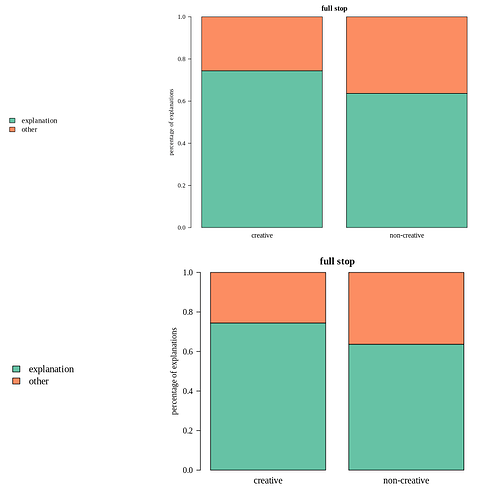
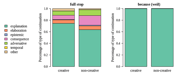
Just treat the preview as guidance. Concentrate on getting saved outputs to look right.

The preview doesn't always work properly depending on which packages are used to generate the plot and/or to render the fonts.

1 Like

Hi @mschrumpf,

I'm overasked by the way RStudio internally communicates with graphic devices.

Regarding your code, I notice that you use base-R barplot to build the plot. Why not ggplot? I briefly checked making a barplot. Using ggplot() and saving wth ggsave() gives same result. Using barplot () however gives a blanc sheet (?)

JW

1 Like

Why not ggplot? Because I just created a few plots using barplot and I would like to avoid starting all over again using a completely different methodology.

@martin.R thank you for your reply.
Yes, that's what I'm learning right now. It's just a much more clunky workflow to go to the file browser and open the output file every time you make adjustments to a plot, as opposed to just looking at the preview window right in RStudio.

Do you happen to know which packages and functions the preview integrates well with?

I see.

Found an old question on Stackoverflow. Maybe the answers provide some direct help.

Good luck,

JW

This topic was automatically closed 21 days after the last reply. New replies are no longer allowed.

If you have a query related to it or one of the replies, start a new topic and refer back with a link.