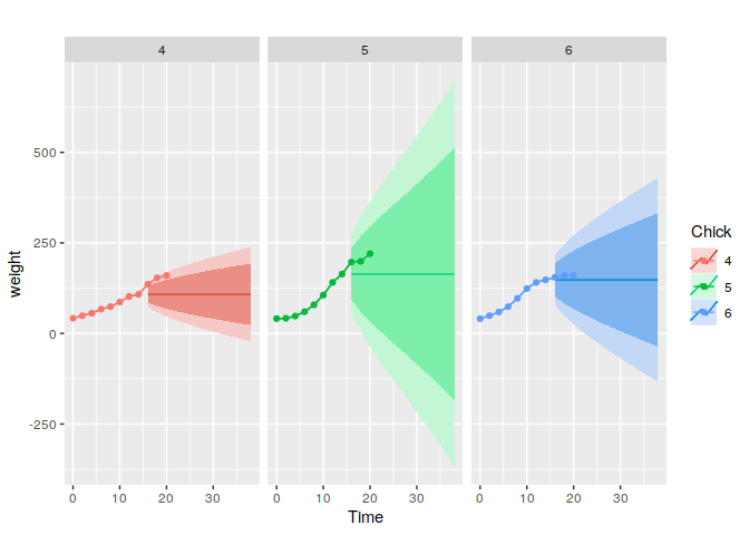
I wish to use forecast() with multivariate time series data to fit a model to a subset of each series (calibration data). Each series relates to a particular unit of interest. I can plot the calibration data and the rest of the data (validation data) using facet_grid over the individual units in ggplot.
How can I add the appropriate forecast object (useful as it has prediction intervals) to the relevant facet? I cannot see how to use commands from ggplot and forecast packages to do this. Instead, all prediction intervals are shown on each frame.
Here's an example that produces some output showing how forecast objects are not associated with the correct facet:
% Use ChickWeight data from R
ChickWeight$Chick <- as.numeric(ChickWeight$Chick)
% Take just three chicks with data that we restrict to the same time points
three.chicks <- dplyr::filter(ChickWeight,Chick %in% c(4:6), Time <=20)[,1:3]
three.chicks$Chick <- as.character(three.chicks$Chick)
% Divide data into early (calibration) and late (validation) subsets
early.data <- dplyr::filter(three.chicks, Time <=14)
early.data.melt <- reshape2::melt(early.data,id.vars=c(1,2))
late.data <- dplyr::filter(three.chicks, Time >14 )
late.data.melt <- reshape2::melt(late.data,id.vars=c(1,2))
unique.time.late <- unique(late.data$Time)
% Form a matrix of early data for each chick that we will convert to time series format shortly for input into forecast()
early.time.series.matrix <- matrix(nrow=length(unique(early.data$Time)),ncol=3)
ii <-0
for (i in 4:6) {
ii <- ii + 1
early.time.series.matrix[,ii] <- dplyr::filter(early.data, Chick == i)$weight
}
colnames(early.time.series.matrix) <- c("4","5","6")
% Create multivariate time series object of the correct frequency and time indices
early.time.series.ts <- ts(early.time.series.matrix, freq=0.5, start=min(early.data$Time))
early.fit <- forecast::forecast(early.time.series.ts, h= 12)
% Assemble parts for plot: calibration and validation data and the predictions for each series
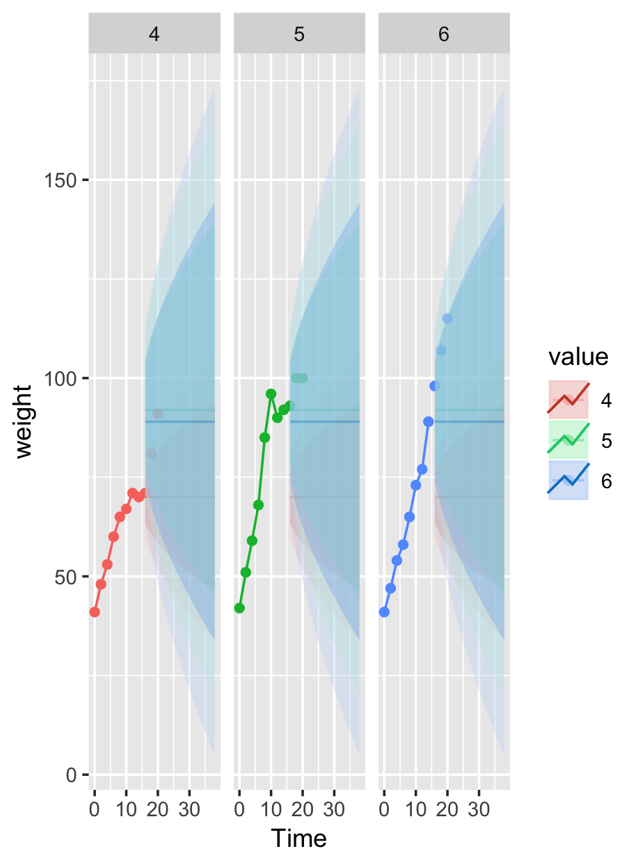
chick.plot <- ggplot2::ggplot(early.data.melt) + ggplot2::geom_line(ggplot2::aes(x=Time,y=weight,color=value,group=variable)) +
ggplot2::geom_point(ggplot2::aes(x=Time,y=weight,color=value,group=variable)) +
ggplot2::geom_point(data=late.data.melt, ggplot2::aes(x=Time,y=weight,color=value,group=variable)) +
forecast::autolayer(early.fit,alpha=0.35, ggplot2::aes(group=variable,color=value))
% Plot with facet_wrap so each facet shows the results for a particular chick.
chick.plot + ggplot2::facet_wrap( ~ value)
Referred here by Forecasting: Principles and Practice, by Rob J Hyndman and George Athanasopoulos