Hi
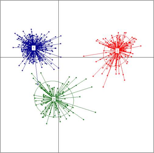
I have csv file having 4 columns 1st clum is members and remaining columns are their group membership probabilities. Now i would like to create scatter plot like in the attached file, is it possible with ggplot2 in R? any help in this regard will be highly appreciated.
Thanks in advance
Hi dromano
Thanks for your message. I can create example shown graph using this code
library(adegenet)
x<-input_file
x1<-as.data.frame(t(x))
gen<-as.genlight(x1)
grp<-find.clusters(gen,max.n.clust = 10)
dapc1<-dapc(gen,grp$grp) # up to here i have data shown as in my example
scatter(dapc1) # here i want to plot the clusters using dataframe.
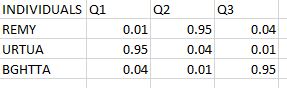
i have individuals with membership probabilities not exactly as groups i need to group them based on similar membership probabilities. I hope i explained you well.
Dear FJCC
Thanks for your help to my request. Your code is working good, but i have individuals with membership probabilities not exactly as groups i need to group them based on similar membership probabilities of groups from Q1 to Q3, other than this your code working well.
Thanks
Could you describe or share the contents of x1? To share them, you could execute the following lines:
sink("x1.txt")       # directs output to a new file called "x1.txt"
dput(x1[1:20, 1:20]) # writes code for recreating a few rows and columns of x1  to "x1.txt"
sink()               # restores output back to the console
and then
open the file "x1.txt" and copy the output
paste the output here, between a pair of triple backticks like this: