This is my script to draw the density plot:
df <- iris
plot(density(df$Sepal.Length), main="Density Plot", ylab="Frequency", sub=paste("Skewness:", round(e1071::skewness(df$Sepal.Length), 2)))
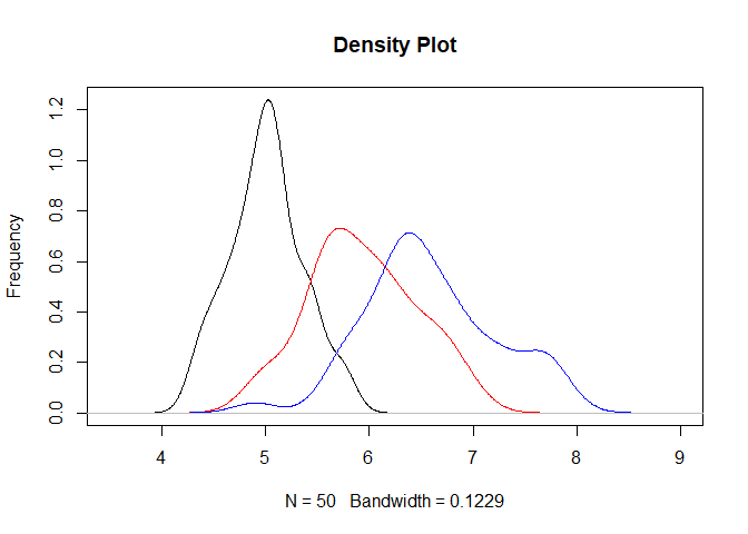
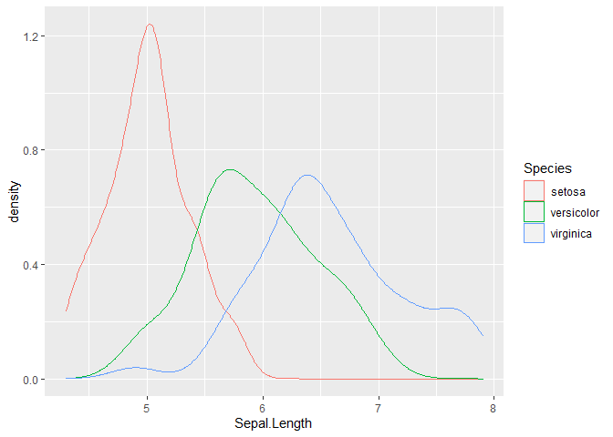
is there a way to plot three density plot (one for every species: setosa, virginica and versicolor) in the same graph?
FJCC
3
Here are sketches of two methods.
df <- iris
#Method 1
SETOSA <- density(df[df$Species=="setosa","Sepal.Length"])
VERSICOLOR <- density(df[df$Species=="versicolor","Sepal.Length"])
VIRGINICA <- density(df[df$Species=="virginica","Sepal.Length"])

plot(SETOSA, main="Density Plot", ylab="Frequency",
     xlim=c(3.5,9))
lines(VERSICOLOR,col="red")
lines(VIRGINICA,col="blue")

#Method 2
library(ggplot2)

ggplot(df,aes(x=Sepal.Length, color=Species)) + geom_density()

Created on 2022-01-05 by the reprex package (v2.0.1)
2 Likes
system
Closed
4
This topic was automatically closed 7 days after the last reply. New replies are no longer allowed.
If you have a query related to it or one of the replies, start a new topic and refer back with a link.

