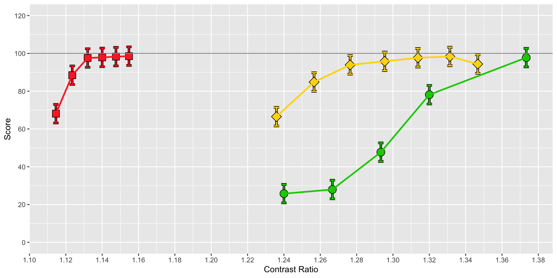
This is the graph I'm working on:
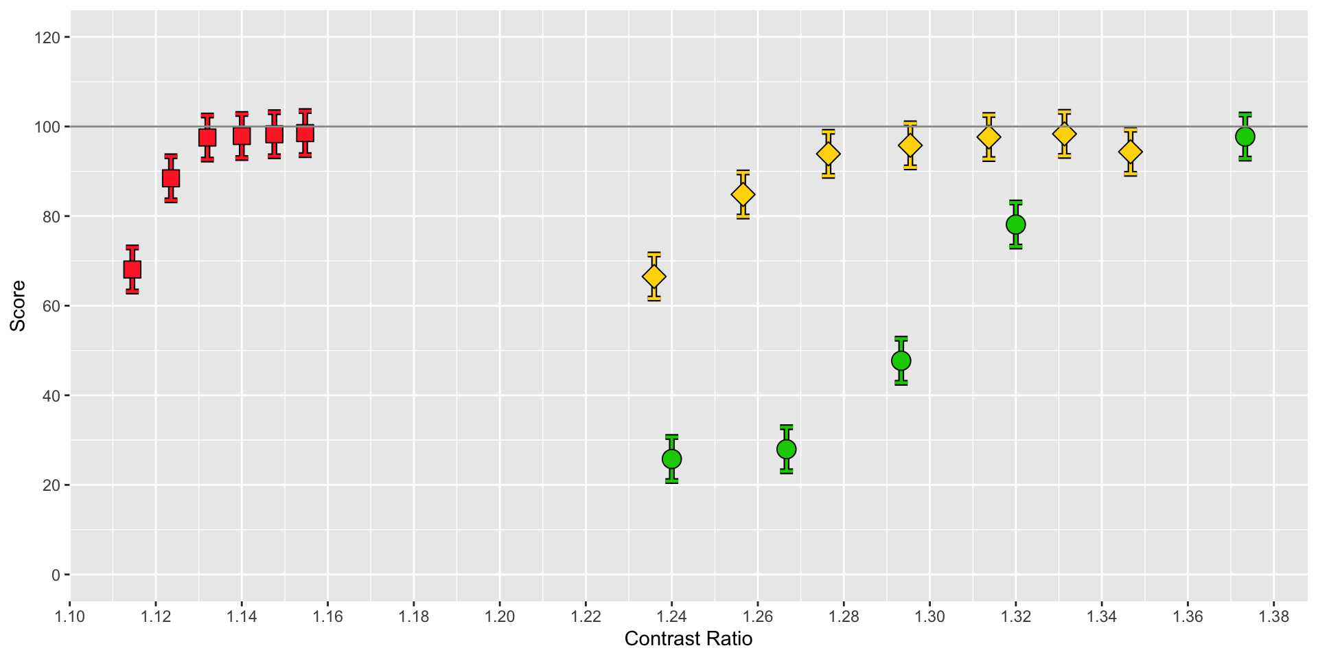
I'd like to draw 3 separate black lines: 1 connecting the 6 red points, 1 connecting the 6 yellow points, and 1 connecting the 6 green points. Here's the code that produces the figure:
cr = as.factor(1:18)
ggplot(CRatio, aes(x = CR, y = Mean)) +
  geom_errorbar(show.legend = FALSE, aes(ymin = Mean - FLSD, ymax = Mean + FLSD), color = "black", width = 0.003, size = 1.5) +
  geom_errorbar(show.legend = FALSE, aes(ymin = Mean - FLSD, ymax = Mean + FLSD, color = cr), width = 0.003, size = 0.75) +
  geom_point(show.legend = FALSE, aes(shape = cr, fill = "black"), size = 4) +
  geom_point(show.legend = FALSE, aes(shape = cr, fill = cr, size = 3)) +
  geom_hline(show.legend = FALSE, yintercept = 100, color = "gray60") +
  theme(legend.position = c(0.92, 0.82)) +
  scale_fill_manual(values = c("1" = "firebrick1", "2" = "firebrick1", "3" = "firebrick1", "4" = "firebrick1", "5" = "firebrick1", "6" = "firebrick1", "7" = "gold", "8" = "green3", "9" =   "gold", "10" = "green3", "11" = "gold", "12" = "green3", "13" = "gold", "14" = "gold", "15" = "green3", "16" = "gold", "17" = "gold", "18" = "green3")) +
  scale_color_manual(values = c("1" = "firebrick1", "2" = "firebrick1", "3" = "firebrick1", "4" = "firebrick1", "5" = "firebrick1", "6" = "firebrick1", "7" = "gold", "8" = "green3", "9" =   "gold", "10" = "green3", "11" = "gold", "12" = "green3", "13" = "gold", "14" = "gold", "15" = "green3", "16" = "gold", "17" = "gold", "18" = "green3")) +
  scale_shape_manual(values = c(22, 22, 22, 22, 22, 22, 23, 21, 23, 21, 23, 21, 23, 23, 21, 23, 23, 21)) +
  scale_x_continuous(breaks = seq(1, 1.4, 0.02)) +
  scale_y_continuous(breaks = seq(-20, 120, 20)) +
  coord_cartesian(ylim = c(0, 120)) +
  xlab("Contrast Ratio") +
  ylab("Score")
The data frame I'm graphing is shown below. I expect I need to add a column to it that identifies the plot color, but I don't know how to get ggplot2 to draw connecting lines only between matching colors.
   CR      N     Mean        SD      FLSD
1.114545, 36, 68.08103, 28.461777, 4.918355
1.123529, 36, 88.43912, 16.905620, 4.918355
1.132000, 36, 97.53609,  5.414429, 4.918355
1.140000, 36, 97.87396,  6.445279, 4.918355
1.147568, 36, 98.27566,  5.394553, 4.918355
1.154737, 36, 98.52912,  4.188169, 4.918355
1.235887, 36, 66.51105, 30.614724, 4.918355
1.240000, 36, 25.77416, 30.007565, 4.918355
1.256579, 36, 84.82706, 22.994580, 4.918355
1.266667, 36, 27.95530, 30.950723, 4.918355
1.276418, 36, 93.89677, 15.541952, 4.918355
1.293333, 36, 47.70902, 34.625131, 4.918355
1.295455, 36, 95.78894, 15.429926, 4.918355
1.313738, 36, 97.65004, 11.511776, 4.918355
1.320000, 36, 78.12021, 22.704971, 4.918355
1.331311, 36, 98.35325,  5.426022, 4.918355
1.346667, 36, 94.35469, 10.343709, 4.918355
1.373333, 36, 97.75070,  6.704323, 4.918355