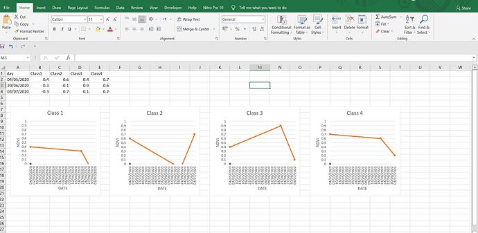
Hi, I need a help, If I have five columns in CSV file, I want to draw charts using R studio, These charts it should be considering the first column is the X-axes and the other columns are the Y-axis , then I will have Four charts Bay applying a loop, Please if you can give some answers to loop It in R studio, I have tried, but I didn't get the object, the plots I need, are line plots!
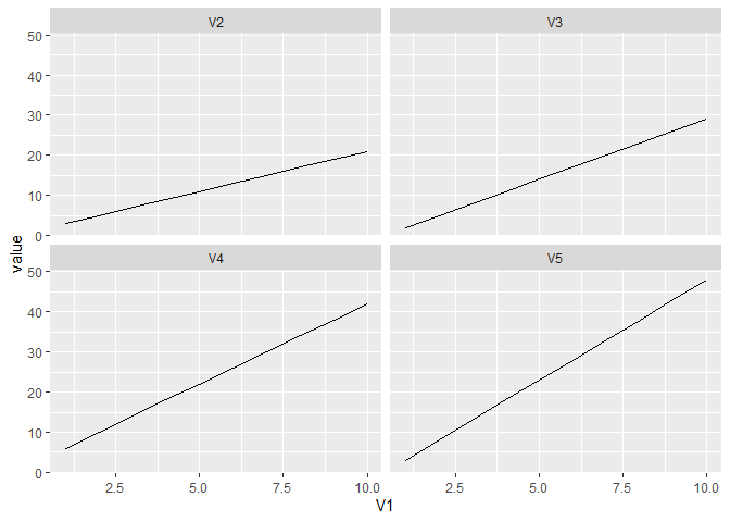
Do you have to use a loop? You can reshape the data with pivot_longer and then make a plot with facets with ggplot. For example:
DF <- data.frame(V1 = 1:10,
                 V2 = 1:10 * 2 + 1,
                 V3 = 1:10 * 3 - 1,
                 V4 = 1:10 * 4 + 2,
                 V5 = 1:10 * 5 - 2)
library(ggplot2)
library(tidyr)
DFlong <- DF |> pivot_longer(cols = -V1, names_to = "Col")
DFlong #show DFlong
#> # A tibble: 40 x 3
#>       V1 Col   value
#>    <int> <chr> <dbl>
#>  1     1 V2        3
#>  2     1 V3        2
#>  3     1 V4        6
#>  4     1 V5        3
#>  5     2 V2        5
#>  6     2 V3        5
#>  7     2 V4       10
#>  8     2 V5        8
#>  9     3 V2        7
#> 10     3 V3        8
#> # ... with 30 more rows
ggplot(DFlong, aes(x = V1, y = value)) + geom_line() +
  facet_wrap(~Col)

Created on 2022-03-23 by the reprex package (v2.0.1)
Hi, I need a help, If I have five columns in CSV file, I want to draw charts using R studio, These charts it should be considering the first column is the X-axes and the other columns are the Y-axis , then I will have Four charts Bay applying a loop, Please if you can give some answers to loop It in R studio, I have tried, but I didn't get the object, the plots I need, are line plots..
this image clarify what I want Exactly, to be informed that the number of the class is more than 100, even the days are more than 40 days, But if I could get your help to apply on this example, then I can apply it later for different range of values.
can we make for loop with write this date from CSV file,
This code saves a png image of each plot. You can remove the comment mark from the print() function and have each plot appear in the plot pane but if there are a large number of plots that is probably not practical.
DF <- data.frame(V1 = 1:10,
                 V2 = 1:10 * 2 + 1,
                 V3 = 1:10 * -3 - 1,
                 V4 = sin(1:10/10*pi),
                 V5 = 1:10 * 5 - 2)
library(ggplot2)

ColNames <- colnames(DF)[2:5]
for (Nm in ColNames) {
 PLT <-  DF |>
  ggplot(aes_string(x = "V1", y = Nm)) + geom_line()
  #print(PLT)
  ggsave(paste0("Graph_",Nm,".png"),plot = PLT, device = "png")
}
This topic was automatically closed 21 days after the last reply. New replies are no longer allowed.
If you have a query related to it or one of the replies, start a new topic and refer back with a link.
