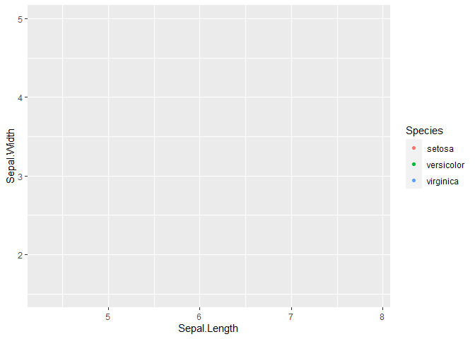
I'm using ggplot to generate plots for a talk I'll be giving in powerpoint. Since the plot has a lot of information, I want to be able to walk people throw it step by step, first having only the axes up (no data), then revealing each group of data one by one. I had planned on doing this by generating multiple plots that have the same dimensions/axes/legends, but differ only in what data are displayed (and then each slide will have a new image with progressively more information on it).
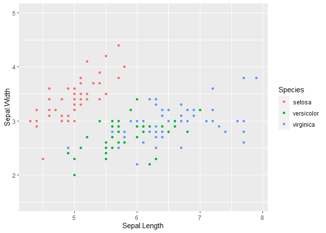
So for instance, if the final plot I want to show looks like this:
library(tidyverse)
mtcars %>%
  ggplot(aes(x = hp, y = mpg, color = as.factor(cyl))) +
  geom_point(size = 2) +
  scale_color_manual(values = c(`4` = 'blue', `6` = 'black', `8` = 'grey'), drop = FALSE) +
  theme_bw()
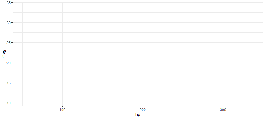
I want to create some companion plots that have the identical axes ranges above, the full legend (with all 3 groups), and in the same chart area, but without some or all of the groups present. For the chart without any data present, this gets me close:
mtcars %>%
  ggplot(aes(x = hp, y = mpg, color = as.factor(cyl))) +
  geom_blank() +
  scale_color_manual(values = c(`4` = 'blue', `6` = 'black', `8` = 'grey'), drop = FALSE) +
  theme_bw()
But it doesn't include the legend.
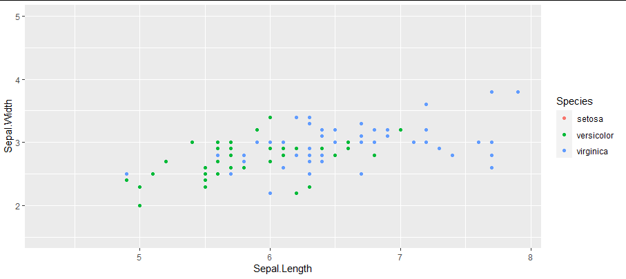
For the plots that only have partial data, something like the the following (obviously) doesn't work because it only has one data value on the legend and the axes are off. The axes are easy enough to change so that they match, but I can't get the legend to display more than the sole data point (this isn't surprising since I've filtered out all the other data, so there's no way for the plot to know that there are other members of the group):
mtcars %>%
  filter(cyl == 4) %>%
  ggplot(aes(x = hp, y = mpg, color = as.factor(cyl))) +
  geom_point(size = 2) +
  scale_color_manual(values = c(`4` = 'blue', `6` = 'black', `8` = 'grey'), drop = FALSE) +
  theme_bw()
In other words, is there a way to display the legend and plot axes/layout for a plot as if all of the data are plotted, but actually only plot a subset of the data (or no data at all)? I feel like there's probably something simple that I'm not familiar with, but couldn't anything when I tried.


